
authentik
https://docs.goauthentik.io/docs/installation/docker-compose
https://www.youtube.com/watch?v=N5unsATNpJk
docker-compose.yml yml
wichtig:
- bei server einen hostnamen hinzufügen
- wenn möglich port 9000 belassen
- gleiches network wie der Nginx Proxy Manager Container nutzen (damit npm über den hostname auf den authentik server zugreifen kann, siehe 500 Internal Server Error weiter unten)
---

services:
  postgresql:
    image: docker.io/library/postgres:16-alpine
    restart: unless-stopped
    healthcheck:
      test: ["CMD-SHELL", "pg_isready -d $${POSTGRES_DB} -U $${POSTGRES_USER}"]
      start_period: 20s
      interval: 30s
      retries: 5
      timeout: 5s
    networks:
      - reverseproxy_network
    volumes:
      - database:/var/lib/postgresql/data
    environment:
      POSTGRES_PASSWORD: ${PG_PASS}
      POSTGRES_USER: ${PG_USER:-authentik}
      POSTGRES_DB: ${PG_DB:-authentik}
    env_file:
      - stack.env
  redis:
    image: docker.io/library/redis:alpine
    command: --save 60 1 --loglevel warning
    restart: unless-stopped
    healthcheck:
      test: ["CMD-SHELL", "redis-cli ping | grep PONG"]
      start_period: 20s
      interval: 30s
      retries: 5
      timeout: 3s
    networks:
      - reverseproxy_network
    volumes:
      - redis:/data
  server:
    image: ${AUTHENTIK_IMAGE:-ghcr.io/goauthentik/server}:${AUTHENTIK_TAG:-2024.6.0}
    restart: unless-stopped
    hostname: authentik_server
    command: server
    ulimits:
      nofile:
        soft: 10240
        hard: 10240
    environment:
      AUTHENTIK_REDIS__HOST: redis
      AUTHENTIK_POSTGRESQL__HOST: postgresql
      AUTHENTIK_POSTGRESQL__USER: ${PG_USER:-authentik}
      AUTHENTIK_POSTGRESQL__NAME: ${PG_DB:-authentik}
      AUTHENTIK_POSTGRESQL__PASSWORD: ${PG_PASS}
    networks:
      - reverseproxy_network
    volumes:
      - media:/media
      - custom-templates:/templates#
    env_file:
      - stack.env
    ports:
      - "${COMPOSE_PORT_HTTP:-9000}:9000"
      - "${COMPOSE_PORT_HTTPS:-9443}:9443"
    depends_on:
      - postgresql
      - redis
  worker:
    image: ${AUTHENTIK_IMAGE:-ghcr.io/goauthentik/server}:${AUTHENTIK_TAG:-2024.6.0}
    restart: unless-stopped
    command: worker
    ulimits:
      nofile:
        soft: 10240
        hard: 10240
    environment:
      AUTHENTIK_REDIS__HOST: redis
      AUTHENTIK_POSTGRESQL__HOST: postgresql
      AUTHENTIK_POSTGRESQL__USER: ${PG_USER:-authentik}
      AUTHENTIK_POSTGRESQL__NAME: ${PG_DB:-authentik}
      AUTHENTIK_POSTGRESQL__PASSWORD: ${PG_PASS}
    # `user: root` and the docker socket volume are optional.
    # See more for the docker socket integration here:
    # https://goauthentik.io/docs/outposts/integrations/docker
    # Removing `user: root` also prevents the worker from fixing the permissions
    # on the mounted folders, so when removing this make sure the folders have the correct UID/GID
    # (1000:1000 by default)
    user: root
    networks:
      - reverseproxy_network
    volumes:
      - /var/run/docker.sock:/var/run/docker.sock
      - media:/media
      - certs:/certs
      - custom-templates:/templates
    env_file:
      - stack.env
    depends_on:
      - postgresql
      - redis

volumes:
  database:
    driver: local
  redis:
    driver: local
  media:
  custom-templates:
  certs:

networks:
  reverseproxy_network:
      name: reverseproxy_network
      driver: bridge
PG_PASS
openssl rand 36 | base64AUTHENTIK_SECRET_KEY
openssl rand 60 | base64Portainer env via advanced mode
PG_PASS=2jvp8Jmnf8cS
AUTHENTIK_SECRET_KEY="hxHHNgxf5PALhfX0FL69v"
AUTHENTIK_ERROR_REPORTING__ENABLED=true
AUTHENTIK_EMAIL__HOST=smtp.world4you.com
AUTHENTIK_EMAIL__PORT=587
AUTHENTIK_EMAIL__USERNAME=MEINE....@MY-MAIL.DE
AUTHENTIK_EMAIL__PASSWORD=MEIN.....MAIL-PW
AUTHENTIK_EMAIL__FROM=NO-REPLY@MY-MAIL.DE
AUTHENTIK_EMAIL__USE_TLS=true
COMPOSE_PORT_HTTP=9006
COMPOSE_PORT_HTTPS=9446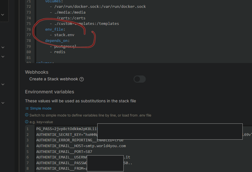
Danach noch das Initial-Setup durchführen, um ein Passwort zu setzen:
http://MEIN-HOSTNAME-ODER-IP:9000/if/flow/initial-setup
oder mit meiner cfg
http://MEIN-HOSTNAME-ODER-IP:9006/if/flow/initial-setup
Zusatzinfo
die Zeilen ulimits: nofile: soft: 10240 hard: 10240
in der docker-compose.yml habe ich eingefügt, weil ein Bug dazu führt, dass die CPU-Leistung des Docker Hosts auf 100% klettert und einige Stunden braucht, bis sie sich wieder erholt. Mehr Infos unter unter https://github.com/goauthentik/authentik/pull/7762 und
https://github.com/goauthentik/authentik/issues/7025, die Lösung stammt aus diesem Kommentar:
https://github.com/goauthentik/authentik/issues/7025#issuecomment-1868333903
Nextcloud Integration
benötigte Nextcloud App: https://apps.nextcloud.com/apps/user_oidc
Anleitung: https://docs.goauthentik.io/integrations/services/nextcloud/
Zusatz:
Befehl, um nur Anmeldung über Authentik zuzulassen:
sudo -u www-data php var/www/nextcloud/occ config:app:set --value=0 user_oidc allow_multiple_user_backendsbzw wenn man diesem Artikel folgt
docker exec -it -u 33 nextcloud-app-1 /bin/bashund dann dann
./occ config:app:set --value=0 user_oidc allow_multiple_user_backends
Wenn man sich dann trotzdem über den Direktlogin zb als Super-Admin einloggen möchte, geht das über über
http://nextcloud.MEINEDOMAIN.de/login?direct=1
Branding (eigene Marke)
# default bg und icon:
/static/dist/assets/icons/icon_left_brand.svg
/static/dist/assets/icons/icon.png
https://www.youtube.com/watch?v=YawgyM509ng
https://www.youtube.com/watch?v=3oIRY0NWPr8
Eigene Backgrounds und Icons
1) media-volume muss in der docker-compose.yml bei server, worker und als volume vorhanden sein:
...
  server:
    image: ${AUTHENTIK_IMAGE:-ghcr.io/goauthentik/server}:${AUTHENTIK_TAG:-2024.6.1}
...
    volumes:
      - media:/media # <------------ HIER
      - custom-templates:/templates#
    env_file:
  worker:
    image: ${AUTHENTIK_IMAGE:-ghcr.io/goauthentik/server}:${AUTHENTIK_TAG:-2024.6.0}
...
    user: root
    volumes:
      - /var/run/docker.sock:/var/run/docker.sock
      - media:/media # <------------ HIER
      - certs:/certs
      - custom-templates:/templates
    env_file:
...
volumes:
  database:
    driver: local
  redis:
    driver: local
  media: # <------------ HIER
  certs:
  custom-templates:
2) Bilddateien übertragen (mit WinSCP, CLI SCP oder MountainDuck, mir egal)
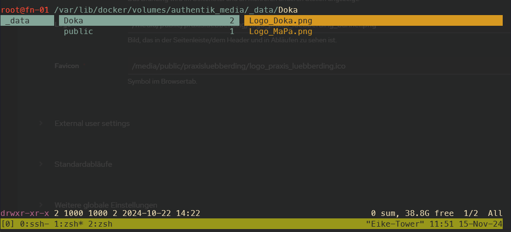
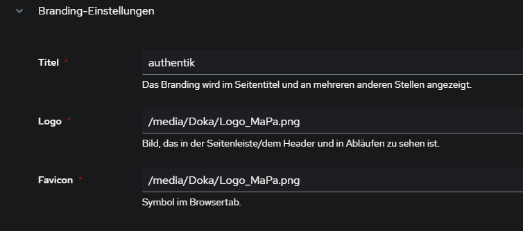
3) Authentik > System > Brands > edit default (Stiftsymbol) > Branding-Settings > Pfade eingeben:
Custom CSS Theme NEU
Seit Version 2025.12 kann man die custom.css über das Admin-Panel editieren:
Admin-Oberfläche > System > Brands > Brand editieren > Branding-Einstellungen > Custom CSS:
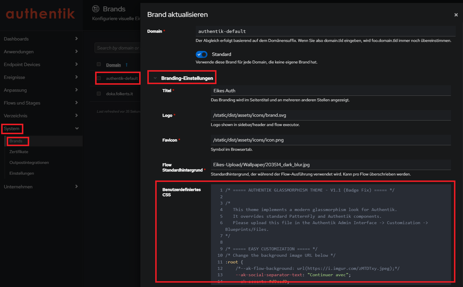
Neues glassmorphism Theme:
Quelle https://github.com/VULGA01/Authentik-Login-theme-Glassmorphism
/* ===== AUTHENTIK GLASSMORPHISM THEME - V1.1 (Badge Fix) ===== */
/*
This theme implements a modern glassmorphism look for Authentik.
It overrides standard PatternFly and Authentik components.
Please upload this file in the Authentik Admin Interface -> Customization -> Blueprints/Files.
*/
/* ===== EASY CUSTOMIZATION ===== */
/* Change the background image URL below */
:root {
--ak-flow-background: url(https://i.imgur.com/zMTDTxy.jpeg);
--ak-social-separator-text: "Continuer avec";
--ak-accent: #d0ced0;
}
/* ===== TOTP COPY BUTTON STYLE (NEUTRAL WHITE) ===== */
:host(ak-stage-authenticator-totp) .pf-c-button.pf-m-secondary {
background: rgba(255, 255, 255, 0.1) !important;
color: white !important;
border: 1px solid rgba(255, 255, 255, 0.2) !important;
backdrop-filter: blur(10px) !important;
border-radius: 12px !important;
padding: 8px 16px !important;
display: flex !important;
align-items: center !important;
justify-content: center !important;
gap: 8px !important;
font-size: 14px !important;
font-weight: 500 !important;
box-shadow: 0 4px 6px rgba(0, 0, 0, 0.1) !important;
transition: all 0.3s ease !important;
margin-top: 5px !important;
}
:host(ak-stage-authenticator-totp) .pf-c-button.pf-m-secondary:hover {
background: rgba(255, 255, 255, 0.2) !important;
border-color: rgba(255, 255, 255, 0.4) !important;
transform: translateY(-2px) !important;
box-shadow: 0 6px 15px rgba(0, 0, 0, 0.15) !important;
}
/* Remove reflection for this specific button to avoid glitches */
:host(ak-stage-authenticator-totp) .pf-c-button.pf-m-secondary::before,
:host(ak-stage-authenticator-totp) .pf-c-button.pf-m-secondary::after {
display: none !important;
content: none !important;
}
/* Fix icon positioning (it was absolute, causing overlap) */
:host(ak-stage-authenticator-totp) .pf-c-button.pf-m-secondary .pf-c-button__progress {
position: static !important;
transform: none !important;
display: inline-flex !important;
align-items: center !important;
}
:host(ak-stage-authenticator-totp) .qr-container {
width: 100% !important;
height: auto !important;
max-width: none !important;
background: transparent !important;
box-shadow: none !important;
display: flex !important;
flex-direction: column !important;
align-items: center !important;
justify-content: center !important;
margin: 10px 0 !important;
border-radius: 0 !important;
}
:host(ak-stage-authenticator-totp) qr-code {
/* Only the QR code gets the fixed white box */
max-width: 150px !important;
width: 150px !important;
height: 150px !important;
margin: 0 0 15px 0 !important;
/* Bottom margin to push button down */
display: flex !important;
justify-content: center !important;
align-items: center !important;
border-radius: 12px !important;
box-shadow: 0 4px 12px rgba(0, 0, 0, 0.2) !important;
background: white !important;
overflow: hidden !important;
}
:host(ak-stage-authenticator-totp) qr-code svg {
width: 100% !important;
height: 100% !important;
object-fit: contain !important;
}
/* Réduire la taille du texte explicatif sur la page TOTP */
:host(ak-stage-authenticator-totp) .pf-c-form__group:not([hidden]) p,
:host(ak-stage-authenticator-totp) .pf-c-form__group:not([hidden]) li {
font-size: 13px !important;
line-height: 1.4 !important;
opacity: 0.9 !important;
margin-bottom: 8px !important;
}
/* Réduire un peu le titre du QR code container si présent */
:host(ak-stage-authenticator-totp) .pf-c-form__group label {
font-size: 14px !important;
margin-bottom: 4px !important;
}
/* ===== FORCE DARK MODE ===== */
:root {
--pf-global--palette--black-50: oklab(0.9067 -0 0) !important;
--pf-global--palette--black-100: oklab(0.8292 -0.0007 -0.0016) !important;
--pf-global--palette--black-200: oklab(0.7407 -0.0007 -0.0017) !important;
--pf-global--palette--black-300: oklab(0.6232 -0.0003 -0.0032) !important;
--pf-global--palette--black-400: oklab(0.4602 -0.0003 -0.0034) !important;
--pf-global--palette--black-500: oklab(0.3906 0.0001 -0.0052) !important;
--pf-global--palette--black-600: oklab(0.3369 0.0001 -0.0054) !important;
--pf-global--palette--black-700: oklab(0.2795 -0.0021 -0.0083) !important;
--pf-global--palette--black-800: oklab(0.2303 -0.0008 -0.0083) !important;
--pf-global--palette--black-900: oklab(0.1798 -0.0034 -0.0053) !important;
--pf-global--palette--red-9999: oklab(0.6739 0.1853 0.1022) !important;
--pf-global--palette--red-8888: oklab(0.723 0.153 0.0784) !important;
--pf-v4-global--palette--blue-300: oklab(70.367% -0.07498 -0.139) !important;
--ak-global--palette--blue-300: oklab(67.552% -0.05374 -0.16817) !important;
--pf-global--palette--blue-300: var(--pf-v4-global--palette--blue-300) !important;
--pf-global--BackgroundColor--100: oklab(0.2303 -0.0008 -0.0083) !important;
--pf-global--BackgroundColor--150: oklab(0.2585 -0.0027 -0.0066) !important;
--pf-global--BackgroundColor--200: oklab(0.1798 -0.0034 -0.0053) !important;
--pf-global--BackgroundColor--300: oklab(0.2795 -0.0021 -0.0083) !important;
--pf-global--BackgroundColor--400: oklab(0.3369 0.0001 -0.0054) !important;
--pf-global--BackgroundColor--light-100: oklab(0.2303 -0.0008 -0.0083) !important;
--pf-global--BackgroundColor--light-200: oklab(0.1798 -0.0034 -0.0053) !important;
--pf-global--BackgroundColor--light-300: oklab(0.2795 -0.0021 -0.0083) !important;
--pf-global--BackgroundColor--dark-100: oklab(0.2303 -0.0008 -0.0083) !important;
--pf-global--BackgroundColor--dark-200: oklab(0.1798 -0.0034 -0.0053) !important;
--pf-global--BackgroundColor--dark-300: oklab(0.2795 -0.0021 -0.0083) !important;
--pf-global--BackgroundColor--dark-400: oklab(0.3369 0.0001 -0.0054) !important;
--pf-global--BorderColor--100: oklab(0.3906 0.0001 -0.0052) !important;
--pf-global--BorderColor--200: oklab(0.4602 -0.0003 -0.0034) !important;
--pf-global--BorderColor--300: oklab(0.3906 0.0001 -0.0052) !important;
--pf-global--BorderColor--400: oklab(0.7407 -0.0007 -0.0017) !important;
--pf-global--Color--100: oklab(0.9067 -0 0) !important;
--pf-global--Color--200: oklab(0.7407 -0.0007 -0.0017) !important;
--pf-global--active-color--100: var(--pf-v4-global--palette--blue-300) !important;
--pf-global--primary-color--300: oklab(0.522 -0.0434 -0.1717) !important;
--pf-global--primary-color--100: var(--pf-global--primary-color--300) !important;
--pf-global--link--Color: var(--pf-v4-global--palette--blue-300) !important;
--pf-global--link--Color--hover: oklab(0.7706 -0.0485 -0.1012) !important;
--pf-global--link--Color--visited: oklab(0.7137 0.0522 -0.151) !important;
--pf-global--disabled-color--100: oklab(0.4602 -0.0003 -0.0034) !important;
--pf-global--disabled-color--200: oklab(0.3906 0.0001 -0.0052) !important;
--pf-global--disabled-color--300: oklab(0.7407 -0.0007 -0.0017) !important;
--pf-global--icon--Color--light: oklab(0.7407 -0.0007 -0.0017) !important;
--pf-global--icon--Color--dark: oklab(0.7407 -0.0007 -0.0017) !important;
--pf-global--Color--dark-100: oklab(0.9067 -0 0) !important;
--pf-global--Color--dark-200: oklab(0.7407 -0.0007 -0.0017) !important;
--pf-global--Color--light-100: oklab(0.9067 -0 0) !important;
--pf-global--Color--light-200: oklab(0.7407 -0.0007 -0.0017) !important;
--pf-global--Color--light-300: oklab(0.3659 -0.0025 -0.0061) !important;
--pf-global--BorderColor--dark-100: oklab(0.3906 0.0001 -0.0052) !important;
--pf-global--BorderColor--light-100: oklab(0.3906 0.0001 -0.0052) !important;
--pf-global--primary-color--light-100: oklab(67.552% -0.05374 -0.16817) !important;
--pf-global--primary-color--dark-100: oklab(67.552% -0.05374 -0.16817) !important;
--pf-global--link--Color--light: var(--pf-v4-global--palette--blue-300) !important;
--pf-global--link--Color--light--hover: var(--pf-global--palette--blue-200) !important;
--pf-global--link--Color--dark: var(--pf-v4-global--palette--blue-300) !important;
--pf-global--link--Color--dark--hover: var(--pf-global--palette--blue-200) !important;
--pf-global--default-color--100: var(--pf-global--palette--cyan-100) !important;
--pf-global--default-color--300: var(--pf-global--palette--cyan-200) !important;
--pf-global--info-color--100: var(--pf-global--palette--blue-200) !important;
--pf-global--info-color--200: var(--pf-global--palette--blue-50) !important;
--pf-global--warning-color--100: oklab(0.7864 0.0298 0.1604) !important;
--pf-global--warning-color--200: oklab(0.8354 0.0112 0.1471) !important;
--pf-global--danger-color--100: var(--pf-global--palette--red-100) !important;
--pf-global--danger-color--200: var(--pf-global--palette--red-50) !important;
--pf-global--success-color--100: oklab(0.6488 -0.1066 0.0846) !important;
--pf-global--success-color--200: var(--pf-global--palette--green-50) !important;
/* Force browser to render standard controls in dark mode */
color-scheme: dark !important;
}
/* Ensure these variables are sticky even if the browser prefers light mode */
@media (prefers-color-scheme: light) {
:root {
--pf-global--BackgroundColor--100: oklab(0.2303 -0.0008 -0.0083) !important;
--pf-global--BackgroundColor--light-100: oklab(0.2303 -0.0008 -0.0083) !important;
--pf-global--Color--100: oklab(0.9067 -0 0) !important;
--pf-global--Color--light-100: oklab(0.9067 -0 0) !important;
--pf-global--Color--dark-100: oklab(0.9067 -0 0) !important;
/* Re-apply the full block if necessary, but usually overrides are enough */
}
}
/* ===== BOUTONS OUI/NON & ACTIONS ===== */
/* Container buttons */
.pf-c-login .pf-c-form__actions,
.pf-c-login .pf-c-form__group-control,
body:has(.pf-c-login) .pf-c-form__actions,
body:has(.pf-c-login) .pf-c-form__group-control {
display: flex !important;
gap: 15px !important;
margin-top: 25px !important;
justify-content: space-between !important;
overflow: visible !important;
padding: 5px !important;
}
/* Base button styles */
.pf-c-login .pf-c-form__actions button,
.pf-c-login .pf-c-form__group-control button,
body:has(.pf-c-login) .pf-c-form__actions button,
body:has(.pf-c-login) .pf-c-form__group-control button,
.pf-c-login button[type="button"],
body:has(.pf-c-login) button[type="button"],
:host(ak-stage-user-login) button[type="submit"] {
border-radius: 14px !important;
padding: 10px 20px !important;
font-weight: 600 !important;
font-size: 15px !important;
transition: all 0.3s cubic-bezier(0.25, 0.46, 0.45, 0.94) !important;
text-transform: none !important;
border: none !important;
backdrop-filter: blur(20px) saturate(130%) !important;
-webkit-backdrop-filter: blur(20px) saturate(130%) !important;
position: relative !important;
overflow: hidden !important;
box-sizing: border-box !important;
min-width: 120px !important;
cursor: pointer !important;
outline: none !important;
}
/* ========================================= */
/* LOGIN BUTTON - FORCE WHITE GLASSMORPHISM */
/* ========================================= */
/* Force white for identification login button */
.pf-c-login .pf-c-form__actions button:first-child,
.pf-c-login .pf-c-form__group-control button:first-child,
body:has(.pf-c-login) .pf-c-form__actions button:first-child,
body:has(.pf-c-login) .pf-c-form__group-control button:first-child,
.pf-c-login button[type="button"]:first-of-type,
body:has(.pf-c-login) button[type="button"]:first-of-type,
:host(ak-stage-identification) .pf-c-button.pf-m-primary,
:host(ak-stage-identification) button[type="submit"].pf-c-button.pf-m-primary {
background: rgba(255, 255, 255, 0.15) !important;
backdrop-filter: blur(10px) !important;
-webkit-backdrop-filter: blur(10px) !important;
border: 1px solid rgba(255, 255, 255, 0.3) !important;
color: white !important;
font-weight: 600 !important;
padding: 14px 24px !important;
border-radius: 14px !important;
transition: all 0.3s ease !important;
box-shadow: 0 6px 20px rgba(0, 0, 0, 0.15), 0 2px 8px rgba(255, 255, 255, 0.1) !important;
}
:host(ak-stage-identification) .pf-c-button.pf-m-primary:hover,
:host(ak-stage-identification) button[type="submit"].pf-c-button.pf-m-primary:hover {
background: rgba(255, 255, 255, 0.25) !important;
border-color: rgba(255, 255, 255, 0.4) !important;
transform: translateY(-2px) !important;
box-shadow: 0 10px 30px rgba(0, 0, 0, 0.2), 0 4px 12px rgba(255, 255, 255, 0.15) !important;
}
/* ========================================= */
/* STAY CONNECTED BUTTONS (USER LOGIN STAGE) */
/* ========================================= */
/* Neutralize 'Yes' and 'No' buttons to Standard Glass Style */
:host(ak-stage-user-login) .pf-c-button.pf-m-primary,
:host(ak-stage-user-login) .pf-c-button.pf-m-secondary {
background: rgba(255, 255, 255, 0.08) !important;
backdrop-filter: blur(10px) !important;
-webkit-backdrop-filter: blur(10px) !important;
border: 1px solid rgba(255, 255, 255, 0.2) !important;
color: white !important;
font-weight: 500 !important;
padding: 10px 24px !important;
border-radius: 14px !important;
transition: all 0.3s ease !important;
box-shadow: 0 4px 6px rgba(0, 0, 0, 0.1) !important;
margin: 0 !important;
/* Reset margins if inherited */
}
:host(ak-stage-user-login) .pf-c-button.pf-m-primary:hover,
:host(ak-stage-user-login) .pf-c-button.pf-m-secondary:hover {
background: rgba(255, 255, 255, 0.2) !important;
transform: translateY(-2px) !important;
box-shadow: 0 8px 15px rgba(0, 0, 0, 0.2) !important;
border-color: rgba(255, 255, 255, 0.4) !important;
}
/* Remove colored pseudo-elements/reflections for Stay Connected */
:host(ak-stage-user-login) .pf-c-button.pf-m-primary::before,
:host(ak-stage-user-login) .pf-c-button.pf-m-secondary::before {
display: none !important;
content: none !important;
}
/* ========================================= */
/* SHARED ANIMATIONS & FIXES */
/* ========================================= */
/* Reflection effect for Login Button ONLY */
:host(ak-stage-identification) .pf-c-button.pf-m-primary::before {
content: '';
position: absolute;
top: 0;
left: -100%;
width: 100%;
height: 100%;
background: linear-gradient(90deg,
transparent 0%,
rgba(255, 255, 255, 0.2) 50%,
transparent 100%);
transition: left 0.6s ease;
z-index: 1;
border-radius: 14px;
}
:host(ak-stage-identification) .pf-c-button.pf-m-primary:hover::before {
left: 100%;
}
/* Z-index fix for text */
:host(ak-stage-user-login) .pf-c-button.pf-m-primary *,
:host(ak-stage-user-login) .pf-c-button.pf-m-secondary *,
:host(ak-stage-identification) .pf-c-button.pf-m-primary *,
:host(ak-stage-identification) .pf-c-button.pf-m-secondary * {
position: relative !important;
z-index: 2 !important;
}
:host(ak-stage-user-login) .pf-c-button.pf-m-primary::after,
:host(ak-stage-user-login) .pf-c-button.pf-m-secondary::after,
:host(ak-stage-identification) .pf-c-button.pf-m-primary::after,
:host(ak-stage-identification) .pf-c-button.pf-m-secondary::after {
border: none !important;
display: none !important;
}
:host(ak-stage-user-login) .pf-c-button:focus,
:host(ak-stage-user-login) .pf-c-button:active,
:host(ak-stage-identification) .pf-c-button:focus,
:host(ak-stage-identification) .pf-c-button:active {
outline: none !important;
}
/* Button 'No' / Secondary */
:host(ak-stage-user-login) .pf-c-button.pf-m-secondary,
:host(ak-stage-identification) .pf-c-button.pf-m-secondary {
background: rgba(220, 53, 69, 0.15) !important;
color: rgba(255, 255, 255, 0.9) !important;
border: 1.5px solid rgba(220, 53, 69, 0.3) !important;
box-shadow:
0 4px 15px rgba(220, 53, 69, 0.1),
0 2px 8px rgba(0, 0, 0, 0.1),
inset 0 1px 0 rgba(255, 255, 255, 0.1) !important;
}
/* Reflection effect 'No' */
:host(ak-stage-user-login) .pf-c-button.pf-m-secondary::before,
:host(ak-stage-identification) .pf-c-button.pf-m-secondary::before {
content: '';
position: absolute;
top: 0;
left: -100%;
width: 100%;
height: 100%;
background: linear-gradient(90deg,
transparent 0%,
rgba(255, 255, 255, 0.15) 50%,
transparent 100%);
transition: left 0.6s ease;
z-index: 1;
border-radius: 14px;
}
:host(ak-stage-user-login) .pf-c-button.pf-m-secondary:hover::before,
:host(ak-stage-identification) .pf-c-button.pf-m-secondary:hover::before {
left: 100%;
}
:host(ak-stage-user-login) .pf-c-button.pf-m-secondary:hover,
:host(ak-stage-identification) .pf-c-button.pf-m-secondary:hover {
background: rgba(220, 53, 69, 0.25) !important;
border-color: rgba(220, 53, 69, 0.45) !important;
color: white !important;
transform: translateY(-1px) !important;
box-shadow:
0 8px 25px rgba(220, 53, 69, 0.2),
0 4px 12px rgba(0, 0, 0, 0.15),
inset 0 1px 0 rgba(255, 255, 255, 0.15) !important;
}
/* Z-index fix for text */
:host(ak-stage-user-login) .pf-c-button.pf-m-primary *,
:host(ak-stage-user-login) .pf-c-button.pf-m-secondary *,
:host(ak-stage-identification) .pf-c-button.pf-m-primary *,
:host(ak-stage-identification) .pf-c-button.pf-m-secondary * {
position: relative !important;
z-index: 2 !important;
}
/* ========================================= */
/* SOCIAL LOGIN BUTTONS (GLASSMORPHISM) */
/* ========================================= */
/* Base style for all social login buttons */
:host(ak-stage-identification) .source-button {
background: rgba(255, 255, 255, 0.08) !important;
border: 1px solid rgba(255, 255, 255, 0.2) !important;
color: white !important;
border-radius: 12px !important;
padding: 10px 20px !important;
transition: all 0.3s ease !important;
display: flex !important;
align-items: center !important;
justify-content: center !important;
text-decoration: none !important;
box-shadow: 0 4px 6px rgba(0, 0, 0, 0.1) !important;
position: relative !important;
font-weight: 600 !important;
font-size: 15px !important;
gap: 8px !important;
backdrop-filter: blur(10px) !important;
-webkit-backdrop-filter: blur(10px) !important;
overflow: hidden !important;
}
:host(ak-stage-identification) .source-button:hover {
background: rgba(255, 255, 255, 0.2) !important;
transform: translateY(-2px) scale(1.02) !important;
box-shadow: 0 8px 15px rgba(0, 0, 0, 0.2) !important;
border-color: rgba(255, 255, 255, 0.4) !important;
}
/* Discord-specific branding */
:host(ak-stage-identification) button[name*="discord"].source-button {
background: rgba(88, 101, 242, 0.25) !important;
border-color: rgba(88, 101, 242, 0.4) !important;
box-shadow:
0 4px 12px rgba(88, 101, 242, 0.2),
inset 0 1px 0 rgba(255, 255, 255, 0.1) !important;
}
:host(ak-stage-identification) button[name*="discord"].source-button:hover {
background: rgba(88, 101, 242, 0.35) !important;
border-color: rgba(88, 101, 242, 0.6) !important;
box-shadow:
0 8px 20px rgba(88, 101, 242, 0.35),
0 0 0 2px rgba(88, 101, 242, 0.2),
inset 0 1px 0 rgba(255, 255, 255, 0.15) !important;
}
/* Shine effect on hover for all social buttons */
:host(ak-stage-identification) .source-button:hover::before {
content: "";
position: absolute;
top: 0;
left: -70%;
width: 55%;
height: 100%;
background: linear-gradient(120deg, transparent 0%, rgba(255, 255, 255, 0.5) 60%, transparent 100%);
transform: skewX(-25deg);
animation: socialShine 0.65s linear 1;
pointer-events: none;
}
@keyframes socialShine {
100% {
left: 130%;
}
}
/* Icon styling within social buttons */
:host(ak-stage-identification) .source-button img,
:host(ak-stage-identification) .source-button span.pf-c-button__icon {
width: 18px !important;
height: 18px !important;
flex-shrink: 0;
}
/* Make Discord icon white */
:host(ak-stage-identification) button[name*="discord"].source-button img {
filter: brightness(0) invert(1);
}
/* Google-specific branding */
:host(ak-stage-identification) button[name*="google"].source-button {
background: rgba(66, 133, 244, 0.25) !important;
border-color: rgba(66, 133, 244, 0.4) !important;
}
:host(ak-stage-identification) button[name*="google"].source-button:hover {
background: rgba(66, 133, 244, 0.35) !important;
border-color: rgba(66, 133, 244, 0.6) !important;
box-shadow:
0 8px 20px rgba(66, 133, 244, 0.35),
0 0 0 2px rgba(66, 133, 244, 0.2) !important;
}
:host(ak-stage-user-login) .pf-c-button.pf-m-primary::after,
:host(ak-stage-user-login) .pf-c-button.pf-m-secondary::after {
border: none !important;
display: none !important;
}
:host(ak-stage-user-login) .pf-c-button:focus,
:host(ak-stage-user-login) .pf-c-button:active {
outline: none !important;
}
/* Responsive */
@media (max-width: 768px) {
.pf-c-login .pf-c-form__actions,
body:has(.pf-c-login) .pf-c-form__actions {
flex-direction: column !important;
gap: 12px !important;
}
:host(ak-stage-user-login) .pf-c-button.pf-m-primary,
:host(ak-stage-user-login) .pf-c-button.pf-m-secondary {
width: 100% !important;
min-width: auto !important;
padding: 14px 28px !important;
}
}
/* ===== RADIO & CHECKBOX (REMEMBER ME) ===== */
.pf-c-login .pf-c-check,
.pf-c-login .pf-c-switch,
body:has(.pf-c-login) .pf-c-check,
body:has(.pf-c-login) .pf-c-switch {
margin: 20px 0 !important;
display: flex !important;
align-items: center !important;
gap: 6px !important;
}
.pf-c-login .pf-c-check__input,
.pf-c-login .pf-c-switch__input,
.pf-c-login input[type="checkbox"],
body:has(.pf-c-login) .pf-c-check__input,
body:has(.pf-c-login) .pf-c-switch__input,
body:has(.pf-c-login) input[type="checkbox"],
input[id*="authentik-remember-me"],
input[name*="remember"] {
appearance: none !important;
-webkit-appearance: none !important;
width: 16px !important;
height: 16px !important;
background: rgba(255, 255, 255, 0.08) !important;
border: 2px solid rgba(255, 255, 255, 0.3) !important;
border-radius: 5px !important;
margin-right: 8px !important;
position: relative !important;
vertical-align: middle !important;
transition: all 0.3s cubic-bezier(0.25, 0.46, 0.45, 0.94) !important;
backdrop-filter: blur(20px) !important;
-webkit-backdrop-filter: blur(20px) !important;
box-shadow:
0 4px 15px rgba(0, 0, 0, 0.15),
inset 0 1px 0 rgba(255, 255, 255, 0.1) !important;
cursor: pointer !important;
}
.pf-c-login .pf-c-check__input:checked,
.pf-c-login .pf-c-switch__input:checked,
.pf-c-login input[type="checkbox"]:checked,
body:has(.pf-c-login) .pf-c-check__input:checked,
body:has(.pf-c-login) .pf-c-switch__input:checked,
body:has(.pf-c-login) input[type="checkbox"]:checked,
input[id*="authentik-remember-me"]:checked,
input[name*="remember"]:checked {
background: rgba(102, 126, 234, 0.7) !important;
border-color: rgba(102, 126, 234, 0.8) !important;
box-shadow:
0 0 0 2px rgba(102, 126, 234, 0.2),
0 6px 20px rgba(102, 126, 234, 0.3),
inset 0 1px 0 rgba(255, 255, 255, 0.2) !important;
}
.pf-c-login .pf-c-check__input:checked::after,
.pf-c-login .pf-c-switch__input:checked::after,
.pf-c-login input[type="checkbox"]:checked::after,
body:has(.pf-c-login) .pf-c-check__input:checked::after,
body:has(.pf-c-login) .pf-c-switch__input:checked::after,
body:has(.pf-c-login) input[type="checkbox"]:checked::after,
input[id*="authentik-remember-me"]:checked::after,
input[name*="remember"]:checked::after {
content: '✓' !important;
position: absolute !important;
left: 50% !important;
top: 50% !important;
transform: translate(-50%, -50%) !important;
color: white !important;
font-size: 10px !important;
font-weight: bold !important;
text-shadow: 0 1px 2px rgba(0, 0, 0, 0.5) !important;
}
.pf-c-login .pf-c-check__label,
.pf-c-login .pf-c-switch__label {
color: rgba(255, 255, 255, 0.9) !important;
font-weight: 400 !important;
font-size: 14px !important;
text-shadow: 0 1px 3px rgba(0, 0, 0, 0.3) !important;
}
/* ===== HIDE 'Powered by authentik' ===== */
/* If text is in a span */
span:contains("Propulsé par"),
span:contains("Powered by") {
display: none !important;
visibility: hidden !important;
font-size: 0 !important;
line-height: 0 !important;
}
/* If it's in a <ul> list in footer */
.pf-c-login__footer .pf-c-list.pf-m-inline,
ul.pf-c-list.pf-m-inline li span:contains("authentik") {
display: none !important;
visibility: hidden !important;
}
/* Fallback selector: hide all brand links elements */
ak-brand-links,
.pf-c-login__footer .pf-c-login__footer .pf-c-list li:last-child,
*[data-ouia-component-type="PF4/Footer"],
ul.pf-c-list.pf-m-inline,
.pf-c-list.pf-m-inline {
display: none !important;
visibility: hidden !important;
}
/* ===== LOGIN PAGE MODERN DESIGN ===== */
/* Page Background */
.pf-c-login .pf-c-page,
body:has(.pf-c-login) .pf-c-page {
/* Fixed background workaround for iOS */
position: relative !important;
min-height: 100vh !important;
min-height: 100dvh !important;
z-index: 0 !important;
}
.pf-c-login .pf-c-page::before,
body:has(.pf-c-login) .pf-c-page::before {
content: "" !important;
position: fixed !important;
top: 0 !important;
left: 0 !important;
width: 100% !important;
height: 100% !important;
background: linear-gradient(135deg, #667eea 0%, #764ba2 100%) !important;
z-index: -1 !important;
pointer-events: none !important;
}
/* Login page wrapper */
.pf-c-login,
body:has(.pf-c-login) {
position: relative !important;
min-height: 100vh !important;
/* SAFEST CENTER ALIGNMENT */
display: flex !important;
flex-direction: column !important;
align-items: center !important;
/* justify-content: center REMOVED: prevents top clipping */
overflow-y: auto !important;
padding: 20px !important;
}
/* Login Container with Glass effect */
.pf-c-login .pf-c-login__container {
background:
rgba(255, 255, 255, 0.03),
url("data:image/svg+xml,%3Csvg viewBox='0 0 400 400' xmlns='http://www.w3.org/2000/svg'%3E%3Cfilter id='noiseFilter'%3E%3CfeTurbulence type='fractalNoise' baseFrequency='0.85' numOctaves='4' stitchTiles='stitch'/%3E%3C/filter%3E%3Crect width='100%25' height='100%25' filter='url(%23noiseFilter)' opacity='0.1'/%3E%3C/svg%3E") !important;
backdrop-filter: blur(40px) !important;
-webkit-backdrop-filter: blur(40px) !important;
border: 1px solid rgba(255, 255, 255, 0.1) !important;
border-radius: 24px !important;
box-shadow:
0 8px 32px rgba(0, 0, 0, 0.15),
inset 0 1px 0 rgba(255, 255, 255, 0.1) !important;
padding: 40px !important;
/* Reduced padding */
/* Desktop default: 450px min-width */
min-width: 450px !important;
/* Combined with max-width for responsiveness */
width: 100% !important;
max-width: 700px !important;
transition: all 0.3s ease !important;
position: relative !important;
/* THE MAGICAL FIX: Safe Centering */
margin: auto !important;
/* STRICT SIZING: Prevent stretching */
height: auto !important;
flex-grow: 0 !important;
flex-shrink: 0 !important;
flex-basis: auto !important;
max-height: none !important;
overflow: visible !important;
display: flex !important;
flex-direction: column !important;
justify-content: center !important;
/* NUCLEAR SAFEGUARD */
align-self: center !important;
justify-self: center !important;
}
/* Login Content */
.pf-c-login .pf-c-login__main {
box-sizing: border-box;
background: transparent !important;
backdrop-filter: blur(20px) !important;
border: 1px solid rgba(255, 255, 255, 0.08) !important;
border-radius: 66px !important;
box-shadow: rgba(0, 0, 0, 0.1) 0px 4px 16px, rgba(255, 255, 255, 0.05) 0px 1px 0px inset !important;
padding: 45px !important;
position: relative !important;
z-index: 10 !important;
/* NUCLEAR SIZING on the ACTUAL BOX */
height: fit-content !important;
min-height: 0 !important;
flex-grow: 0 !important;
/* Allow box to grow with content */
overflow-y: visible !important;
min-width: auto !important;
max-height: none !important;
width: 100% !important;
/* iOS Fix: width 100% instead of 54vh */
max-width: 570px !important;
/* iOS Fix: max-width px instead of vh */
margin: auto !important;
height: fit-content !important;
/* Ensure it shrinks to content */
}
/* Hide empty social links container to prevent spacing issues */
.pf-c-login__main-footer-links:empty,
ak-brand-links:empty {
display: none !important;
margin: 0 !important;
padding: 0 !important;
}
/* Agrandissement exceptionnel pour le stage TOTP */
.pf-c-login .pf-c-login__main:has(ak-stage-authenticator-totp),
body:has(.pf-c-login) .pf-c-login__main:has(ak-stage-authenticator-totp) {
max-height: 90vh !important;
max-width: 600px !important;
width: auto !important;
padding-top: 30px !important;
padding-bottom: 30px !important;
}
/* Overlay de chargement avec le même arrondi */
ak-loading-overlay {
border-radius: 66px !important;
overflow: hidden !important;
}
/* Force White Text in Login Container - Shadow DOM Compatible */
:host(ak-flow-executor) .pf-c-title,
:host(ak-flow-executor) h1,
:host(ak-flow-executor) h2,
:host(ak-flow-executor) h3,
:host(ak-flow-executor) p,
:host(ak-flow-executor) span,
:host(ak-flow-executor) div,
:host(ak-flow-executor) label,
:host(ak-flow-executor) .pf-c-form__label,
:host(ak-stage-identification) label,
:host(ak-stage-password) label,
:host(ak-stage-identification) .pf-c-title,
:host(ak-stage-password) .pf-c-title,
:host(ak-stage-consent) .pf-c-title,
:host(ak-stage-authenticator-validate) .pf-c-title,
:host(ak-stage-authenticator-validate) label,
:host(ak-stage-authenticator-validate-code) .pf-c-title,
:host(ak-stage-authenticator-validate-code) label,
:host(ak-stage-authenticator-validate-duo) .pf-c-title,
:host(ak-stage-authenticator-validate-duo) label,
:host(ak-user-settings) .pf-c-title,
:host(ak-user-settings) label,
:host(ak-user-settings) .pf-c-card__title,
:host(ak-user-settings-flow-executor) .pf-c-card__title,
:host(ak-user-settings-password) .pf-c-card__title,
:host(ak-form-element-horizontal) label,
:host(ak-form-element-horizontal) .pf-c-form__label,
:host(ak-user-stage-prompt) label,
:host(ak-user-stage-prompt) .pf-c-title,
:host(ak-stage-prompt) label,
:host(ak-stage-prompt) .pf-c-title {
color: white !important;
text-shadow: 0 1px 2px rgba(0, 0, 0, 0.5) !important;
}
/* Links in Login */
.pf-c-login a {
color: rgba(255, 255, 255, 0.9) !important;
text-decoration: none !important;
transition: all 0.2s ease !important;
}
.pf-c-login a:hover {
color: white !important;
text-shadow: 0 0 8px rgba(255, 255, 255, 0.6) !important;
text-decoration: underline !important;
}
/* Form Inputs - Shadow DOM targeted */
:host(ak-stage-identification) .pf-c-form-control,
:host(ak-stage-password) .pf-c-form-control,
:host(ak-flow-executor) .pf-c-form-control,
:host(ak-stage-identification) input:not([type="checkbox"]),
:host(ak-stage-password) input:not([type="checkbox"]),
:host(ak-stage-authenticator-validate) .pf-c-form-control,
:host(ak-stage-authenticator-validate) input:not([type="checkbox"]),
:host(ak-stage-authenticator-validate-code) .pf-c-form-control,
:host(ak-stage-authenticator-validate-code) input:not([type="checkbox"]),
:host(ak-stage-authenticator-totp) .pf-c-form-control,
:host(ak-stage-authenticator-totp) input:not([type="checkbox"]),
:host(ak-user-settings) .pf-c-form-control,
:host(ak-user-settings-flow-executor) .pf-c-form-control,
:host(ak-user-settings-password) .pf-c-form-control,
:host(ak-form-element-horizontal) .pf-c-form-control,
:host(ak-form-element-horizontal) input,
:host(ak-form-element-horizontal) select,
:host(ak-user-stage-prompt) .pf-c-form-control,
:host(ak-user-stage-prompt) input,
:host(ak-user-stage-prompt) select,
:host(ak-stage-prompt) .pf-c-form-control,
:host(ak-stage-prompt) input,
:host(ak-stage-prompt) select {
background-color: rgba(255, 255, 255, 0.06) !important;
border: 1.5px solid rgba(255, 255, 255, 0.2) !important;
border-radius: 14px !important;
padding: 10px 15px !important;
font-size: 16px !important;
color: white !important;
height: auto !important;
min-height: 40px !important;
transition: all 0.3s cubic-bezier(0.4, 0, 0.2, 1) !important;
backdrop-filter: blur(20px) saturate(130%) !important;
-webkit-backdrop-filter: blur(20px) saturate(130%) !important;
box-shadow: 0 4px 15px rgba(0, 0, 0, 0.2), inset 0 1px 0 rgba(255, 255, 255, 0.08) !important;
}
/* Ensure dropdown options are readable and select text is visible */
:host(ak-form-element-horizontal) select,
:host(ak-user-stage-prompt) select,
:host(ak-stage-prompt) select {
color: white !important;
background-color: rgba(255, 255, 255, 0.1) !important;
}
:host(ak-form-element-horizontal) select option,
:host(ak-user-stage-prompt) select option,
:host(ak-stage-prompt) select option {
background-color: #1f1f1f !important;
color: white !important;
text-shadow: none !important;
}
:host(ak-stage-identification) .pf-c-form-control:focus,
:host(ak-stage-password) .pf-c-form-control:focus,
:host(ak-flow-executor) .pf-c-form-control:focus,
:host(ak-stage-identification) input:not([type="checkbox"]):focus,
:host(ak-stage-password) input:not([type="checkbox"]):focus,
:host(ak-stage-authenticator-validate) .pf-c-form-control:focus,
:host(ak-stage-authenticator-validate) input:not([type="checkbox"]):focus,
:host(ak-stage-authenticator-validate-code) .pf-c-form-control:focus,
:host(ak-stage-authenticator-validate-code) input:not([type="checkbox"]):focus,
:host(ak-user-settings) .pf-c-form-control:focus,
:host(ak-user-settings-flow-executor) .pf-c-form-control:focus,
:host(ak-user-settings-password) .pf-c-form-control:focus,
:host(ak-form-element-horizontal) .pf-c-form-control:focus,
:host(ak-form-element-horizontal) input:focus,
:host(ak-form-element-horizontal) select:focus,
:host(ak-user-stage-prompt) .pf-c-form-control:focus,
:host(ak-user-stage-prompt) input:focus,
:host(ak-user-stage-prompt) select:focus,
:host(ak-stage-prompt) .pf-c-form-control:focus,
:host(ak-stage-prompt) input:focus,
:host(ak-stage-prompt) select:focus {
background-color: rgba(255, 255, 255, 0.08) !important;
border-color: rgba(102, 126, 234, 0.5) !important;
border-width: 1.5px !important;
outline: none !important;
box-shadow: 0 4px 15px rgba(0, 0, 0, 0.2), inset 0 1px 0 rgba(255, 255, 255, 0.08) !important;
}
/* Primary Button Login - Shadow DOM targeted */
:host(ak-stage-identification) .pf-c-button.pf-m-primary,
:host(ak-stage-password) .pf-c-button.pf-m-primary,
:host(ak-stage-consent) .pf-c-button.pf-m-primary,
:host(ak-stage-identification) button.pf-m-primary,
:host(ak-stage-password) button.pf-m-primary,
:host(ak-stage-authenticator-validate) .pf-c-button.pf-m-primary,
:host(ak-stage-authenticator-validate-code) .pf-c-button.pf-m-primary,
:host(ak-stage-authenticator-totp) .pf-c-button.pf-m-primary,
:host(ak-stage-authenticator-validate-duo) .pf-c-button.pf-m-primary,
:host(ak-stage-authenticator-validate-webauthn) .pf-c-button.pf-m-primary,
:host(ak-user-settings) .pf-c-button.pf-m-primary,
:host(ak-user-settings-flow-executor) .pf-c-button.pf-m-primary,
:host(ak-user-settings-password) .pf-c-button.pf-m-primary,
:host(ak-user-stage-prompt) .pf-c-button.pf-m-primary,
:host(ak-form-element-horizontal) .pf-c-button.pf-m-primary,
:host(ak-stage-authenticator-static) .pf-c-button.pf-m-primary,
:host(ak-stage-prompt) .pf-c-button.pf-m-primary,
/* FIX: Connect Button in User Settings */
:host(ak-user-settings-source-oauth) .pf-c-button.pf-m-primary {
background: rgba(255, 255, 255, 0.15) !important;
color: white !important;
border: 1px solid rgba(255, 255, 255, 0.3) !important;
border-radius: 14px !important;
box-shadow:
0 6px 20px rgba(0, 0, 0, 0.15),
0 2px 8px rgba(255, 255, 255, 0.1),
inset 0 1px 0 rgba(255, 255, 255, 0.2) !important;
backdrop-filter: blur(20px) !important;
-webkit-backdrop-filter: blur(20px) !important;
transition: all 0.3s ease !important;
text-transform: none !important;
font-weight: 600 !important;
font-size: 16px !important;
/* Force height */
padding-top: 12px !important;
padding-bottom: 12px !important;
padding-top: 12px !important;
padding-bottom: 12px !important;
}
/* FIX: Disconnect Button (Danger) in User Settings */
:host(ak-user-settings-source-oauth) .pf-c-button.pf-m-danger {
background: rgba(220, 20, 60, 0.25) !important;
/* Red tint */
color: white !important;
border: 1px solid rgba(255, 100, 100, 0.3) !important;
border-radius: 14px !important;
box-shadow: 0 4px 15px rgba(0, 0, 0, 0.15) !important;
backdrop-filter: blur(20px) !important;
-webkit-backdrop-filter: blur(20px) !important;
transition: all 0.3s ease !important;
font-weight: 600 !important;
font-size: 14px !important;
/* Slightly smaller than primary */
text-transform: none !important;
}
:host(ak-user-settings-source-oauth) .pf-c-button.pf-m-danger:hover {
background: rgba(220, 20, 60, 0.4) !important;
/* Brighter red on hover */
border-color: rgba(255, 100, 100, 0.6) !important;
transform: translateY(-2px) !important;
box-shadow: 0 6px 20px rgba(0, 0, 0, 0.25) !important;
color: white !important;
}
/* Secondary Button (Security Key, WebAuthn, etc.) - Glassmorphism */
:host(ak-stage-identification) .pf-c-button.pf-m-secondary,
:host(ak-stage-password) .pf-c-button.pf-m-secondary,
:host(ak-stage-authenticator-validate) .pf-c-button.pf-m-secondary,
:host(ak-stage-authenticator-validate-code) .pf-c-button.pf-m-secondary,
:host(ak-stage-authenticator-webauthn) .pf-c-button.pf-m-secondary,
:host(ak-flow-executor) .pf-c-button.pf-m-secondary {
background: rgba(255, 255, 255, 0.08) !important;
color: white !important;
border: 1px solid rgba(255, 255, 255, 0.2) !important;
border-radius: 14px !important;
box-shadow: 0 4px 15px rgba(0, 0, 0, 0.1) !important;
backdrop-filter: blur(20px) !important;
-webkit-backdrop-filter: blur(20px) !important;
transition: all 0.3s ease !important;
font-weight: 500 !important;
margin-top: 10px !important;
display: block !important;
width: 100% !important;
text-align: center !important;
}
:host(ak-stage-identification) .pf-c-button.pf-m-secondary:hover,
:host(ak-stage-password) .pf-c-button.pf-m-secondary:hover,
:host(ak-stage-authenticator-validate) .pf-c-button.pf-m-secondary:hover,
:host(ak-stage-authenticator-validate-code) .pf-c-button.pf-m-secondary:hover,
:host(ak-stage-authenticator-webauthn) .pf-c-button.pf-m-secondary:hover,
:host(ak-flow-executor) .pf-c-button.pf-m-secondary:hover {
background: rgba(255, 255, 255, 0.15) !important;
border-color: rgba(255, 255, 255, 0.4) !important;
transform: translateY(-2px) !important;
box-shadow: 0 6px 20px rgba(0, 0, 0, 0.2) !important;
color: white !important;
color: white !important;
}
/* KEY ICON & GLITCH FIX */
/* Repurpose ::before to be a Key Icon instead of a glitchy bar */
:host(ak-stage-identification) .pf-c-button.pf-m-secondary::before,
:host(ak-stage-password) .pf-c-button.pf-m-secondary::before,
:host(ak-stage-authenticator-validate) .pf-c-button.pf-m-secondary::before,
:host(ak-flow-executor) .pf-c-button.pf-m-secondary::before {
content: "" !important;
display: inline-block !important;
width: 16px !important;
height: 16px !important;
margin-right: 8px !important;
/* Font Awesome Key Icon (White) */
background-image: url("data:image/svg+xml,%3Csvg xmlns='http://www.w3.org/2000/svg' viewBox='0 0 512 512' fill='white'%3E%3Cpath d='M336 352c97.2 0 176-78.8 176-176S433.2 0 336 0S160 78.8 160 176c0 18.7 2.9 36.6 8.3 53.7L7 391c-4.5 4.5-7 10.6-7 17v80c0 13.3 10.7 24 24 24h80c13.3 0 24-10.7 24-24V448h40c13.3 0 24-10.7 24-24V384h40c6.4 0 12.5-2.5 17-7l33.3-33.3c16.9 5.2 38.6 352zM336 96a80 80 0 1 1 0 160 80 80 0 1 1 0-160z'/%3E%3C/svg%3E") !important;
background-repeat: no-repeat !important;
background-position: center !important;
background-size: contain !important;
/* Reset any glitchy borders/backgrounds from previous states */
border: none !important;
background-color: transparent !important;
position: static !important;
transform: none !important;
}
:host(ak-stage-identification) .pf-c-button.pf-m-primary:hover,
:host(ak-stage-password) .pf-c-button.pf-m-primary:hover,
:host(ak-stage-identification) button.pf-m-primary:hover,
:host(ak-stage-password) button.pf-m-primary:hover,
:host(ak-stage-authenticator-validate) .pf-c-button.pf-m-primary:hover,
:host(ak-stage-authenticator-validate-code) .pf-c-button.pf-m-primary:hover,
:host(ak-stage-authenticator-validate-duo) .pf-c-button.pf-m-primary:hover,
:host(ak-stage-authenticator-validate-webauthn) .pf-c-button.pf-m-primary:hover,
:host(ak-user-settings) .pf-c-button.pf-m-primary:hover,
:host(ak-user-settings-flow-executor) .pf-c-button.pf-m-primary:hover,
:host(ak-user-settings-password) .pf-c-button.pf-m-primary:hover,
:host(ak-user-stage-prompt) .pf-c-button.pf-m-primary:hover,
:host(ak-form-element-horizontal) .pf-c-button.pf-m-primary:hover,
:host(ak-stage-authenticator-static) .pf-c-button.pf-m-primary:hover,
:host(ak-stage-prompt) .pf-c-button.pf-m-primary:hover,
:host(ak-user-settings-source-oauth) .pf-c-button.pf-m-primary:hover {
background: rgba(255, 255, 255, 0.25) !important;
border-color: rgba(255, 255, 255, 0.4) !important;
transform: translateY(-2px) !important;
box-shadow:
0 10px 30px rgba(0, 0, 0, 0.2),
0 4px 12px rgba(255, 255, 255, 0.15),
inset 0 1px 0 rgba(255, 255, 255, 0.25) !important;
}
/* Remove default PatternFly after element on buttons inside specific hosts */
:host(ak-stage-identification) .pf-c-button::after,
:host(ak-stage-password) .pf-c-button::after,
:host(ak-stage-consent) .pf-c-button::after {
display: none !important;
content: none !important;
}
/* Footer "Forgot Password" Band */
.pf-c-login__main-footer-band {
background: transparent !important;
backdrop-filter: none !important;
border: none !important;
box-shadow: none !important;
margin-top: 10px !important;
display: flex !important;
justify-content: center !important;
}
.pf-c-login__main-footer-band a {
color: rgba(255, 255, 255, 0.6) !important;
text-decoration: none !important;
font-size: 14px !important;
transition: all 0.2s ease !important;
}
.pf-c-login__main-footer-band a:hover {
color: white !important;
text-decoration: underline !important;
text-shadow: 0 0 5px rgba(255, 255, 255, 0.5) !important;
}
/* ===== UI GLOBAL (SCROLLBAR) ===== */
:root {
--sb-size: 10px;
--sb-radius: 12px;
--sb-track: rgba(255, 255, 255, 0.06);
--sb-thumb: rgba(255, 255, 255, 0.28);
--sb-thumb-hover: rgba(255, 255, 255, 0.42);
--sb-thumb-active: rgba(255, 255, 255, 0.55);
}
*::-webkit-scrollbar {
width: var(--sb-size);
height: var(--sb-size);
}
*::-webkit-scrollbar-track {
background: var(--sb-track);
border-radius: var(--sb-radius);
margin: 4px;
}
*::-webkit-scrollbar-thumb {
background-color: var(--sb-thumb);
border-radius: var(--sb-radius);
border: 2px solid transparent;
background-clip: padding-box;
}
/* ===== APPS & DASHBOARD ===== */
/* Application Cards & User Settings Cards */
.pf-c-card.pf-m-compact,
.pf-c-expandable-section.pf-m-display-lg,
:host(ak-user-settings) .pf-c-card,
:host(ak-user-settings-flow-executor) .pf-c-card,
:host(ak-user-settings-password) .pf-c-card,
:host(ak-user-settings-mfa) .pf-c-card,
:host(ak-user-settings-source) .pf-c-card {
position: relative;
overflow: hidden;
border-radius: 20px !important;
background: rgba(255, 255, 255, 0.05) !important;
backdrop-filter: blur(20px) saturate(130%) !important;
-webkit-backdrop-filter: blur(20px) saturate(130%) !important;
border: 1px solid rgba(255, 255, 255, 0.15) !important;
transition: all 0.3s ease-in-out !important;
box-shadow:
0 4px 16px rgba(0, 0, 0, 0.4),
inset 0 1px 0 rgba(255, 255, 255, 0.05) !important;
}
.pf-c-card.pf-m-compact:hover,
:host(ak-user-settings) .pf-c-card:hover,
:host(ak-user-settings-flow-executor) .pf-c-card:hover,
:host(ak-user-settings-password) .pf-c-card:hover {
transform: translateY(-3px) scale(1.01) !important;
box-shadow:
0 8px 32px rgba(102, 126, 234, 0.25),
0 4px 12px rgba(118, 75, 162, 0.2) !important;
border-color: rgba(102, 126, 234, 0.4) !important;
}
/* User Settings Tabs - Shadow DOM */
:host(ak-user-settings) .pf-c-tabs,
:host(ak-user-settings) .pf-c-tabs__list {
background: transparent !important;
border-bottom-color: rgba(255, 255, 255, 0.1) !important;
}
:host(ak-user-settings) .pf-c-tabs__button {
color: rgba(255, 255, 255, 0.7) !important;
}
:host(ak-user-settings) .pf-c-tabs__link.pf-m-current,
:host(ak-user-settings) .pf-c-tabs__item.pf-m-current .pf-c-tabs__button {
color: white !important;
background: rgba(255, 255, 255, 0.1) !important;
border-radius: 10px 10px 0 0 !important;
}
:host(ak-user-settings) .pf-c-tabs__item.pf-m-current::after {
border-bottom-color: #667eea !important;
border-bottom-width: 3px !important;
}
/* Sidebar */
.pf-c-page__sidebar {
background: rgba(19, 19, 19, 0.4) !important;
backdrop-filter: blur(20px) saturate(120%) !important;
-webkit-backdrop-filter: blur(20px) saturate(120%) !important;
border-right: 1px solid rgba(255, 255, 255, 0.08) !important;
}
/* Header */
.pf-c-page__header,
.pf-c-page__header-tools {
background: transparent !important;
border-bottom: none !important;
box-shadow: none !important;
}
.pf-c-page>.pf-c-page__header {
background: rgba(0, 0, 0, 0.4) !important;
backdrop-filter: blur(18px) !important;
-webkit-backdrop-filter: blur(18px) !important;
border-bottom: 1px solid rgba(255, 255, 255, 0.1) !important;
}
/* IOS/Mobile Fix: .pf-c-page needs relative positioning, fixed bg moved to ::before */
.pf-c-page {
/* iOS Fix: moved to pseudo-element to preventing scrolling glitch */
/* background-image removed from here, handled via ::before on specific pages or globally if needed */
position: relative !important;
background: transparent !important;
background-color: transparent !important;
}
/* Ensure inner page containers are transparent so the background shows through */
:host(ak-library-impl) .pf-c-page,
:host(ak-library-impl) .pf-c-page__main,
.pf-c-page__main,
.pf-c-page__main-section,
.pf-c-page__drawer,
.pf-c-drawer__content,
.pf-c-drawer__main,
:host(ak-library-impl) .pf-l-gallery {
background: transparent !important;
background-color: transparent !important;
}
/* Global Background: ONLY apply outside of Admin Interface */
/* This prevents the background from leaking into the admin panel */
/* Global Background: Applied generally, but hidden in specific contexts below */
/* OPT-IN BACKGROUND STRATEGY */
/* Only apply the fixed background to User Interface and Login flows */
/* This automatically excludes the Admin Interface */
/* REF-INSPIRED BACKGROUND STRATEGY */
/* Apply background directly to the page wrapper, like in theme-ref-icon.css */
.pf-c-page {
background-image: var(--ak-flow-background) !important;
background-size: cover !important;
background-position: center !important;
background-repeat: no-repeat !important;
background-attachment: fixed !important;
}
/* HIJACK ADMIN PANEL: Remove background image in admin interface */
:host(ak-interface-admin) .pf-c-page {
background-image: none !important;
background-color: var(--pf-global--BackgroundColor--100) !important;
}
/* DASHBOARD TRANSPARENCY FIX */
/* Force variables to transparent inside the library/dashboard host AND user interface wrapper */
:host(ak-library-impl),
:host(ak-interface-user) {
--pf-global--BackgroundColor--100: transparent !important;
--pf-c-page--BackgroundColor: transparent !important;
--pf-c-page__main-section--BackgroundColor: transparent !important;
}
/* DASHBOARD TRANSPARENCY FIX */
/* Force variables to transparent inside the library/dashboard host AND user interface wrapper */
:host(ak-library-impl),
:host(ak-interface-user) {
--pf-global--BackgroundColor--100: transparent !important;
--pf-c-page--BackgroundColor: transparent !important;
--pf-c-page__main-section--BackgroundColor: transparent !important;
}
/* Force specific containers to be transparent in dashboard */
:host(ak-library-impl) .pf-c-page,
:host(ak-library-impl) .pf-c-page__main,
:host(ak-library-impl) .pf-c-page__main-section,
:host(ak-library-impl) .pf-c-drawer__content,
:host(ak-library-impl) .pf-c-drawer__main,
:host(ak-interface-user) .pf-c-page,
:host(ak-interface-user) .pf-c-page__main {
background: transparent !important;
background-color: transparent !important;
}
/* ========================================= */
/* === FORM INPUTS & PASSWORD TOGGLE FIX === */
/* ========================================= */
/* Fix Input Group Position to allow absolute button */
.pf-c-input-group {
position: relative !important;
display: flex !important;
width: 100% !important;
}
/* Position the "Show Password" button inside the input */
.pf-c-button.pf-m-control {
position: absolute !important;
top: 50% !important;
right: 5px !important;
transform: translateY(-50%) !important;
background: transparent !important;
border: none !important;
box-shadow: none !important;
/* Very high z-index to stay above focused inputs */
z-index: 9999 !important;
padding: 5px !important;
margin: 0 !important;
height: auto !important;
min-width: 0 !important;
width: 30px !important;
display: flex !important;
align-items: center !important;
justify-content: center !important;
cursor: pointer !important;
pointer-events: auto !important;
}
/* Hover effect */
.pf-c-button.pf-m-control:hover {
background: rgba(255, 255, 255, 0.1) !important;
border-radius: 50% !important;
}
/* Remove borders */
.pf-c-button.pf-m-control::after,
.pf-c-button.pf-m-control::before {
display: none !important;
content: none !important;
}
/* Ensure input has space */
.pf-c-form-control {
padding-right: 40px !important;
}
/* ===== ADMIN INTERFACE PRESERVATION ===== */
/* Reset sensitive admin elements to avoid breaking them */
[data-ak-interface-root="ak-interface-admin"] .pf-c-button.pf-m-plain,
[data-ak-interface-root="ak-interface-admin"] .pf-c-button.pf-m-secondary,
[data-ak-interface-root="ak-interface-admin"] .pf-c-button.pf-m-primary {
width: auto !important;
min-width: 0 !important;
height: auto !important;
transform: none !important;
background: var(--pf-c-button--m-plain--BackgroundColor, transparent) !important;
border: none !important;
box-shadow: none !important;
color: var(--pf-c-button--m-plain--Color, inherit) !important;
}
[data-ak-interface-root="ak-interface-admin"] .pf-c-select__toggle,
[data-ak-interface-root="ak-interface-admin"] .pf-c-form-control {
height: auto !important;
min-height: 0 !important;
padding: initial !important;
background: var(--pf-c-form-control--BackgroundColor, #fff) !important;
border: 1px solid var(--pf-c-form-control--BorderColor, #ccc) !important;
border-radius: var(--pf-c-form-control--BorderRadius, 3px) !important;
backdrop-filter: none !important;
box-shadow: none !important;
color: var(--pf-c-form-control--Color, initial) !important;
}
/* ===== ADMIN BUTTON STYLING ===== */
:host(ak-interface-user) a[href*="/if/admin/"],
:host(ak-interface-user-presentation) a[href*="/if/admin/"],
:host(ak-interface-user) .pf-c-page__header-tools-item a.pf-c-button.pf-m-secondary,
:host(ak-interface-user-presentation) .pf-c-page__header-tools-item a.pf-c-button.pf-m-secondary {
border-radius: 50px !important;
border: none !important;
background: rgba(255, 255, 255, 0.15) !important;
backdrop-filter: blur(10px) !important;
-webkit-backdrop-filter: blur(10px) !important;
color: white !important;
padding: 8px 24px !important;
transition: all 0.3s ease !important;
box-shadow: 0 4px 15px rgba(0, 0, 0, 0.1), inset 0 1px 0 rgba(255, 255, 255, 0.1) !important;
text-transform: none !important;
font-weight: 500 !important;
}
/* Button 'Yes' / Primary */
:host(ak-stage-identification) .pf-c-button.pf-m-primary {
background: rgba(40, 167, 69, 0.25) !important;
backdrop-filter: blur(10px) !important;
-webkit-backdrop-filter: blur(10px) !important;
border: 1.5px solid rgba(40, 167, 69, 0.4) !important;
color: white !important;
font-weight: 600 !important;
padding: 10px 24px !important;
border-radius: 14px !important;
transition: all 0.4s cubic-bezier(0.175, 0.885, 0.32, 1.275) !important;
box-shadow:
0 4px 15px rgba(40, 167, 69, 0.15),
0 2px 8px rgba(0, 0, 0, 0.1),
inset 0 1px 0 rgba(255, 255, 255, 0.15) !important;
position: relative !important;
overflow: hidden !important;
margin-top: 4px !important;
/* Fix for hover clipping */
margin-bottom: 4px !important;
}
:host(ak-interface-user) a[href*="/if/admin/"]:hover,
:host(ak-interface-user-presentation) a[href*="/if/admin/"]:hover,
:host(ak-interface-user) .pf-c-page__header-tools-item a.pf-c-button.pf-m-secondary:hover,
:host(ak-interface-user-presentation) .pf-c-page__header-tools-item a.pf-c-button.pf-m-secondary:hover {
background: rgba(255, 255, 255, 0.25) !important;
transform: translateY(-2px) !important;
box-shadow: 0 8px 20px rgba(0, 0, 0, 0.2), inset 0 1px 0 rgba(255, 255, 255, 0.2) !important;
color: white !important;
text-decoration: none !important;
}
:host(ak-interface-user) a[href*="/if/admin/"]::after,
:host(ak-interface-user-presentation) a[href*="/if/admin/"]::after,
:host(ak-interface-user) .pf-c-page__header-tools-item a.pf-c-button.pf-m-secondary::after,
:host(ak-interface-user-presentation) .pf-c-page__header-tools-item a.pf-c-button.pf-m-secondary::after {
border: none !important;
display: none !important;
content: none !important;
}
:host(ak-interface-user) a[href*="/if/admin/"]:focus,
:host(ak-interface-user-presentation) a[href*="/if/admin/"]:focus,
:host(ak-interface-user) .pf-c-page__header-tools-item a.pf-c-button.pf-m-secondary:focus,
:host(ak-interface-user-presentation) .pf-c-page__header-tools-item a.pf-c-button.pf-m-secondary:focus {
box-shadow: 0 4px 15px rgba(0, 0, 0, 0.1) !important;
}
/* ===== DASHBOARD CARDS ===== */
:host(ak-library-impl) .pf-c-card.pf-m-hoverable {
background: rgba(255, 255, 255, 0.08) !important;
border: 1px solid rgba(255, 255, 255, 0.1) !important;
backdrop-filter: blur(10px) !important;
transition: all 0.2s cubic-bezier(0.4, 0, 0.2, 1) !important;
border-radius: 20px !important;
}
:host(ak-library-impl) .pf-c-card.pf-m-hoverable:hover {
background: rgba(255, 255, 255, 0.15) !important;
transform: translateY(-4px) !important;
box-shadow: 0 12px 24px rgba(0, 0, 0, 0.25), inset 0 1px 0 rgba(255, 255, 255, 0.15) !important;
border-color: rgba(255, 255, 255, 0.25) !important;
}
/* Remove PatternFly default hover flash/border */
:host(ak-library-impl) .pf-c-card.pf-m-hoverable::after,
:host(ak-library-impl) .pf-c-card.pf-m-hoverable::before,
:host(ak-library-impl) .pf-c-card.pf-m-hoverable:hover::after,
:host(ak-library-impl) .pf-c-card.pf-m-hoverable:hover::before {
display: none !important;
border: none !important;
content: none !important;
box-shadow: none !important;
}
:host(ak-library-impl) .pf-c-card__title,
:host(ak-library-impl) .pf-c-card__body {
color: white !important;
color: white !important;
text-shadow: 0 1px 2px rgba(0, 0, 0, 0.5) !important;
}
/* ===== DASHBOARD SEARCH BAR ===== */
/* Fix the red underline on hover/focus to be white instead */
:host(ak-library-impl) input[type="text"],
:host(ak-library-impl) input[type="search"],
:host(ak-library-impl) .pf-c-form-control {
border-bottom-color: rgba(255, 255, 255, 0.3) !important;
}
:host(ak-library-impl) input[type="text"]:hover,
:host(ak-library-impl) input[type="search"]:hover,
:host(ak-library-impl) input[type="text"]:focus,
:host(ak-library-impl) input[type="search"]:focus,
:host(ak-library-impl) .pf-c-form-control:hover,
:host(ak-library-impl) .pf-c-form-control:focus {
border-bottom-color: white !important;
border-color: rgba(255, 255, 255, 0.5) !important;
}
/* ===== DISABLE HOVER ON SETTINGS CARDS ===== */
/* These cards should be static containers, not interactive */
:host(ak-user-settings) .pf-c-card:hover,
:host(ak-user-settings-flow-executor) .pf-c-card:hover,
:host(ak-user-settings-password) .pf-c-card:hover {
transform: none !important;
background: rgba(255, 255, 255, 0.08) !important;
box-shadow: 0 4px 15px rgba(0, 0, 0, 0.1) !important;
border-color: rgba(255, 255, 255, 0.1) !important;
}
:host(ak-user-settings) .pf-c-card.pf-m-hoverable::after,
:host(ak-user-settings) .pf-c-card.pf-m-hoverable::before,
:host(ak-user-settings) .pf-c-card:hover::after,
:host(ak-user-settings) .pf-c-card:hover::before,
:host(ak-user-settings-flow-executor) .pf-c-card:hover::after,
:host(ak-user-settings-flow-executor) .pf-c-card:hover::before,
:host(ak-user-settings-password) .pf-c-card:hover::after,
:host(ak-user-settings-password) .pf-c-card:hover::before {
display: none !important;
content: none !important;
border: none !important;
}
/* ===== USER SETTINGS TABLES TRANSPARENCY ===== */
/* Remove grey background from tables in user settings only */
:host(ak-user-session-list) .pf-c-table,
:host(ak-user-settings-mfa) .pf-c-table,
:host(ak-user-consent-list) .pf-c-table,
:host(ak-user-reputation-list) .pf-c-table,
:host(ak-user-token-list) .pf-c-table,
:host(ak-user-session-list) .pf-c-table tr,
:host(ak-user-settings-mfa) .pf-c-table tr,
:host(ak-user-consent-list) .pf-c-table tr,
:host(ak-user-reputation-list) .pf-c-table tr,
:host(ak-user-token-list) .pf-c-table tr {
background-color: transparent !important;
background: transparent !important;
--pf-c-table--BackgroundColor: transparent !important;
}
:host(ak-user-session-list) .pf-c-table tbody>tr>*,
:host(ak-user-settings-mfa) .pf-c-table tbody>tr>*,
:host(ak-user-consent-list) .pf-c-table tbody>tr>*,
:host(ak-user-reputation-list) .pf-c-table tbody>tr>*,
:host(ak-user-token-list) .pf-c-table tbody>tr>* {
--pf-c-table--cell--BackgroundColor: transparent !important;
border-bottom-color: rgba(255, 255, 255, 0.1) !important;
}
/* Remove card background if it wraps the table */
:host(ak-user-session-list) .pf-c-card,
:host(ak-user-settings-mfa) .pf-c-card,
:host(ak-user-consent-list) .pf-c-card,
:host(ak-user-reputation-list) .pf-c-card,
:host(ak-user-token-list) .pf-c-card {
background-color: transparent !important;
box-shadow: none !important;
}
/* Table Headers (Toolbar) and Footers (Pagination) */
:host(ak-user-session-list) .pf-c-toolbar,
:host(ak-user-settings-mfa) .pf-c-toolbar,
:host(ak-user-consent-list) .pf-c-toolbar,
:host(ak-user-reputation-list) .pf-c-toolbar,
:host(ak-user-token-list) .pf-c-toolbar,
:host(ak-user-session-list) .pf-c-pagination,
:host(ak-user-settings-mfa) .pf-c-pagination,
:host(ak-user-consent-list) .pf-c-pagination,
:host(ak-user-reputation-list) .pf-c-pagination,
:host(ak-user-token-list) .pf-c-pagination {
background-color: transparent !important;
background: transparent !important;
border: none !important;
box-shadow: none !important;
--pf-c-toolbar--BackgroundColor: transparent !important;
}
/* Toolbar Buttons (Refresh, Delete) */
:host(ak-user-session-list) .pf-c-toolbar .pf-c-button,
:host(ak-user-settings-mfa) .pf-c-toolbar .pf-c-button,
:host(ak-user-consent-list) .pf-c-toolbar .pf-c-button,
:host(ak-user-reputation-list) .pf-c-toolbar .pf-c-button,
:host(ak-user-token-list) .pf-c-toolbar .pf-c-button,
/* Fix specifically for ak-spinner-button which wraps the button */
:host(ak-user-session-list) ak-spinner-button .pf-c-button,
:host(ak-user-settings-mfa) ak-spinner-button .pf-c-button,
:host(ak-user-consent-list) ak-spinner-button .pf-c-button,
:host(ak-user-reputation-list) ak-spinner-button .pf-c-button,
:host(ak-user-token-list) ak-spinner-button .pf-c-button,
/* Target the shadow DOM part for spinner buttons */
:host(ak-user-session-list) ak-spinner-button::part(spinner-button),
:host(ak-user-settings-mfa) ak-spinner-button::part(spinner-button),
:host(ak-user-consent-list) ak-spinner-button::part(spinner-button),
:host(ak-user-reputation-list) ak-spinner-button::part(spinner-button),
:host(ak-user-token-list) ak-spinner-button::part(spinner-button) {
background: rgba(255, 255, 255, 0.1) !important;
border: 1px solid rgba(255, 255, 255, 0.2) !important;
color: white !important;
backdrop-filter: blur(5px);
border-radius: 6px !important;
}
/* Fix pseudo-elements that cause the blue border in PatternFly */
:host(ak-user-session-list) ak-spinner-button::part(spinner-button)::after,
:host(ak-user-settings-mfa) ak-spinner-button::part(spinner-button)::after,
:host(ak-user-consent-list) ak-spinner-button::part(spinner-button)::after,
:host(ak-user-reputation-list) ak-spinner-button::part(spinner-button)::after,
:host(ak-user-token-list) ak-spinner-button::part(spinner-button)::after {
border: none !important;
border-color: transparent !important;
}
/* Secondary Actions in Token List (Create, etc) */
:host(ak-user-token-list) .pf-c-button.pf-m-secondary {
background: rgba(255, 255, 255, 0.1) !important;
border: 1px solid rgba(255, 255, 255, 0.2) !important;
color: white !important;
}
:host(ak-user-token-list) .pf-c-button.pf-m-secondary::after {
border: none !important;
border-color: transparent !important;
}
/* Specific fix for "Enroll" dropdown toggle */
:host(ak-user-settings-mfa) .pf-c-dropdown__toggle.pf-m-primary {
background: rgba(255, 255, 255, 0.1) !important;
border: 1px solid rgba(255, 255, 255, 0.2) !important;
color: white !important;
}
:host(ak-user-settings-mfa) .pf-c-dropdown__toggle.pf-m-primary:after {
border: none !important;
}
/* Search Bar Styling */
:host(ak-table-search) .pf-c-form-control,
:host(ak-table-search) input[type="search"] {
background-color: rgba(255, 255, 255, 0.08) !important;
border: 1px solid rgba(255, 255, 255, 0.2) !important;
color: white !important;
border-radius: 6px !important;
}
/* Search Bar Hover - Use accent color */
:host(ak-table-search) .pf-c-form-control:hover,
:host(ak-table-search) input[type="search"]:hover {
border-color: var(--ak-accent) !important;
}
/* ========================================= */
/* GLOBAL CHIP / BADGE FIX */
/* ========================================= */
/* ========================================= */
/* ========================================= */
/* SPECIFIC HOST CHIP FIX (USER INTERFACE) */
/* ========================================= */
/* Target ak-chip ONLY within specific User Interface components */
/* This ensures Admin Interface chips are NEVER touched */
:host(ak-user-consent-list) ak-chip,
:host(ak-user-consent-list) ak-chip[theme="dark"],
:host(ak-user-token-list) ak-chip,
:host(ak-user-token-list) ak-chip[theme="dark"],
:host(ak-user-settings-mfa) ak-chip,
:host(ak-user-settings-mfa) ak-chip[theme="dark"],
:host(ak-user-session-list) ak-chip,
:host(ak-user-session-list) ak-chip[theme="dark"],
:host(ak-user-reputation-list) ak-chip,
:host(ak-user-reputation-list) ak-chip[theme="dark"],
/* FIX: Permission Chips */
:host(ak-user-consent-list) .pf-c-chip,
.pf-c-chip,
ak-chip {
--pf-c-chip--BackgroundColor: #333333 !important;
--pf-c-chip__text--Color: white !important;
--pf-c-chip--Color: white !important;
color: white !important;
}
:host(ak-user-consent-list) ak-chip::part(chip),
:host(ak-user-token-list) ak-chip::part(chip),
:host(ak-user-settings-mfa) ak-chip::part(chip),
:host(ak-user-session-list) ak-chip::part(chip),
:host(ak-user-reputation-list) ak-chip::part(chip) {
background: #333333 !important;
background-color: #333333 !important;
background-image: none !important;
color: white !important;
border: 1px solid rgba(255, 255, 255, 0.2) !important;
border-radius: 12px !important;
}
:host(ak-user-consent-list) ak-chip::part(chip)::before,
:host(ak-user-consent-list) ak-chip::part(chip)::after,
:host(ak-user-token-list) ak-chip::part(chip)::before,
:host(ak-user-token-list) ak-chip::part(chip)::after,
:host(ak-user-settings-mfa) ak-chip::part(chip)::before,
:host(ak-user-settings-mfa) ak-chip::part(chip)::after,
:host(ak-user-session-list) ak-chip::part(chip)::before,
:host(ak-user-session-list) ak-chip::part(chip)::after,
:host(ak-user-reputation-list) ak-chip::part(chip)::before,
:host(ak-user-reputation-list) ak-chip::part(chip)::after {
display: none !important;
content: none !important;
}
:host(ak-user-consent-list) ak-chip::part(chip):hover,
:host(ak-user-token-list) ak-chip::part(chip):hover,
:host(ak-user-settings-mfa) ak-chip::part(chip):hover,
:host(ak-user-session-list) ak-chip::part(chip):hover,
:host(ak-user-reputation-list) ak-chip::part(chip):hover {
background-color: rgba(255, 255, 255, 0.2) !important;
}
:host(ak-user-session-list) .pf-c-toolbar .pf-c-button:hover,
:host(ak-user-settings-mfa) .pf-c-toolbar .pf-c-button:hover,
:host(ak-user-consent-list) .pf-c-toolbar .pf-c-button:hover,
:host(ak-user-reputation-list) .pf-c-toolbar .pf-c-button:hover,
:host(ak-user-token-list) .pf-c-toolbar .pf-c-button:hover,
:host(ak-user-session-list) ak-spinner-button .pf-c-button:hover,
:host(ak-user-settings-mfa) ak-spinner-button .pf-c-button:hover,
:host(ak-user-consent-list) ak-spinner-button .pf-c-button:hover,
:host(ak-user-reputation-list) ak-spinner-button .pf-c-button:hover,
:host(ak-user-token-list) ak-spinner-button .pf-c-button:hover,
:host(ak-user-session-list) ak-spinner-button::part(spinner-button):hover,
:host(ak-user-settings-mfa) ak-spinner-button::part(spinner-button):hover,
:host(ak-user-consent-list) ak-spinner-button::part(spinner-button):hover,
:host(ak-user-reputation-list) ak-spinner-button::part(spinner-button):hover,
:host(ak-user-token-list) ak-spinner-button::part(spinner-button):hover,
:host(ak-user-settings-mfa) .pf-c-dropdown__toggle.pf-m-primary:hover,
:host(ak-user-token-list) .pf-c-button.pf-m-secondary:hover,
:host(ak-user-consent-list) ak-chip:hover {
background: rgba(255, 255, 255, 0.2) !important;
transform: translateY(-2px);
box-shadow: 0 4px 12px rgba(0, 0, 0, 0.2);
}
:host(ak-user-consent-list) ak-chip::part(chip):hover {
background-color: rgba(255, 255, 255, 0.2) !important;
}
/* ========================================= */
/* DASHBOARD APP ICONS REFINEMENT */
/* ========================================= */
/* Reduce the size of large icons (User Dashboard) */
ak-app-icon[size="pf-m-lg"] {
--icon-height: 3rem !important;
/* Reduced from 4rem */
}
/* Rounded corners for App Icons to prevent sharp rectangles */
ak-app-icon::part(icon) {
border-radius: 15px !important;
overflow: hidden !important;
}
/* Ensure images cover the area nicely if they have backgrounds */
ak-app-icon::part(icon image) {
border-radius: 15px !important;
}
.pf-c-label.pf-m-green {
--pf-c-label--BackgroundColor: #1c1c1c !important;
--pf-c-label__icon--Color: #4d9144;
--pf-c-label__content--before--BorderColor: #474747 !important;
--pf-c-label__content--Color: var(--pf-c-label--m-green__content--Color);
--pf-c-label__content--before--BorderColor: var(--pf-c-label--m-green__content--before--BorderColor);
--pf-c-label__content--link--hover--before--BorderColor: var(--pf-c-label--m-green__content--link--hover--before--BorderColor);
--pf-c-label__content--link--focus--before--BorderColor: var(--pf-c-label--m-green__content--link--focus--before--BorderColor);
--pf-c-label--m-outline__content--Color: var(--pf-c-label--m-outline--m-green__content--Color);
--pf-c-label--m-outline__content--before--BorderColor: #3f453f !important;
/* --pf-c-label--m-outline__content--link--hover--before--BorderColor: var(--pf-c-label--m-outline--m-green__content--link--hover--before--BorderColor); */
--pf-c-label--m-outline__content--link--focus--before--BorderColor: var(--pf-c-label--m-outline--m-green__content--link--focus--before--BorderColor);
--pf-c-label--m-editable__content--before--BorderColor: var(--pf-c-label--m-green__content--before--BorderColor);
--pf-c-label--m-editable__content--hover--before--BorderColor: var(--pf-c-label--m-green__content--before--BorderColor);
--pf-c-label--m-editable__content--focus--before--BorderColor: var(--pf-c-label--m-green__content--before--BorderColor);
}
.pf-c-label.pf-m-gray {
--pf-c-label--BackgroundColor: #1a1a1a !important;
--pf-c-label__icon--Color: #d91e1e !important;
--pf-c-label__content--Color: var(--pf-c-label--m-gray__content--Color);
--pf-c-label__content--before--BorderColor: var(--pf-c-label--m-gray__content--before--BorderColor);
--pf-c-label__content--link--hover--before--BorderColor: var(--pf-c-label--m-gray__content--link--hover--before--BorderColor);
--pf-c-label__content--link--focus--before--BorderColor: var(--pf-c-label--m-gray__content--link--focus--before--BorderColor);
}
/* ========================================= */
/* SOCIAL LOGIN BUTTONS (EXTERNAL IDP) */
/* ========================================= */
.pf-c-login__main-footer-links {
margin-top: 0 !important;
position: relative !important;
display: flex !important;
justify-content: center !important;
/* Ensure separator is full width on top */
flex-wrap: wrap !important;
}
/* Custom CSS-only Separator "Ou" */
.pf-c-login__main-footer-links::before {
content: var(--ak-social-separator-text) !important;
display: block !important;
width: 100% !important;
text-align: center !important;
font-size: 15px !important;
color: #ffffff !important;
opacity: 1 !important;
margin-bottom: 20px !important;
margin-top: 10px !important;
font-weight: 400 !important;
/* The Line Trick: Solid White & Balanced Gap for "Continuer avec" */
background: linear-gradient(to right,
rgba(255, 255, 255, 1) 0%,
rgba(255, 255, 255, 1) 32%,
transparent 32%,
transparent 68%,
rgba(255, 255, 255, 1) 68%,
rgba(255, 255, 255, 1) 100%) !important;
background-size: 100% 1px !important;
background-position: center !important;
background-repeat: no-repeat !important;
}
.pf-c-login__main-footer-links-item-link {
background: rgba(255, 255, 255, 0.08) !important;
border: 1px solid rgba(255, 255, 255, 0.2) !important;
color: white !important;
border-radius: 12px !important;
padding: 10px 20px !important;
transition: all 0.3s ease !important;
display: flex !important;
align-items: center !important;
justify-content: center !important;
text-decoration: none !important;
box-shadow: 0 4px 6px rgba(0, 0, 0, 0.1) !important;
}
/* Resize the icon (FontAwesome or SVG) */
.pf-c-login__main-footer-links-item-link i,
.pf-c-login__main-footer-links-item-link svg {
/* Revert to slightly larger icon since text is gone */
font-size: 24px !important;
width: 24px !important;
height: 24px !important;
text-align: center !important;
display: flex !important;
align-items: center !important;
justify-content: center !important;
}
/* If no match found, fallback to aria-label or just blank */
content: attr(aria-label);
font-size: 14px !important;
font-weight: 500 !important;
color: rgba(255, 255, 255, 0.9) !important;
white-space: nowrap !important;
display: block !important;
text-transform: capitalize !important;
}
/* Ensure nice casing */
}
/* Resize the icon (FontAwesome or SVG) */
.pf-c-login__main-footer-links-item-link i,
.pf-c-login__main-footer-links-item-link svg {
font-size: 18px !important;
/* Reduce specific icon size */
width: 18px !important;
height: 18px !important;
text-align: center !important;
display: flex !important;
align-items: center !important;
justify-content: center !important;
}
.pf-c-login__main-footer-links-item-link:hover {
background: rgba(255, 255, 255, 0.2) !important;
transform: translateY(-2px) !important;
box-shadow: 0 8px 15px rgba(0, 0, 0, 0.2) !important;
border-color: rgba(255, 255, 255, 0.4) !important;
}
/* Ensure no default underlined link style */
.pf-c-login__main-footer-links-item-link:active,
.pf-c-login__main-footer-links-item-link:visited {
color: white !important;
text-decoration: none !important;
}
/* Specific fix for images inside social buttons */
.pf-c-login__main-footer-links-item-link img {
margin-right: 8px !important;
max-height: 20px !important;
}
/* ===== SOCIAL BUTTONS IN FOOTER (Discord, Google, etc.) ===== */
/* Horizontal layout with white glassmorphism matching login button */
/* Container for horizontal layout */
.pf-c-login__main-footer-links {
display: flex !important;
flex-direction: row !important;
flex-wrap: wrap !important;
justify-content: center !important;
align-items: center !important;
gap: 12px !important;
margin-top: 10px !important;
}
.pf-c-login__main-footer-links-item {
display: inline-flex !important;
width: auto !important;
}
.pf-c-login__main-footer-links-item button {
background: rgba(255, 255, 255, 0.15) !important;
backdrop-filter: blur(10px) !important;
-webkit-backdrop-filter: blur(10px) !important;
border: 1px solid rgba(255, 255, 255, 0.3) !important;
color: white !important;
font-weight: 600 !important;
border-radius: 12px !important;
padding: 10px 16px !important;
font-size: 14px !important;
display: flex !important;
align-items: center !important;
justify-content: center !important;
gap: 6px !important;
min-width: 100px !important;
max-width: 120px !important;
height: auto !important;
transition: all 0.3s ease !important;
box-shadow: 0 6px 20px rgba(0, 0, 0, 0.15), 0 2px 8px rgba(255, 255, 255, 0.1) !important;
position: relative;
overflow: hidden;
margin: 0 !important;
flex: 0 0 auto !important;
}
.pf-c-login__main-footer-links-item button img {
width: 18px !important;
height: 18px !important;
margin-right: 0 !important;
flex-shrink: 0;
display: inline-block;
}
/* Remove specific Discord/Google colors - use white glassmorphism for all */
.pf-c-login__main-footer-links-item button:has(img[src*="discord"]),
.pf-c-login__main-footer-links-item button:has(img[src*="google"]) {
background: rgba(255, 255, 255, 0.15) !important;
border-color: rgba(255, 255, 255, 0.3) !important;
}
/* Make Discord icon white */
.pf-c-login__main-footer-links-item button:has(img[src*="discord"]) img {
filter: brightness(0) invert(1);
}
/* Hover effect - identical to login button */
.pf-c-login__main-footer-links-item button:hover {
background: rgba(255, 255, 255, 0.25) !important;
border-color: rgba(255, 255, 255, 0.4) !important;
transform: translateY(-2px) !important;
box-shadow: 0 10px 30px rgba(0, 0, 0, 0.2), 0 4px 12px rgba(255, 255, 255, 0.15) !important;
cursor: pointer;
}
/* Separator "ou" above buttons */
.pf-c-login__main-footer-links::before {
content: "──────── ou ────────";
display: block;
width: 100%;
color: #b8bbc2;
text-align: center;
font-size: 14px;
font-weight: 500;
margin: 10px 0 15px 0;
letter-spacing: 0.4px;
opacity: 0.8;
}
/* ===== RESPONSIVE MOBILE ===== */
@media (max-width: 768px) {
/* Force le background de la page sur mobile */
.pf-c-page,
body,
.pf-c-login .pf-c-page,
body:has(.pf-c-login) .pf-c-page {
background: transparent !important;
background-color: transparent !important;
position: fixed !important;
top: 0 !important;
left: 0 !important;
right: 0 !important;
bottom: 0 !important;
width: 100vw !important;
height: 100vh !important;
margin: 0 !important;
padding: 0 !important;
overflow: hidden !important;
}
/* Background flouté sur un pseudo-élément */
.pf-c-page::before,
body::before,
.pf-c-login .pf-c-page::before,
body:has(.pf-c-login)::before {
content: '' !important;
position: fixed !important;
top: -10px !important;
left: -10px !important;
right: -10px !important;
bottom: -10px !important;
width: calc(100vw + 20px) !important;
height: calc(100vh + 20px) !important;
background: linear-gradient(135deg, #667eea 0%, #764ba2 100%) !important;
background-image: var(--ak-flow-background) !important;
background-size: cover !important;
background-position: center !important;
background-repeat: no-repeat !important;
filter: blur(8px) !important;
-webkit-filter: blur(8px) !important;
z-index: -1 !important;
}
/* Force .pf-c-login à prendre toute la largeur sur mobile */
.pf-c-login {
width: 100vw !important;
max-width: 100vw !important;
min-width: 100vw !important;
height: 100vh !important;
min-height: 100vh !important;
padding: 0 !important;
margin: 0 !important;
position: fixed !important;
top: 0 !important;
left: 0 !important;
right: 0 !important;
bottom: 0 !important;
overflow-x: hidden !important;
overflow-y: auto !important;
}
/* Supprime le scroll et margin en bas */
body,
html {
overflow-x: hidden !important;
margin: 0 !important;
padding: 0 !important;
width: 100vw !important;
height: 100vh !important;
}
/* Box login plein écran sur mobile - TRANSPARENTE */
.pf-c-login .pf-c-login__container,
body .pf-c-login .pf-c-login__container,
body:has(.pf-c-login) .pf-c-login__container {
width: 100% !important;
max-width: 100% !important;
min-width: 100% !important;
box-sizing: border-box !important;
/* Mobile Centering Fix: Stop forcing full height/fixed pos */
height: auto !important;
min-height: 0 !important;
position: relative !important;
margin: auto !important;
/* Enable centering */
border-radius: 0 !important;
border: none !important;
padding: 20px !important;
background: transparent !important;
backdrop-filter: none !important;
-webkit-backdrop-filter: none !important;
box-shadow: none !important;
/* Reset Fixed positioning props */
top: auto !important;
left: auto !important;
right: auto !important;
bottom: auto !important;
z-index: 1 !important;
overflow-y: visible !important;
}
.pf-c-login .pf-c-login__main,
body .pf-c-login .pf-c-login__main,
body:has(.pf-c-login) .pf-c-login__main {
width: 100% !important;
max-width: 100% !important;
box-sizing: border-box !important;
border-radius: 0 !important;
border: none !important;
padding: 30px 20px !important;
min-height: auto !important;
max-height: none !important;
/* Complètement transparent - juste le contenu */
background: transparent !important;
backdrop-filter: none !important;
-webkit-backdrop-filter: none !important;
box-shadow: none !important;
position: relative !important;
z-index: 2 !important;
/* FIX: Reset potential PatternFly margins that push it down */
margin: auto !important;
margin-top: auto !important;
margin-bottom: auto !important;
}
/* Supprime les espaces du footer */
.pf-c-login__footer,
.pf-c-login__main-footer {
padding-bottom: 0 !important;
margin-bottom: 0 !important;
}
/* Boutons plus grands sur mobile */
.pf-c-login .pf-c-form__actions button:first-child,
.pf-c-login .pf-c-form__group-control button:first-child,
:host(ak-stage-identification) .pf-c-button.pf-m-primary,
:host(ak-stage-identification) button[type="submit"].pf-c-button.pf-m-primary {
width: 100% !important;
padding: 16px 24px !important;
font-size: 16px !important;
}
/* Inputs plus grands */
:host(ak-stage-identification) .pf-c-form-control,
:host(ak-stage-password) .pf-c-form-control,
:host(ak-stage-identification) input:not([type="checkbox"]),
:host(ak-stage-password) input:not([type="checkbox"]) {
padding: 14px 16px !important;
font-size: 16px !important;
min-height: 50px !important;
}
/* Boutons sociaux alignés horizontalement (max 4 par ligne) */
.pf-c-login__main-footer-links {
flex-direction: row !important;
flex-wrap: wrap !important;
justify-content: center !important;
gap: 10px !important;
}
.pf-c-login__main-footer-links-item button {
/* Compact buttons for row of 4 */
width: auto !important;
min-width: 60px !important;
/* Ensure touch target */
flex: 1 1 auto !important;
/* Grow slightly to fill row */
max-width: 80px !important;
/* Don't get too big */
font-size: 15px !important;
padding: 10px 10px !important;
/* Reduced padding */
}
.pf-c-login__main-footer-links-item button img {
width: 18px !important;
height: 18px !important;
}
/* Overlay de chargement plein écran sur mobile */
ak-loading-overlay {
border-radius: 0 !important;
}
/* ========================================= */
/* === FIX DASHBOARD MOBILE (Background) === */
/* ========================================= */
/* ========================================= */
/* === FIX DASHBOARD MOBILE (Background) === */
/* ========================================= */
/* ========================================= */
/* === FIX DASHBOARD MOBILE (Background) === */
/* ========================================= */
/* Force l'image de fond visible sur html/body/dashboard */
html,
body,
:host(ak-interface-user),
:host(ak-library-impl),
.pf-c-page {
background-color: #151515 !important;
/* fallback */
background-image: var(--ak-flow-background) !important;
background-size: cover !important;
background-position: center !important;
background-repeat: no-repeat !important;
/* iOS Fix: Mobile scroll behavior to avoid jitter/locks */
background-attachment: scroll !important;
min-height: 100dvh !important;
position: relative !important;
}
/* Fix Login Container Padding on Mobile */
.pf-c-login .pf-c-login__container {
padding: 10px 15px 20px 15px !important;
min-width: auto !important;
width: 100% !important;
border: none !important;
box-shadow: none !important;
}
.pf-c-login .pf-c-login__main {
padding: 25px 20px !important;
width: 100% !important;
border-radius: 20px !important;
}
/* Mais garde la transparence sur les conteneurs intermédiaires */
:host(ak-library-impl) .pf-c-page,
:host(ak-library-impl) .pf-c-page__main,
.pf-c-page__main,
.pf-c-page__main-section,
.pf-c-page__drawer,
.pf-c-drawer__content,
.pf-c-drawer__main,
:host(ak-library-impl) .pf-l-gallery {
background: transparent !important;
background-color: transparent !important;
}
/* ========================================= */
/* === FIX DASHBOARD MOBILE (Grid 2 cols) == */
/* ========================================= */
/* Force 2 colonnes pour la grille d'apps sur mobile */
:host(ak-library-impl) .pf-l-gallery {
display: grid !important;
grid-template-columns: repeat(2, 1fr) !important;
gap: 10px !important;
}
/* Ajuste la taille des cartes pour qu'elles rentrent */
:host(ak-library-impl) .pf-c-card.pf-m-hoverable {
min-height: 120px !important;
padding: 10px !important;
width: 100% !important;
max-width: 100% !important;
}
/* Réduit un peu la taille de l'icône dans la carte si nécessaire */
:host(ak-library-impl) .pf-c-card__body img {
max-width: 40px !important;
max-height: 40px !important;
}
}
Custom CSS Theme ALT
custom.css (zb Farben ändern oder Hintergrund auf allen Flows)
Quelle: https://github.com/goauthentik/authentik/discussions/4831
docker-compose.yml:
# docker-compose.yml bei server: und worker:
...
    volumes:
      - media:/media
      - custom-templates:/templates#
      - /mnt/praxis-volume-01/docker-data/volumes/authentik_media/_data/public/praxis/custom.css:/web/dist/custom.css
      # oder
      - ./my-css-file.css:/web/dist/custom.css
    env_file:
...
custom.css:
/*** global ***/
:root {
  --ak-accent: #344c4a;
  --pf-global--Color--100: #5f7271;
  --pf-global--Color--200: #5f7271;
  --pf-global--primary-color--100: #8DAAA8;
  --pf-global--primary-color--200: #5f7271;
  --pf-global--primary-color--400: var(--ak-accent);
}

.pf-c-background-image {
  /*--ak-flow-background: url(https://picsum.photos/1920/1080) !important;*/
  --ak-flow-background: url("/media/public/praxis/dreamy_dark.png") !important;
}

.pf-c-login__main,
.pf-c-login__footer .pf-c-list,
.pf-c-page__sidebar {
  background-color: transparent !important;
  /* background-color: #2e2e2e6b !important; */
  backdrop-filter: blur(25px);
}

.pf-c-login__main::before,
.pf-c-login__footer .pf-c-list::before,
.pf-c-page__sidebar::before {
  content: "";
  position: absolute;
  left: 0;
  top: 0;
  width: 100%;
  height: 100%;
  z-index: -1;
  background-color: rgba(245, 0, 0, 1.0);
  opacity: 0.1;
}


/*** flows ***/
.pf-c-background-image {
  --pf-c-background-image--Filter: none;
}

.ak-login-container {
  /* fix #4830 */
  justify-content: initial;
}

.pf-c-login__header {
  margin-top: 10px;
}

/* give both the blur and color same radius */
.pf-c-login__main,
.pf-c-login__main::before {
  border-radius: 3px 3px 0 0;
}

.pf-c-login__footer .pf-c-list,
.pf-c-login__footer .pf-c-list::before {
  border-radius: 0 0 3px 3px;
}

.pf-c-login__main::before,
.pf-c-login__footer .pf-c-list::before {
  background-color: var(--pf-c-login__main--BackgroundColor);
}

.pf-c-login__footer {
  /* unset inverted colorscheme on footer since we're adding bg */
  --pf-global--Color--100: inherit;
  --pf-global--Color--200: inherit;
  --pf-global--BorderColor--100: inherit;
  --pf-global--primary-color--100: inherit;
  --pf-global--link--Color: inherit;
  --pf-global--link--Color--hover: inherit;
  --pf-global--BackgroundColor--100: inherit;
  display: none;
  /* For removing footer with Powered by Authentik link */
}

.pf-c-login__footer .pf-c-list {
  padding-top: var(--pf-c-login__footer--c-list--PaddingTop);
  padding-bottom: var(--pf-c-login__footer--c-list--PaddingTop);
}

@media (prefers-color-scheme: dark) {

  .pf-c-login__main::before,
  .pf-c-login__footer .pf-c-list::before {
    background-color: var(--ak-dark-background);
  }
}


/*** user interface ***/
.header input {
  border-bottom-color: var(--pf-global--primary-color--100);
}


/*** admin interface ***/
.pf-c-page__sidebar {
  backdrop-filter: blur(10px);
}

.pf-c-page__sidebar::before {
  background-color: var(--pf-global--BackgroundColor--dark-300);
}

@media (prefers-color-scheme: dark) {
  .pf-c-page__sidebar::before {
    background-color: var(--ak-dark-background-light);
  }

  .pf-c-nav {
    background-color: transparent;
  }
}

.pf-c-nav__link.pf-m-current::after,
.pf-c-nav__link.pf-m-current:hover::after,
.pf-c-nav__item.pf-m-current:not(.pf-m-expanded) .pf-c-nav__link::after {
  --pf-c-nav__link--m-current--after--BorderColor: var(--ak-accent) !important;
}
Proxy Provider
nach Anleitung von https://geekscircuit.com/set-up-authentik-sso-with-nginx-proxy-manager/
Wenn man eine Seite mit Authentik sichern möchte, die kein Userlogin hat (zb gethomepage/homepage dashboard)
https://www.youtube.com/watch?v=Nh1qiqCYDt4
1. Authentik Domain in authentik Embedded Outpost ändern
um die eigene Domain festzulegen. Ist zb wichtig im Falle von Emails und Links, die versendet werden.
Anwendungen > Outpost > authentik Embedded Outpost > bearbeiten > Erweiterte Einstellungen > Konfiguration > authentik_host auf eigene Domain umstellen:
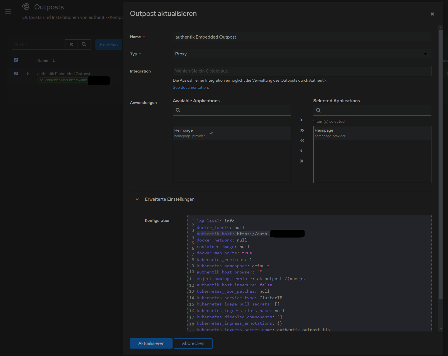
2. Proxy Provider erstellen erstellen
Applications > Provider > new Proxy Provider > Forward Auth (single application) > externer host eingeben
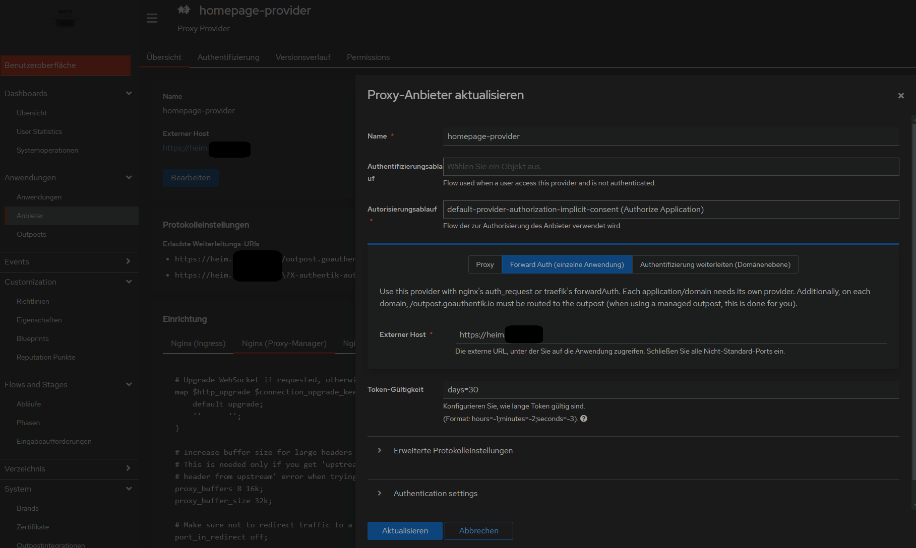
3. Anwendung mit dem erstellten Provider erstellen
...
danach weiter wie beim 500 Internal Server Error vorgehen, also NPM mit custom configuration und alle Container in gleiches Docker-Network legen:
500 Internal Server Error
Lösung auf github gepostet: https://github.com/vineethmn/geekscomments/issues/1#issuecomment-2436487499
#### TLDR:
- add NPM and Authentik to the same docker network
- use the Authentik server dockercontainer INTERNAL Port in NPM > advanced > custom config and not the one you exposed (when you chose to use for example 9006:9000 in your docker-compose.yml then redirect to 9000 anyway. I dont know why 9006 is not working)
#### LDR:
First I added the NPM and Authentik containers in the same docker network and added a hostname in my my
authentik docker-compose.yml
...
    server:

    image: ${AUTHENTIK_IMAGE:-ghcr.io/goauthentik/server}:${AUTHENTIK_TAG:-2024.6.0}
        hostname: authentik_server
        ports:

      - 9006:9000
            - 9446:9443
        networks:

      - reverseproxy_network

    volumes:
...
    postgresql:

    image: docker.io/library/postgres:16-alpine
        networks:

      - reverseproxy_network

    volumes:
...

networks:
    reverseproxy_network:

      name: reverseproxy_network

      driver: bridge
and and
npm docker-compose.yml
services:
    app:

    image: 'jc21/nginx-proxy-manager:latest'
        restart: always
        ports:

      - '80:80'
            - '81:81'

      - '443:443'
        volumes:

      - data:/data

      - letsencrypt:/etc/letsencrypt
        networks:

      - reverseproxy_network

volumes:
    data:

  letsencrypt:

networks:
    reverseproxy_network:

      name: reverseproxy_network

      driver: bridge
after that i used the NPM > Proxy Host > Advanced > Custom Nginx Configuration config by by
https://geekscircuit.com/set-up-authentik-sso-with-nginx-proxy-manager
for my homepage proxy host:
(you only need to change proxy_pass if your authentik-server hostname does not match with mine 'hostname: authentik_server')
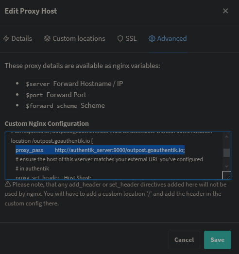
custom nginx configuration
# Increase buffer size for large headers
# This is needed only if you get 'upstream sent too big header while reading response
# header from upstream' error when trying to access an application protected by goauthentik
proxy_buffers 8 16k;
proxy_buffer_size 32k;

location / {
        # Put your proxy_pass to your application here
        proxy_pass                   $forward_scheme://$server:$port;

        # authentik-specific config
        auth_request               /outpost.goauthentik.io/auth/nginx;
        error_page                   401 = @goauthentik_proxy_signin;

    auth_request_set $auth_cookie $upstream_http_set_cookie;
        add_header Set-Cookie $auth_cookie;


    # translate headers from the outposts back to the actual upstream
        auth_request_set $authentik_username $upstream_http_x_authentik_username;

    auth_request_set $authentik_groups $upstream_http_x_authentik_groups;
        auth_request_set $authentik_email $upstream_http_x_authentik_email;

    auth_request_set $authentik_name $upstream_http_x_authentik_name;
        auth_request_set $authentik_uid $upstream_http_x_authentik_uid;


    proxy_set_header X-authentik-username $authentik_username;
        proxy_set_header X-authentik-groups $authentik_groups;

    proxy_set_header X-authentik-email $authentik_email;
        proxy_set_header X-authentik-name $authentik_name;

    proxy_set_header X-authentik-uid $authentik_uid;
}

# all requests to /outpost.goauthentik.io must be accessible without authentication
location /outpost.goauthentik.io {
        proxy_pass                   http://authentik_server:9000/outpost.goauthentik.io; # <<<< CHANGE HERE <<<<

    # ensure the host of this vserver matches your external URL you've configured
        # in authentik
        proxy_set_header       Host $host;
        proxy_set_header       X-Original-URL $scheme://$http_host$request_uri;
        add_header                   Set-Cookie $auth_cookie;
        auth_request_set       $auth_cookie $upstream_http_set_cookie;


    # required for POST requests to work
        proxy_pass_request_body off;

    proxy_set_header Content-Length "";
}

# Special location for when the /auth endpoint returns a 401,
# redirect to the /start URL which initiates SSO
location @goauthentik_proxy_signin {
        internal;

    add_header Set-Cookie $auth_cookie;

    return 302 /outpost.goauthentik.io/start?rd=$request_uri;

    # For domain level, use the below error_page to redirect to your authentik server with the full redirect path

    # return 302 https://authentik.company/outpost.goauthentik.io/start?rd=$scheme://$http_host$request_uri;
}
i also did not have to change anything on my authentik outpost:
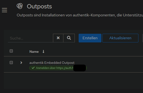
Andere mit dem gleichen Problem:
https://geekscircuit.com/set-up-authentik-sso-with-nginx-proxy-manager/
https://github.com/goauthentik/authentik/issues/10010
https://www.reddit.com/r/selfhosted/comments/vs12ug/sso_with_authentik_and_nginx_proxy_manager/?tl=de
https://www.youtube.com/watch?v=Nh1qiqCYDt4&list=PLH73rprBo7vSkDq-hAuXOoXx2es-1ExOP
Einladungen per Mail
User-Enrollment kann mit mit Flows aus dem Anhang dieses Artikels realisiert werden.
Quelle: https://www.youtube.com/watch?v=mGOTpRfulfQ
https://docs.goauthentik.io/docs/add-secure-apps/flows-stages/flow/examples/flows (Enrollment-2-Stage.yaml in Abläufe importieren)
Flows

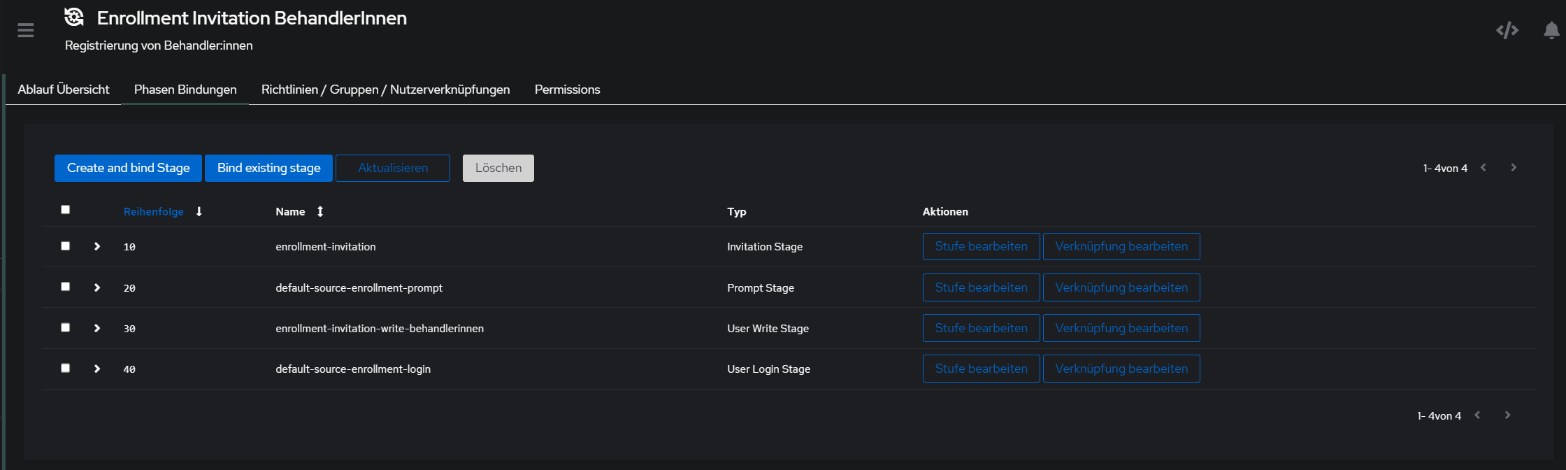
^ auf Reiehnfolge der Fields achten, damit username, Name, Email, Pw, pw nochmal richtig sortiert sind
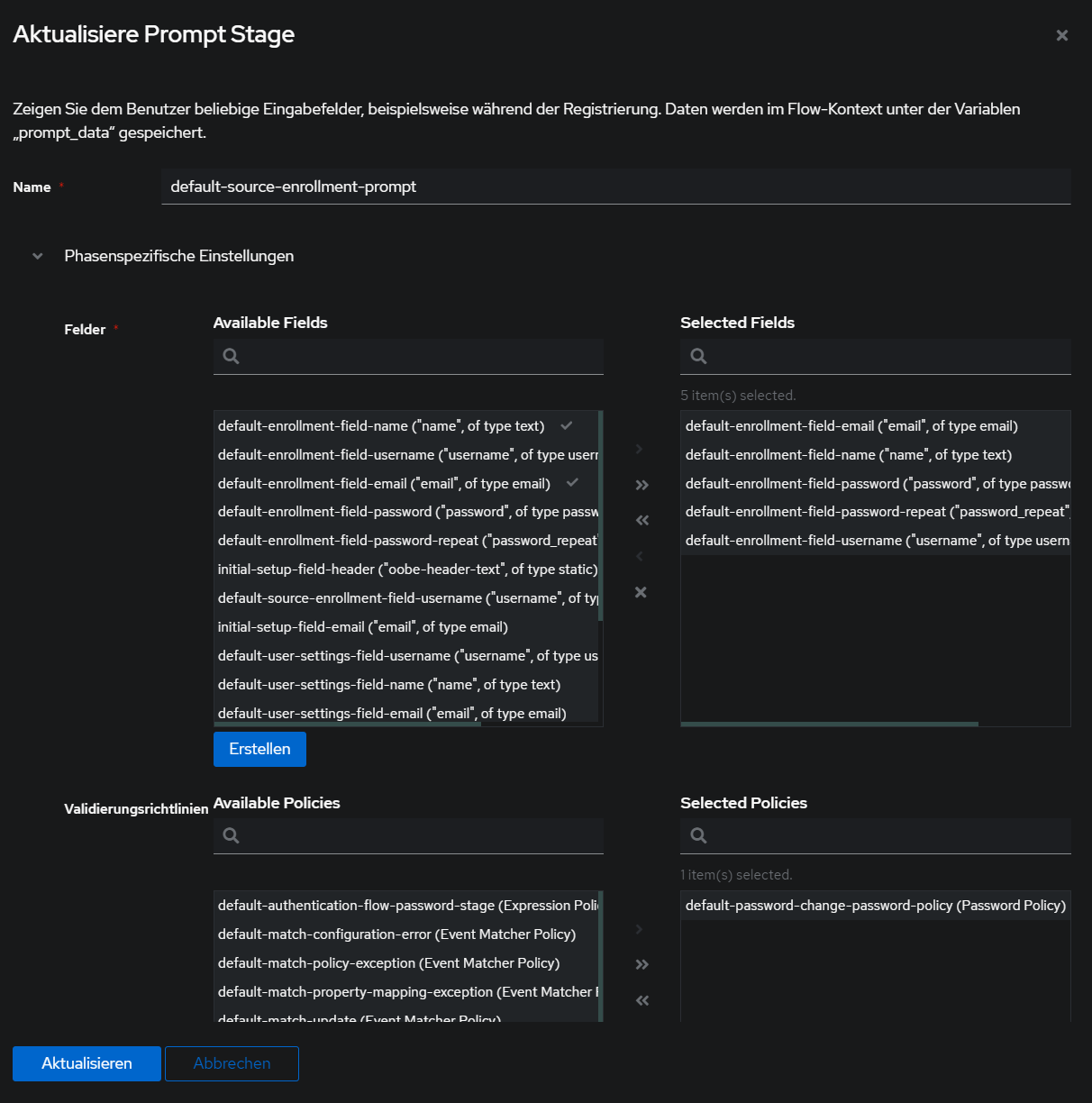
Phasen

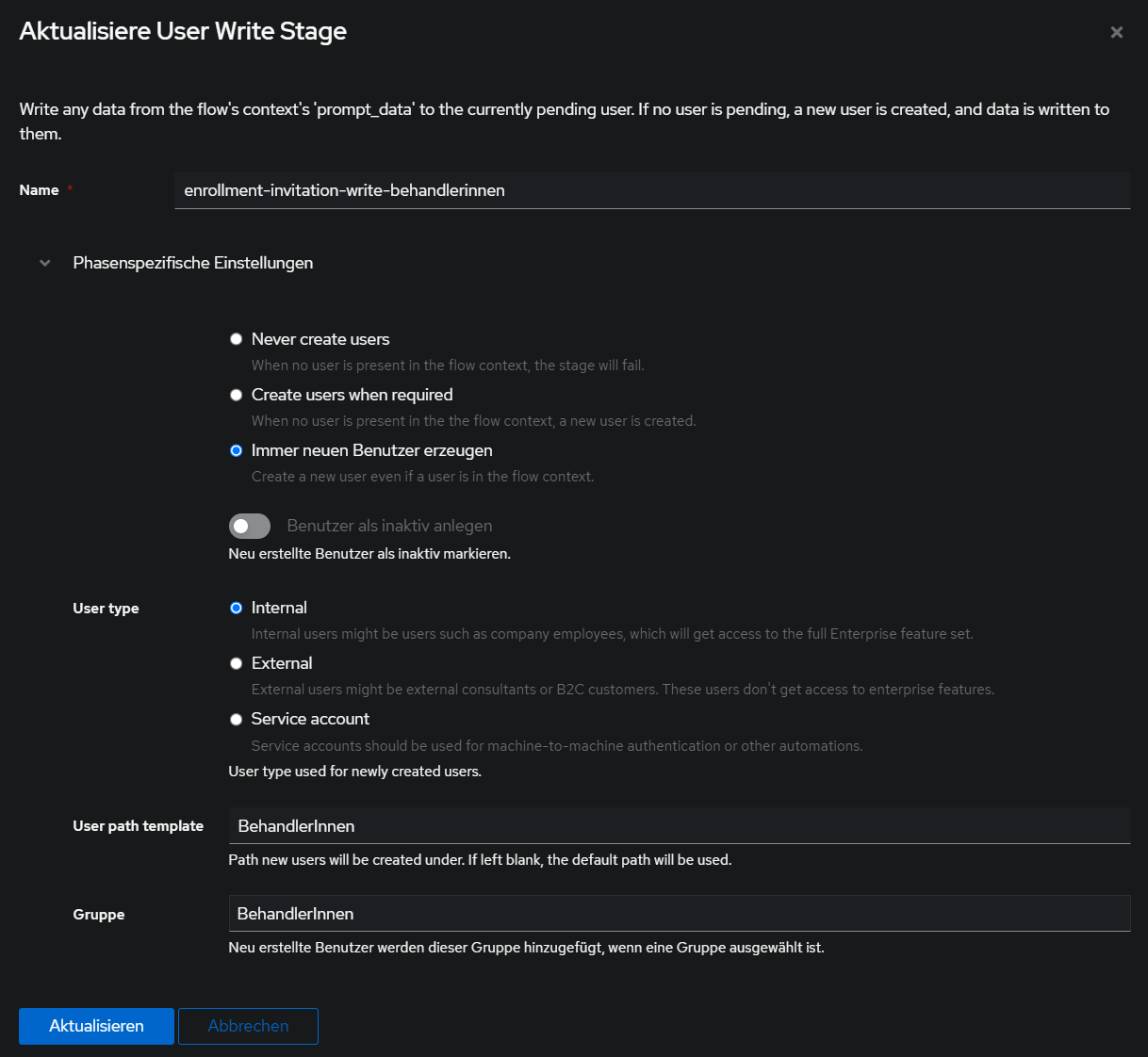
Danach auf Verzeichnis > Einladungen > Erstellen klicken und mit dem Flow einen Einladungslink erzeugen:
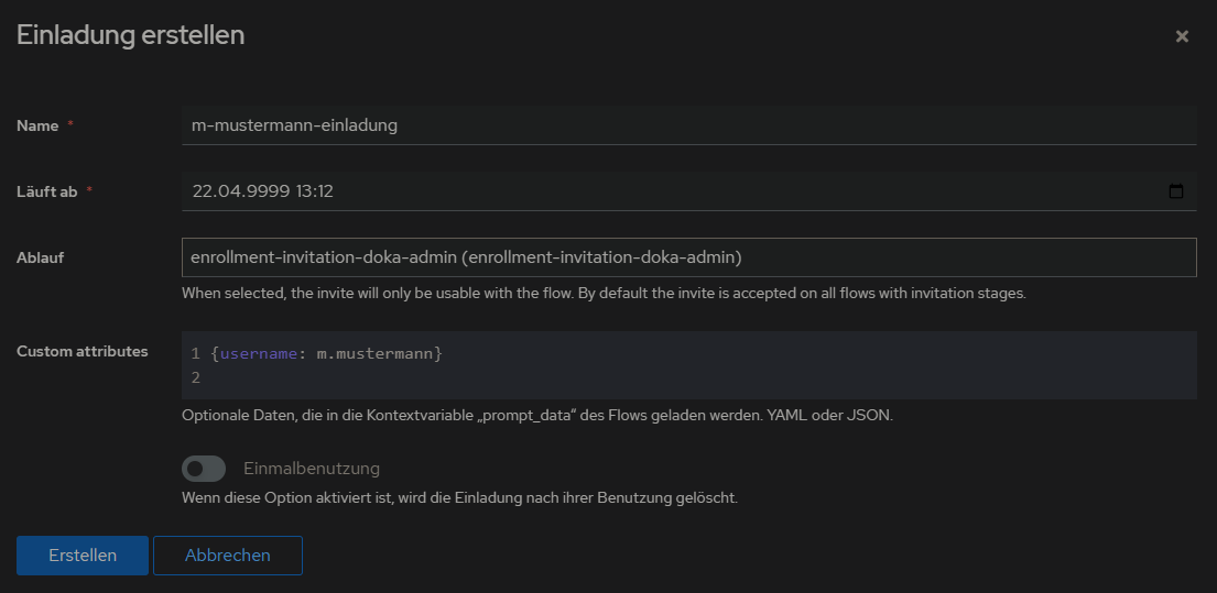
den Eintrag ausklappen, um den Link zu kopieren:
