# authentik
[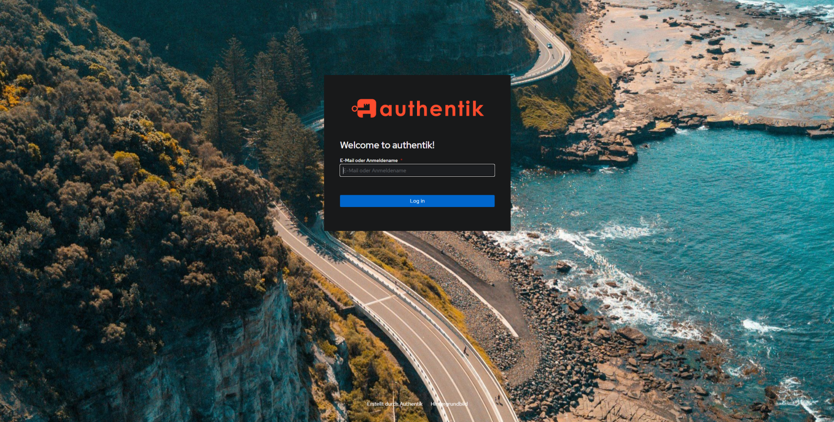](https://wiki.folkerts.it/uploads/images/gallery/2024-07/cL1image.png)
[https://docs.goauthentik.io/docs/installation/docker-compose](https://docs.goauthentik.io/docs/installation/docker-compose)
[https://www.youtube.com/watch?v=N5unsATNpJk](https://www.youtube.com/watch?v=N5unsATNpJk)
##### docker-compose.yml
wichtig:
- bei server einen hostnamen hinzufügen
- wenn möglich port 9000 belassen
- gleiches network wie der Nginx Proxy Manager Container nutzen (damit npm über den hostname auf den authentik server zugreifen kann, siehe 500 Internal Server Error weiter unten)
```yaml
---
services:
postgresql:
image: docker.io/library/postgres:16-alpine
restart: unless-stopped
healthcheck:
test: ["CMD-SHELL", "pg_isready -d $${POSTGRES_DB} -U $${POSTGRES_USER}"]
start_period: 20s
interval: 30s
retries: 5
timeout: 5s
networks:
- reverseproxy_network
volumes:
- database:/var/lib/postgresql/data
environment:
POSTGRES_PASSWORD: ${PG_PASS}
POSTGRES_USER: ${PG_USER:-authentik}
POSTGRES_DB: ${PG_DB:-authentik}
env_file:
- stack.env
redis:
image: docker.io/library/redis:alpine
command: --save 60 1 --loglevel warning
restart: unless-stopped
healthcheck:
test: ["CMD-SHELL", "redis-cli ping | grep PONG"]
start_period: 20s
interval: 30s
retries: 5
timeout: 3s
networks:
- reverseproxy_network
volumes:
- redis:/data
server:
image: ${AUTHENTIK_IMAGE:-ghcr.io/goauthentik/server}:${AUTHENTIK_TAG:-2024.6.0}
restart: unless-stopped
hostname: authentik_server
command: server
ulimits:
nofile:
soft: 10240
hard: 10240
environment:
AUTHENTIK_REDIS__HOST: redis
AUTHENTIK_POSTGRESQL__HOST: postgresql
AUTHENTIK_POSTGRESQL__USER: ${PG_USER:-authentik}
AUTHENTIK_POSTGRESQL__NAME: ${PG_DB:-authentik}
AUTHENTIK_POSTGRESQL__PASSWORD: ${PG_PASS}
networks:
- reverseproxy_network
volumes:
- media:/media
- custom-templates:/templates#
env_file:
- stack.env
ports:
- "${COMPOSE_PORT_HTTP:-9000}:9000"
- "${COMPOSE_PORT_HTTPS:-9443}:9443"
depends_on:
- postgresql
- redis
worker:
image: ${AUTHENTIK_IMAGE:-ghcr.io/goauthentik/server}:${AUTHENTIK_TAG:-2024.6.0}
restart: unless-stopped
command: worker
ulimits:
nofile:
soft: 10240
hard: 10240
environment:
AUTHENTIK_REDIS__HOST: redis
AUTHENTIK_POSTGRESQL__HOST: postgresql
AUTHENTIK_POSTGRESQL__USER: ${PG_USER:-authentik}
AUTHENTIK_POSTGRESQL__NAME: ${PG_DB:-authentik}
AUTHENTIK_POSTGRESQL__PASSWORD: ${PG_PASS}
# `user: root` and the docker socket volume are optional.
# See more for the docker socket integration here:
# https://goauthentik.io/docs/outposts/integrations/docker
# Removing `user: root` also prevents the worker from fixing the permissions
# on the mounted folders, so when removing this make sure the folders have the correct UID/GID
# (1000:1000 by default)
user: root
networks:
- reverseproxy_network
volumes:
- /var/run/docker.sock:/var/run/docker.sock
- media:/media
- certs:/certs
- custom-templates:/templates
env_file:
- stack.env
depends_on:
- postgresql
- redis
volumes:
database:
driver: local
redis:
driver: local
media:
custom-templates:
certs:
networks:
reverseproxy_network:
name: reverseproxy_network
driver: bridge
```
PG\_PASS
```bash
openssl rand 36 | base64
```
AUTHENTIK\_SECRET\_KEY
```bash
openssl rand 60 | base64
```
Portainer env via advanced mode
```
PG_PASS=2jvp8Jmnf8cS
AUTHENTIK_SECRET_KEY="hxHHNgxf5PALhfX0FL69v"
AUTHENTIK_ERROR_REPORTING__ENABLED=true
AUTHENTIK_EMAIL__HOST=smtp.world4you.com
AUTHENTIK_EMAIL__PORT=587
AUTHENTIK_EMAIL__USERNAME=MEINE....@MY-MAIL.DE
AUTHENTIK_EMAIL__PASSWORD=MEIN.....MAIL-PW
AUTHENTIK_EMAIL__FROM=NO-REPLY@MY-MAIL.DE
AUTHENTIK_EMAIL__USE_TLS=true
COMPOSE_PORT_HTTP=9006
COMPOSE_PORT_HTTPS=9446
```
[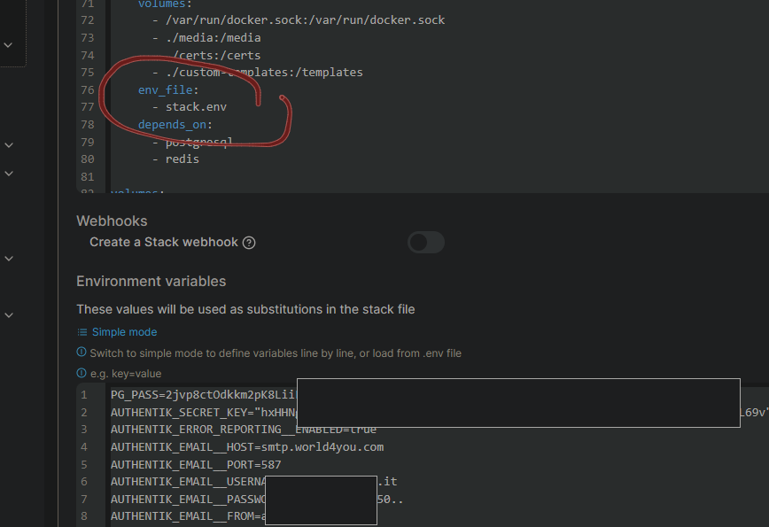](https://wiki.folkerts.it/uploads/images/gallery/2024-07/cTTimage.png)
Danach noch das Initial-Setup durchführen, um ein Passwort zu setzen:
`http://MEIN-HOSTNAME-ODER-IP:9000/if/flow/initial-setup `
`oder mit meiner cfg`
`http://MEIN-HOSTNAME-ODER-IP:9006/if/flow/initial-setup`
**Zusatzinfo**
die Zeilen
` ulimits:`
` nofile:`
` soft: 10240`
` hard: 10240`
in der docker-compose.yml habe ich eingefügt, weil ein Bug dazu führt, dass die CPU-Leistung des Docker Hosts auf 100% klettert und einige Stunden braucht, bis sie sich wieder erholt. Mehr Infos unter [https://github.com/goauthentik/authentik/pull/7762](https://github.com/goauthentik/authentik/pull/7762) und
[https://github.com/goauthentik/authentik/issues/7025](https://github.com/goauthentik/authentik/issues/7025), die Lösung stammt aus diesem Kommentar:
[https://github.com/goauthentik/authentik/issues/7025#issuecomment-1868333903](https://github.com/goauthentik/authentik/issues/7025#issuecomment-1868333903)
### Nextcloud Integration
benötigte Nextcloud App: [https://apps.nextcloud.com/apps/user\_oidc](https://apps.nextcloud.com/apps/user_oidc)
Anleitung: [https://docs.goauthentik.io/integrations/services/nextcloud/](https://docs.goauthentik.io/integrations/services/nextcloud/)
#### Zusatz:
Befehl, um nur Anmeldung über Authentik zuzulassen:
```bash
sudo -u www-data php var/www/nextcloud/occ config:app:set --value=0 user_oidc allow_multiple_user_backends
```
bzw wenn man [diesem Artikel](https://wiki.folkerts.it/books/nextcloud/page/nextcloud-befehle-cli-und-db) folgt
```bash
docker exec -it -u 33 nextcloud-app-1 /bin/bash
```
und dann
```bash
./occ config:app:set --value=0 user_oidc allow_multiple_user_backends
```
[](https://wiki.folkerts.it/uploads/images/gallery/2024-08/YGAimage.png)
Wenn man sich dann trotzdem über den Direktlogin zb als Super-Admin einloggen möchte, geht das über
[http://nextcloud.MEINEDOMAIN.de/login?direct=1](http://nextcloud.MEINEDOMAIN.de/login?direct=1)
### Branding (eigene Marke)
IMG-UPLOAD NEU SEIT 2025.4, dieser Upload ist obsolet! In neueren Versionen einfach unter Authentik Admin-Console > Anpassung > Files hochladen, bzw. unter docker volume authentik\_media und dann relativen Pfad in Branding angeben:
uploadpfad auf docker zb
/var/lib/docker/volumes/authentik\_media/\_data/public/Eikes-Upload/Wallpaper
[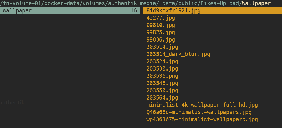](https://wiki.folkerts.it/uploads/images/gallery/2026-03/rs5image.png)
Pfad dann relativ unter Branding:
[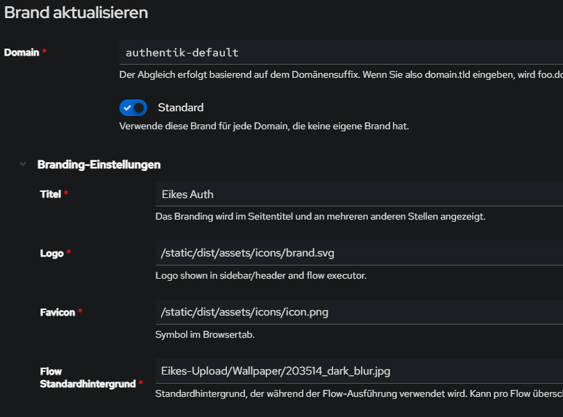](https://wiki.folkerts.it/uploads/images/gallery/2026-03/LTTimage.png)
Ab hier alte Anleitung
```
# default bg und icon:
/static/dist/assets/icons/icon_left_brand.svg
/static/dist/assets/icons/icon.png
```
[https://www.youtube.com/watch?v=YawgyM509ng](https://www.youtube.com/watch?v=YawgyM509ng)
[https://www.youtube.com/watch?v=3oIRY0NWPr8](https://www.youtube.com/watch?v=3oIRY0NWPr8)
#### Eigene Backgrounds und Icons
1\) media-volume muss in der docker-compose.yml bei server, worker und als volume vorhanden sein:
```
...
server:
image: ${AUTHENTIK_IMAGE:-ghcr.io/goauthentik/server}:${AUTHENTIK_TAG:-2024.6.1}
...
volumes:
- media:/media # <------------ HIER
- custom-templates:/templates#
env_file:
worker:
image: ${AUTHENTIK_IMAGE:-ghcr.io/goauthentik/server}:${AUTHENTIK_TAG:-2024.6.0}
...
user: root
volumes:
- /var/run/docker.sock:/var/run/docker.sock
- media:/media # <------------ HIER
- certs:/certs
- custom-templates:/templates
env_file:
...
volumes:
database:
driver: local
redis:
driver: local
media: # <------------ HIER
certs:
custom-templates:
```
2\) Bilddateien übertragen (mit WinSCP, CLI SCP oder MountainDuck, mir egal)
[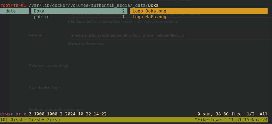](https://wiki.folkerts.it/uploads/images/gallery/2024-11/oojimage.png)
3\) Authentik > System > Brands > edit default (Stiftsymbol) > Branding-Settings > Pfade eingeben:
[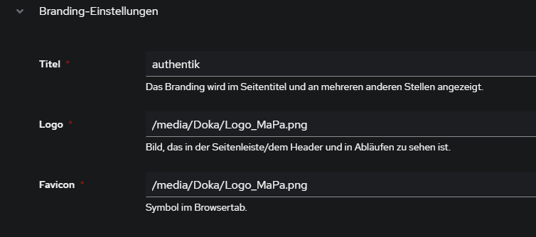](https://wiki.folkerts.it/uploads/images/gallery/2024-11/3qOimage.png)
#### Custom Icons von walkxcode
Quelle: [https://www.archy.net/cyberpunk-authentik-a-neon-glassmorphism-theme/](https://www.archy.net/cyberpunk-authentik-a-neon-glassmorphism-theme/)
App Icons via CDN:
Since Font Awesome doesn't play, grab SVGs from the awesome [dashboard-icons](https://github.com/walkxcode/dashboard-icons?ref=archy.net) project. Set them in Admin > Applications > Edit > Icon URL:
```
https://cdn.jsdelivr.net/gh/walkxcode/dashboard-icons/svg/grafana.svg
https://cdn.jsdelivr.net/gh/walkxcode/dashboard-icons/svg/gitlab.svg
https://cdn.jsdelivr.net/gh/walkxcode/dashboard-icons/svg/proxmox.svg
https://cdn.jsdelivr.net/gh/walkxcode/dashboard-icons/svg/portainer.svg
```
Browse all icons at [github.com/walkxcode/dashboard-icons](https://github.com/walkxcode/dashboard-icons/tree/main/svg?ref=archy.net).
#### Custom CSS Theme "neon"
Quellen:
[https://www.archy.net/cyberpunk-authentik-a-neon-glassmorphism-theme/](https://www.archy.net/cyberpunk-authentik-a-neon-glassmorphism-theme/)
[https://gitlab.raidho.fr/Stephane/authentik-neon](https://gitlab.raidho.fr/Stephane/authentik-neon)
custom.css
```css
@import url('https://fonts.googleapis.com/css2?family=Inter:wght@300;400;500;600&display=swap');
body { font-family: 'Inter', -apple-system, system-ui, sans-serif !important; }
.pf-c-page, .pf-v6-c-page {
background-image: url('YOUR_BACKGROUND_URL') !important;
background-size: cover !important;
background-position: center !important;
background-attachment: fixed !important;
}
.pf-c-page__main-section, .pf-v6-c-page__main-section { background: transparent !important; }
.ak-library-application {
background: linear-gradient(145deg, rgba(25,18,55,0.7), rgba(12,10,28,0.85)) !important;
backdrop-filter: blur(16px) !important;
border: 1px solid rgba(120,80,255,0.12) !important;
border-radius: 20px !important;
transition: all 0.4s cubic-bezier(0.4,0,0.2,1) !important;
box-shadow: 0 4px 24px rgba(0,0,0,0.4) !important;
position: relative !important;
}
.ak-library-application::before {
content: ''; position: absolute; top:0; left:20%; right:20%; height:1px;
background: linear-gradient(90deg, transparent, #a080ff, transparent);
opacity: 0.4; transition: all 0.4s ease;
}
.ak-library-application:hover {
border-color: rgba(120,80,255,0.4) !important;
box-shadow: 0 12px 50px rgba(120,80,255,0.12) !important;
transform: translateY(-6px) scale(1.02) !important;
}
.ak-library-application:hover::before { left:10%; right:10%; opacity:0.8; }
.pf-c-button.pf-m-primary, .pf-v6-c-button.pf-m-primary {
background: linear-gradient(135deg, #7850ff, #5030cc) !important;
border: none !important; border-radius: 10px !important;
box-shadow: 0 4px 18px rgba(120,80,255,0.35) !important;
}
.pf-c-form-control, .pf-v6-c-form-control {
background: rgba(15,12,35,0.6) !important;
border: 1px solid rgba(120,80,255,0.15) !important;
border-radius: 10px !important; color: #e8e2ff !important;
}
.pf-c-form-control:focus, .pf-v6-c-form-control:focus {
border-color: #7850ff !important;
box-shadow: 0 0 15px rgba(120,80,255,0.15) !important;
}
.pf-c-modal-box, .pf-v6-c-modal-box {
background: rgba(15,12,30,0.95) !important;
backdrop-filter: blur(30px) !important; border-radius: 20px !important;
}
.pf-c-backdrop, .pf-v6-c-backdrop {
background: rgba(0,0,0,0.6) !important; backdrop-filter: blur(4px) !important;
}
::-webkit-scrollbar { width: 5px; }
::-webkit-scrollbar-thumb { background: rgba(120,80,255,0.25); border-radius: 10px; }
::selection { background: rgba(120,80,255,0.3); color: white; }
.ak-flow-body .pf-c-login__main, .ak-flow-body .pf-v6-c-login__main {
background: rgba(12,10,25,0.75) !important;
backdrop-filter: blur(20px) !important; border-radius: 24px !important;
}
```
#### Custom CSS Theme "Glassmorphism"
Seit Version 2025.12 kann man die custom.css über das Admin-Panel editieren:
Admin-Oberfläche > System > Brands > Brand editieren > Branding-Einstellungen > Custom CSS:
[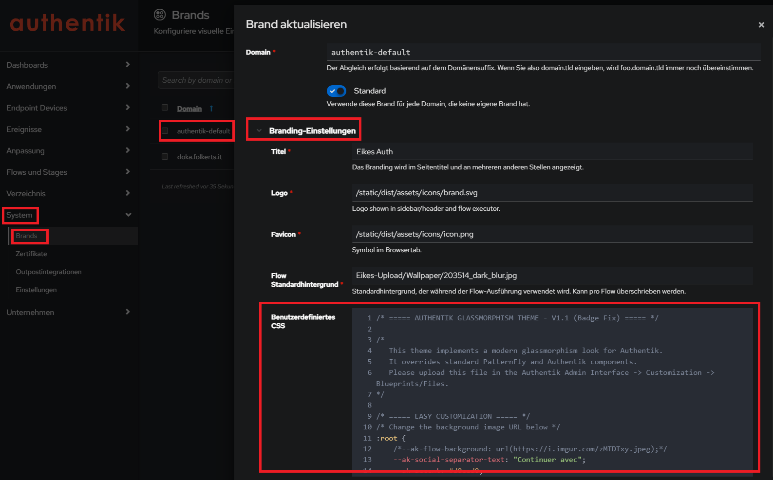](https://wiki.folkerts.it/uploads/images/gallery/2026-03/wG1image.png)
Neues glassmorphism Theme:
Quelle [https://github.com/VULGA01/Authentik-Login-theme-Glassmorphism](https://github.com/VULGA01/Authentik-Login-theme-Glassmorphism)
mit bugfixes aus issue " broken in 2025.12.0":[ https://github.com/VULGA01/Authentik-Login-theme-Glassmorphism/issues/5](https://github.com/VULGA01/Authentik-Login-theme-Glassmorphism/issues/5)
wichtiger Link, um Images direkt als URL (quasi CDN) zur Verfügung zu stellen:
[https://wiki.folkerts.it/books/docker/page/nginx-proxy-manager-npm](https://wiki.folkerts.it/books/docker/page/nginx-proxy-manager-npm)
custom.css:
```css
/* ===== AUTHENTIK GLASSMORPHISM THEME - V1.1 (Badge Fix) ===== */
/*
This theme implements a modern glassmorphism look for Authentik.
It overrides standard PatternFly and Authentik components.
Please upload this file in the Authentik Admin Interface -> Customization -> Blueprints/Files.
*/
/* ===== EASY CUSTOMIZATION ===== */
/* Change the background image URL below */
:root {
--ak-flow-background: url("https://cdn.MEINEDOMAIN.de/images/dreamy-aesthetic-color-year-tones-nature-landscape4_dark_blur.png");
--ak-social-separator-text: "Continuer avec";
--ak-accent: #d0ced0;
}
/* ===== TOTP COPY BUTTON STYLE (NEUTRAL WHITE) ===== */
:host(ak-stage-authenticator-totp) .pf-c-button.pf-m-secondary {
background: rgba(255, 255, 255, 0.1) !important;
color: white !important;
border: 1px solid rgba(255, 255, 255, 0.2) !important;
backdrop-filter: blur(10px) !important;
border-radius: 12px !important;
padding: 8px 16px !important;
display: flex !important;
align-items: center !important;
justify-content: center !important;
gap: 8px !important;
font-size: 14px !important;
font-weight: 500 !important;
box-shadow: 0 4px 6px rgba(0, 0, 0, 0.1) !important;
transition: all 0.3s ease !important;
margin-top: 5px !important;
}
:host(ak-stage-authenticator-totp) .pf-c-button.pf-m-secondary:hover {
background: rgba(255, 255, 255, 0.2) !important;
border-color: rgba(255, 255, 255, 0.4) !important;
transform: translateY(-2px) !important;
box-shadow: 0 6px 15px rgba(0, 0, 0, 0.15) !important;
}
/* Remove reflection for this specific button to avoid glitches */
:host(ak-stage-authenticator-totp) .pf-c-button.pf-m-secondary::before,
:host(ak-stage-authenticator-totp) .pf-c-button.pf-m-secondary::after {
display: none !important;
content: none !important;
}
/* Fix icon positioning (it was absolute, causing overlap) */
:host(ak-stage-authenticator-totp) .pf-c-button.pf-m-secondary .pf-c-button__progress {
position: static !important;
transform: none !important;
display: inline-flex !important;
align-items: center !important;
}
:host(ak-stage-authenticator-totp) .qr-container {
width: 100% !important;
height: auto !important;
max-width: none !important;
background: transparent !important;
box-shadow: none !important;
display: flex !important;
flex-direction: column !important;
align-items: center !important;
justify-content: center !important;
margin: 10px 0 !important;
border-radius: 0 !important;
}
:host(ak-stage-authenticator-totp) qr-code {
/* Only the QR code gets the fixed white box */
max-width: 150px !important;
width: 150px !important;
height: 150px !important;
margin: 0 0 15px 0 !important;
/* Bottom margin to push button down */
display: flex !important;
justify-content: center !important;
align-items: center !important;
border-radius: 12px !important;
box-shadow: 0 4px 12px rgba(0, 0, 0, 0.2) !important;
background: white !important;
overflow: hidden !important;
}
:host(ak-stage-authenticator-totp) qr-code svg {
width: 100% !important;
height: 100% !important;
object-fit: contain !important;
}
/* Réduire la taille du texte explicatif sur la page TOTP */
:host(ak-stage-authenticator-totp) .pf-c-form__group:not([hidden]) p,
:host(ak-stage-authenticator-totp) .pf-c-form__group:not([hidden]) li {
font-size: 13px !important;
line-height: 1.4 !important;
opacity: 0.9 !important;
margin-bottom: 8px !important;
}
/* Réduire un peu le titre du QR code container si présent */
:host(ak-stage-authenticator-totp) .pf-c-form__group label {
font-size: 14px !important;
margin-bottom: 4px !important;
}
/* ===== FORCE DARK MODE ===== */
:root {
--pf-global--palette--black-50: oklab(0.9067 -0 0) !important;
--pf-global--palette--black-100: oklab(0.8292 -0.0007 -0.0016) !important;
--pf-global--palette--black-200: oklab(0.7407 -0.0007 -0.0017) !important;
--pf-global--palette--black-300: oklab(0.6232 -0.0003 -0.0032) !important;
--pf-global--palette--black-400: oklab(0.4602 -0.0003 -0.0034) !important;
--pf-global--palette--black-500: oklab(0.3906 0.0001 -0.0052) !important;
--pf-global--palette--black-600: oklab(0.3369 0.0001 -0.0054) !important;
--pf-global--palette--black-700: oklab(0.2795 -0.0021 -0.0083) !important;
--pf-global--palette--black-800: oklab(0.2303 -0.0008 -0.0083) !important;
--pf-global--palette--black-900: oklab(0.1798 -0.0034 -0.0053) !important;
--pf-global--palette--red-9999: oklab(0.6739 0.1853 0.1022) !important;
--pf-global--palette--red-8888: oklab(0.723 0.153 0.0784) !important;
--pf-v4-global--palette--blue-300: oklab(70.367% -0.07498 -0.139) !important;
--ak-global--palette--blue-300: oklab(67.552% -0.05374 -0.16817) !important;
--pf-global--palette--blue-300: var(--pf-v4-global--palette--blue-300) !important;
--pf-global--BackgroundColor--100: oklab(0.2303 -0.0008 -0.0083) !important;
--pf-global--BackgroundColor--150: oklab(0.2585 -0.0027 -0.0066) !important;
--pf-global--BackgroundColor--200: oklab(0.1798 -0.0034 -0.0053) !important;
--pf-global--BackgroundColor--300: oklab(0.2795 -0.0021 -0.0083) !important;
--pf-global--BackgroundColor--400: oklab(0.3369 0.0001 -0.0054) !important;
--pf-global--BackgroundColor--light-100: oklab(0.2303 -0.0008 -0.0083) !important;
--pf-global--BackgroundColor--light-200: oklab(0.1798 -0.0034 -0.0053) !important;
--pf-global--BackgroundColor--light-300: oklab(0.2795 -0.0021 -0.0083) !important;
--pf-global--BackgroundColor--dark-100: oklab(0.2303 -0.0008 -0.0083) !important;
--pf-global--BackgroundColor--dark-200: oklab(0.1798 -0.0034 -0.0053) !important;
--pf-global--BackgroundColor--dark-300: oklab(0.2795 -0.0021 -0.0083) !important;
--pf-global--BackgroundColor--dark-400: oklab(0.3369 0.0001 -0.0054) !important;
--pf-global--BorderColor--100: oklab(0.3906 0.0001 -0.0052) !important;
--pf-global--BorderColor--200: oklab(0.4602 -0.0003 -0.0034) !important;
--pf-global--BorderColor--300: oklab(0.3906 0.0001 -0.0052) !important;
--pf-global--BorderColor--400: oklab(0.7407 -0.0007 -0.0017) !important;
--pf-global--Color--100: oklab(0.9067 -0 0) !important;
--pf-global--Color--200: oklab(0.7407 -0.0007 -0.0017) !important;
--pf-global--active-color--100: var(--pf-v4-global--palette--blue-300) !important;
--pf-global--primary-color--300: oklab(0.522 -0.0434 -0.1717) !important;
--pf-global--primary-color--100: var(--pf-global--primary-color--300) !important;
--pf-global--link--Color: var(--pf-v4-global--palette--blue-300) !important;
--pf-global--link--Color--hover: oklab(0.7706 -0.0485 -0.1012) !important;
--pf-global--link--Color--visited: oklab(0.7137 0.0522 -0.151) !important;
--pf-global--disabled-color--100: oklab(0.4602 -0.0003 -0.0034) !important;
--pf-global--disabled-color--200: oklab(0.3906 0.0001 -0.0052) !important;
--pf-global--disabled-color--300: oklab(0.7407 -0.0007 -0.0017) !important;
--pf-global--icon--Color--light: oklab(0.7407 -0.0007 -0.0017) !important;
--pf-global--icon--Color--dark: oklab(0.7407 -0.0007 -0.0017) !important;
--pf-global--Color--dark-100: oklab(0.9067 -0 0) !important;
--pf-global--Color--dark-200: oklab(0.7407 -0.0007 -0.0017) !important;
--pf-global--Color--light-100: oklab(0.9067 -0 0) !important;
--pf-global--Color--light-200: oklab(0.7407 -0.0007 -0.0017) !important;
--pf-global--Color--light-300: oklab(0.3659 -0.0025 -0.0061) !important;
--pf-global--BorderColor--dark-100: oklab(0.3906 0.0001 -0.0052) !important;
--pf-global--BorderColor--light-100: oklab(0.3906 0.0001 -0.0052) !important;
--pf-global--primary-color--light-100: oklab(67.552% -0.05374 -0.16817) !important;
--pf-global--primary-color--dark-100: oklab(67.552% -0.05374 -0.16817) !important;
--pf-global--link--Color--light: var(--pf-v4-global--palette--blue-300) !important;
--pf-global--link--Color--light--hover: var(--pf-global--palette--blue-200) !important;
--pf-global--link--Color--dark: var(--pf-v4-global--palette--blue-300) !important;
--pf-global--link--Color--dark--hover: var(--pf-global--palette--blue-200) !important;
--pf-global--default-color--100: var(--pf-global--palette--cyan-100) !important;
--pf-global--default-color--300: var(--pf-global--palette--cyan-200) !important;
--pf-global--info-color--100: var(--pf-global--palette--blue-200) !important;
--pf-global--info-color--200: var(--pf-global--palette--blue-50) !important;
--pf-global--warning-color--100: oklab(0.7864 0.0298 0.1604) !important;
--pf-global--warning-color--200: oklab(0.8354 0.0112 0.1471) !important;
--pf-global--danger-color--100: var(--pf-global--palette--red-100) !important;
--pf-global--danger-color--200: var(--pf-global--palette--red-50) !important;
--pf-global--success-color--100: oklab(0.6488 -0.1066 0.0846) !important;
--pf-global--success-color--200: var(--pf-global--palette--green-50) !important;
/* Force browser to render standard controls in dark mode */
color-scheme: dark !important;
}
/* Ensure these variables are sticky even if the browser prefers light mode */
@media (prefers-color-scheme: light) {
:root {
--pf-global--BackgroundColor--100: oklab(0.2303 -0.0008 -0.0083) !important;
--pf-global--BackgroundColor--light-100: oklab(0.2303 -0.0008 -0.0083) !important;
--pf-global--Color--100: oklab(0.9067 -0 0) !important;
--pf-global--Color--light-100: oklab(0.9067 -0 0) !important;
--pf-global--Color--dark-100: oklab(0.9067 -0 0) !important;
/* Re-apply the full block if necessary, but usually overrides are enough */
}
}
/* ===== BOUTONS OUI/NON & ACTIONS ===== */
/* Container buttons */
.pf-c-login .pf-c-form__actions,
.pf-c-login .pf-c-form__group-control,
body:has(.pf-c-login) .pf-c-form__actions,
body:has(.pf-c-login) .pf-c-form__group-control {
display: flex !important;
gap: 15px !important;
margin-top: 25px !important;
justify-content: space-between !important;
overflow: visible !important;
padding: 5px !important;
}
/* Base button styles */
.pf-c-login .pf-c-form__actions button,
.pf-c-login .pf-c-form__group-control button,
body:has(.pf-c-login) .pf-c-form__actions button,
body:has(.pf-c-login) .pf-c-form__group-control button,
.pf-c-login button[type="button"],
body:has(.pf-c-login) button[type="button"],
:host(ak-stage-user-login) button[type="submit"] {
border-radius: 14px !important;
padding: 10px 20px !important;
font-weight: 600 !important;
font-size: 15px !important;
transition: all 0.3s cubic-bezier(0.25, 0.46, 0.45, 0.94) !important;
text-transform: none !important;
border: none !important;
backdrop-filter: blur(20px) saturate(130%) !important;
-webkit-backdrop-filter: blur(20px) saturate(130%) !important;
position: relative !important;
overflow: hidden !important;
box-sizing: border-box !important;
min-width: 120px !important;
cursor: pointer !important;
outline: none !important;
}
/* ========================================= */
/* LOGIN BUTTON - FORCE WHITE GLASSMORPHISM */
/* ========================================= */
/* Force white for identification login button */
.pf-c-login .pf-c-form__actions button:first-child,
.pf-c-login .pf-c-form__group-control button:first-child,
body:has(.pf-c-login) .pf-c-form__actions button:first-child,
body:has(.pf-c-login) .pf-c-form__group-control button:first-child,
.pf-c-login button[type="button"]:first-of-type,
body:has(.pf-c-login) button[type="button"]:first-of-type,
:host(ak-stage-identification) .pf-c-button.pf-m-primary,
:host(ak-stage-identification) button[type="submit"].pf-c-button.pf-m-primary {
background: rgba(255, 255, 255, 0.15) !important;
backdrop-filter: blur(10px) !important;
-webkit-backdrop-filter: blur(10px) !important;
border: 1px solid rgba(255, 255, 255, 0.3) !important;
color: white !important;
font-weight: 600 !important;
padding: 14px 24px !important;
border-radius: 14px !important;
transition: all 0.3s ease !important;
box-shadow: 0 6px 20px rgba(0, 0, 0, 0.15), 0 2px 8px rgba(255, 255, 255, 0.1) !important;
}
:host(ak-stage-identification) .pf-c-button.pf-m-primary:hover,
:host(ak-stage-identification) button[type="submit"].pf-c-button.pf-m-primary:hover {
background: rgba(255, 255, 255, 0.25) !important;
border-color: rgba(255, 255, 255, 0.4) !important;
transform: translateY(-2px) !important;
box-shadow: 0 10px 30px rgba(0, 0, 0, 0.2), 0 4px 12px rgba(255, 255, 255, 0.15) !important;
}
/* ========================================= */
/* STAY CONNECTED BUTTONS (USER LOGIN STAGE) */
/* ========================================= */
/* Neutralize 'Yes' and 'No' buttons to Standard Glass Style */
:host(ak-stage-user-login) .pf-c-button.pf-m-primary,
:host(ak-stage-user-login) .pf-c-button.pf-m-secondary {
background: rgba(255, 255, 255, 0.08) !important;
backdrop-filter: blur(10px) !important;
-webkit-backdrop-filter: blur(10px) !important;
border: 1px solid rgba(255, 255, 255, 0.2) !important;
color: white !important;
font-weight: 500 !important;
padding: 10px 24px !important;
border-radius: 14px !important;
transition: all 0.3s ease !important;
box-shadow: 0 4px 6px rgba(0, 0, 0, 0.1) !important;
margin: 0 !important;
/* Reset margins if inherited */
}
:host(ak-stage-user-login) .pf-c-button.pf-m-primary:hover,
:host(ak-stage-user-login) .pf-c-button.pf-m-secondary:hover {
background: rgba(255, 255, 255, 0.2) !important;
transform: translateY(-2px) !important;
box-shadow: 0 8px 15px rgba(0, 0, 0, 0.2) !important;
border-color: rgba(255, 255, 255, 0.4) !important;
}
/* Remove colored pseudo-elements/reflections for Stay Connected */
:host(ak-stage-user-login) .pf-c-button.pf-m-primary::before,
:host(ak-stage-user-login) .pf-c-button.pf-m-secondary::before {
display: none !important;
content: none !important;
}
/* ========================================= */
/* SHARED ANIMATIONS & FIXES */
/* ========================================= */
/* Reflection effect for Login Button ONLY */
:host(ak-stage-identification) .pf-c-button.pf-m-primary::before {
content: '';
position: absolute;
top: 0;
left: -100%;
width: 100%;
height: 100%;
background: linear-gradient(90deg,
transparent 0%,
rgba(255, 255, 255, 0.2) 50%,
transparent 100%);
transition: left 0.6s ease;
z-index: 1;
border-radius: 14px;
}
:host(ak-stage-identification) .pf-c-button.pf-m-primary:hover::before {
left: 100%;
}
/* Z-index fix for text */
:host(ak-stage-user-login) .pf-c-button.pf-m-primary *,
:host(ak-stage-user-login) .pf-c-button.pf-m-secondary *,
:host(ak-stage-identification) .pf-c-button.pf-m-primary *,
:host(ak-stage-identification) .pf-c-button.pf-m-secondary * {
position: relative !important;
z-index: 2 !important;
}
:host(ak-stage-user-login) .pf-c-button.pf-m-primary::after,
:host(ak-stage-user-login) .pf-c-button.pf-m-secondary::after,
:host(ak-stage-identification) .pf-c-button.pf-m-primary::after,
:host(ak-stage-identification) .pf-c-button.pf-m-secondary::after {
border: none !important;
display: none !important;
}
:host(ak-stage-user-login) .pf-c-button:focus,
:host(ak-stage-user-login) .pf-c-button:active,
:host(ak-stage-identification) .pf-c-button:focus,
:host(ak-stage-identification) .pf-c-button:active {
outline: none !important;
}
/* Button 'No' / Secondary */
:host(ak-stage-user-login) .pf-c-button.pf-m-secondary,
:host(ak-stage-identification) .pf-c-button.pf-m-secondary {
background: rgba(220, 53, 69, 0.15) !important;
color: rgba(255, 255, 255, 0.9) !important;
border: 1.5px solid rgba(220, 53, 69, 0.3) !important;
box-shadow:
0 4px 15px rgba(220, 53, 69, 0.1),
0 2px 8px rgba(0, 0, 0, 0.1),
inset 0 1px 0 rgba(255, 255, 255, 0.1) !important;
}
/* Reflection effect 'No' */
:host(ak-stage-user-login) .pf-c-button.pf-m-secondary::before,
:host(ak-stage-identification) .pf-c-button.pf-m-secondary::before {
content: '';
position: absolute;
top: 0;
left: -100%;
width: 100%;
height: 100%;
background: linear-gradient(90deg,
transparent 0%,
rgba(255, 255, 255, 0.15) 50%,
transparent 100%);
transition: left 0.6s ease;
z-index: 1;
border-radius: 14px;
}
:host(ak-stage-user-login) .pf-c-button.pf-m-secondary:hover::before,
:host(ak-stage-identification) .pf-c-button.pf-m-secondary:hover::before {
left: 100%;
}
:host(ak-stage-user-login) .pf-c-button.pf-m-secondary:hover,
:host(ak-stage-identification) .pf-c-button.pf-m-secondary:hover {
background: rgba(220, 53, 69, 0.25) !important;
border-color: rgba(220, 53, 69, 0.45) !important;
color: white !important;
transform: translateY(-1px) !important;
box-shadow:
0 8px 25px rgba(220, 53, 69, 0.2),
0 4px 12px rgba(0, 0, 0, 0.15),
inset 0 1px 0 rgba(255, 255, 255, 0.15) !important;
}
/* Z-index fix for text */
:host(ak-stage-user-login) .pf-c-button.pf-m-primary *,
:host(ak-stage-user-login) .pf-c-button.pf-m-secondary *,
:host(ak-stage-identification) .pf-c-button.pf-m-primary *,
:host(ak-stage-identification) .pf-c-button.pf-m-secondary * {
position: relative !important;
z-index: 2 !important;
}
/* ========================================= */
/* SOCIAL LOGIN BUTTONS (GLASSMORPHISM) */
/* ========================================= */
/* Base style for all social login buttons */
:host(ak-stage-identification) .source-button {
background: rgba(255, 255, 255, 0.08) !important;
border: 1px solid rgba(255, 255, 255, 0.2) !important;
color: white !important;
border-radius: 12px !important;
padding: 10px 20px !important;
transition: all 0.3s ease !important;
display: flex !important;
align-items: center !important;
justify-content: center !important;
text-decoration: none !important;
box-shadow: 0 4px 6px rgba(0, 0, 0, 0.1) !important;
position: relative !important;
font-weight: 600 !important;
font-size: 15px !important;
gap: 8px !important;
backdrop-filter: blur(10px) !important;
-webkit-backdrop-filter: blur(10px) !important;
overflow: hidden !important;
}
:host(ak-stage-identification) .source-button:hover {
background: rgba(255, 255, 255, 0.2) !important;
transform: translateY(-2px) scale(1.02) !important;
box-shadow: 0 8px 15px rgba(0, 0, 0, 0.2) !important;
border-color: rgba(255, 255, 255, 0.4) !important;
}
/* Discord-specific branding */
:host(ak-stage-identification) button[name*="discord"].source-button {
background: rgba(88, 101, 242, 0.25) !important;
border-color: rgba(88, 101, 242, 0.4) !important;
box-shadow:
0 4px 12px rgba(88, 101, 242, 0.2),
inset 0 1px 0 rgba(255, 255, 255, 0.1) !important;
}
:host(ak-stage-identification) button[name*="discord"].source-button:hover {
background: rgba(88, 101, 242, 0.35) !important;
border-color: rgba(88, 101, 242, 0.6) !important;
box-shadow:
0 8px 20px rgba(88, 101, 242, 0.35),
0 0 0 2px rgba(88, 101, 242, 0.2),
inset 0 1px 0 rgba(255, 255, 255, 0.15) !important;
}
/* Shine effect on hover for all social buttons */
:host(ak-stage-identification) .source-button:hover::before {
content: "";
position: absolute;
top: 0;
left: -70%;
width: 55%;
height: 100%;
background: linear-gradient(120deg, transparent 0%, rgba(255, 255, 255, 0.5) 60%, transparent 100%);
transform: skewX(-25deg);
animation: socialShine 0.65s linear 1;
pointer-events: none;
}
@keyframes socialShine {
100% {
left: 130%;
}
}
/* Icon styling within social buttons */
:host(ak-stage-identification) .source-button img,
:host(ak-stage-identification) .source-button span.pf-c-button__icon {
width: 18px !important;
height: 18px !important;
flex-shrink: 0;
}
/* Make Discord icon white */
:host(ak-stage-identification) button[name*="discord"].source-button img {
filter: brightness(0) invert(1);
}
/* Google-specific branding */
:host(ak-stage-identification) button[name*="google"].source-button {
background: rgba(66, 133, 244, 0.25) !important;
border-color: rgba(66, 133, 244, 0.4) !important;
}
:host(ak-stage-identification) button[name*="google"].source-button:hover {
background: rgba(66, 133, 244, 0.35) !important;
border-color: rgba(66, 133, 244, 0.6) !important;
box-shadow:
0 8px 20px rgba(66, 133, 244, 0.35),
0 0 0 2px rgba(66, 133, 244, 0.2) !important;
}
:host(ak-stage-user-login) .pf-c-button.pf-m-primary::after,
:host(ak-stage-user-login) .pf-c-button.pf-m-secondary::after {
border: none !important;
display: none !important;
}
:host(ak-stage-user-login) .pf-c-button:focus,
:host(ak-stage-user-login) .pf-c-button:active {
outline: none !important;
}
/* Responsive */
@media (max-width: 768px) {
.pf-c-login .pf-c-form__actions,
body:has(.pf-c-login) .pf-c-form__actions {
flex-direction: column !important;
gap: 12px !important;
}
:host(ak-stage-user-login) .pf-c-button.pf-m-primary,
:host(ak-stage-user-login) .pf-c-button.pf-m-secondary {
width: 100% !important;
min-width: auto !important;
padding: 14px 28px !important;
}
}
/* ===== RADIO & CHECKBOX (REMEMBER ME) ===== */
.pf-c-login .pf-c-check,
.pf-c-login .pf-c-switch,
body:has(.pf-c-login) .pf-c-check,
body:has(.pf-c-login) .pf-c-switch {
margin: 20px 0 !important;
display: flex !important;
align-items: center !important;
gap: 6px !important;
}
.pf-c-login .pf-c-check__input,
.pf-c-login .pf-c-switch__input,
.pf-c-login input[type="checkbox"],
body:has(.pf-c-login) .pf-c-check__input,
body:has(.pf-c-login) .pf-c-switch__input,
body:has(.pf-c-login) input[type="checkbox"],
input[id*="authentik-remember-me"],
input[name*="remember"] {
appearance: none !important;
-webkit-appearance: none !important;
width: 16px !important;
height: 16px !important;
background: rgba(255, 255, 255, 0.08) !important;
border: 2px solid rgba(255, 255, 255, 0.3) !important;
border-radius: 5px !important;
margin-right: 8px !important;
position: relative !important;
vertical-align: middle !important;
transition: all 0.3s cubic-bezier(0.25, 0.46, 0.45, 0.94) !important;
backdrop-filter: blur(20px) !important;
-webkit-backdrop-filter: blur(20px) !important;
box-shadow:
0 4px 15px rgba(0, 0, 0, 0.15),
inset 0 1px 0 rgba(255, 255, 255, 0.1) !important;
cursor: pointer !important;
}
.pf-c-login .pf-c-check__input:checked,
.pf-c-login .pf-c-switch__input:checked,
.pf-c-login input[type="checkbox"]:checked,
body:has(.pf-c-login) .pf-c-check__input:checked,
body:has(.pf-c-login) .pf-c-switch__input:checked,
body:has(.pf-c-login) input[type="checkbox"]:checked,
input[id*="authentik-remember-me"]:checked,
input[name*="remember"]:checked {
background: rgba(102, 126, 234, 0.7) !important;
border-color: rgba(102, 126, 234, 0.8) !important;
box-shadow:
0 0 0 2px rgba(102, 126, 234, 0.2),
0 6px 20px rgba(102, 126, 234, 0.3),
inset 0 1px 0 rgba(255, 255, 255, 0.2) !important;
}
.pf-c-login .pf-c-check__input:checked::after,
.pf-c-login .pf-c-switch__input:checked::after,
.pf-c-login input[type="checkbox"]:checked::after,
body:has(.pf-c-login) .pf-c-check__input:checked::after,
body:has(.pf-c-login) .pf-c-switch__input:checked::after,
body:has(.pf-c-login) input[type="checkbox"]:checked::after,
input[id*="authentik-remember-me"]:checked::after,
input[name*="remember"]:checked::after {
content: '✓' !important;
position: absolute !important;
left: 50% !important;
top: 50% !important;
transform: translate(-50%, -50%) !important;
color: white !important;
font-size: 10px !important;
font-weight: bold !important;
text-shadow: 0 1px 2px rgba(0, 0, 0, 0.5) !important;
}
.pf-c-login .pf-c-check__label,
.pf-c-login .pf-c-switch__label {
color: rgba(255, 255, 255, 0.9) !important;
font-weight: 400 !important;
font-size: 14px !important;
text-shadow: 0 1px 3px rgba(0, 0, 0, 0.3) !important;
}
/* ===== HIDE 'Powered by authentik' ===== */
/* If text is in a span */
span:contains("Propulsé par"),
span:contains("Powered by") {
display: none !important;
visibility: hidden !important;
font-size: 0 !important;
line-height: 0 !important;
}
/* If it's in a list in footer */
.pf-c-login__footer .pf-c-list.pf-m-inline,
ul.pf-c-list.pf-m-inline li span:contains("authentik") {
display: none !important;
visibility: hidden !important;
}
/* Fallback selector: hide all brand links elements */
ak-brand-links,
.pf-c-login__footer .pf-c-login__footer .pf-c-list li:last-child,
*[data-ouia-component-type="PF4/Footer"],
ul.pf-c-list.pf-m-inline,
.pf-c-list.pf-m-inline {
display: none !important;
visibility: hidden !important;
}
/* ===== LOGIN PAGE MODERN DESIGN ===== */
/* Page Background */
.pf-c-login .pf-c-page,
body:has(.pf-c-login) .pf-c-page {
/* Fixed background workaround for iOS */
position: relative !important;
min-height: 100vh !important;
min-height: 100dvh !important;
z-index: 0 !important;
}
.pf-c-login .pf-c-page::before,
body:has(.pf-c-login) .pf-c-page::before,
body::before {
content: "" !important;
position: fixed !important;
top: 0 !important;
left: 0 !important;
width: 100% !important;
height: 100% !important;
background-image: var(--ak-flow-background) !important;
background-size: cover !important;
background-position: center !important;
background-repeat: no-repeat !important;
z-index: -1 !important;
pointer-events: none !important;
}
/* Login page wrapper */
.pf-c-login,
body:has(.pf-c-login) {
position: relative !important;
min-height: 100vh !important;
/* SAFEST CENTER ALIGNMENT */
display: flex !important;
flex-direction: column !important;
align-items: center !important;
/* justify-content: center REMOVED: prevents top clipping */
overflow-y: auto !important;
padding: 20px !important;
}
/* Login Container with Glass effect */
.pf-c-login .pf-c-login__container,
ak-flow-executor.pf-c-login {
background:
rgba(255, 255, 255, 0.03),
url("data:image/svg+xml,%3Csvg viewBox='0 0 400 400' xmlns='http://www.w3.org/2000/svg'%3E%3Cfilter id='noiseFilter'%3E%3CfeTurbulence type='fractalNoise' baseFrequency='0.85' numOctaves='4' stitchTiles='stitch'/%3E%3C/filter%3E%3Crect width='100%25' height='100%25' filter='url(%23noiseFilter)' opacity='0.1'/%3E%3C/svg%3E") !important;
backdrop-filter: blur(40px) !important;
-webkit-backdrop-filter: blur(40px) !important;
border: 1px solid rgba(255, 255, 255, 0.1) !important;
border-radius: 24px !important;
box-shadow:
0 8px 32px rgba(0, 0, 0, 0.15),
inset 0 1px 0 rgba(255, 255, 255, 0.1) !important;
padding: 40px !important;
/* Reduced padding */
/* Desktop default: 450px min-width */
min-width: 450px !important;
/* Combined with max-width for responsiveness */
width: 100% !important;
max-width: 700px !important;
transition: all 0.3s ease !important;
position: relative !important;
/* THE MAGICAL FIX: Safe Centering */
margin: auto !important;
/* STRICT SIZING: Prevent stretching */
height: auto !important;
flex-grow: 0 !important;
flex-shrink: 0 !important;
flex-basis: auto !important;
max-height: none !important;
overflow: visible !important;
display: flex !important;
flex-direction: column !important;
justify-content: center !important;
/* NUCLEAR SAFEGUARD */
align-self: center !important;
justify-self: center !important;
}
/* ===== SHADOW DOM LAYOUT FIXES (v2025.12+) ===== */
/* Fix 1: Remove BOTH ::before and ::after spacers that cause vertical gap */
.pf-c-login::before,
.pf-c-login::after,
ak-flow-executor.pf-c-login::before,
ak-flow-executor.pf-c-login::after,
body:has(.pf-c-login) .pf-c-login::before,
body:has(.pf-c-login) .pf-c-login::after {
display: none !important;
content: none !important;
height: 0 !important;
}
/* Fix 2: Remove double card effect - strip glassmorphism from outer container */
ak-flow-executor.pf-c-login {
background: transparent !important;
backdrop-filter: none !important;
-webkit-backdrop-filter: none !important;
border: none !important;
box-shadow: none !important;
padding: 0 !important;
min-height: 100vh !important;
margin: 0 !important;
/* Fix grid layout for perfect centering */
display: grid !important;
align-content: center !important;
justify-items: center !important;
grid-template-rows: auto !important;
gap: 20px !important;
}
/* Fix 3: Ensure body centers content without overflow */
body:has(.pf-c-login) {
display: flex !important;
align-items: center !important;
justify-content: center !important;
overflow-y: auto !important;
min-height: 100vh !important;
}
/* Login Content */
.pf-c-login .pf-c-login__main,
ak-flow-executor::part(main) {
box-sizing: border-box;
background: transparent !important;
backdrop-filter: blur(20px) !important;
-webkit-backdrop-filter: blur(20px) !important;
border: 1px solid rgba(255, 255, 255, 0.08) !important;
border-radius: 66px !important;
box-shadow: rgba(0, 0, 0, 0.1) 0px 4px 16px, rgba(255, 255, 255, 0.05) 0px 1px 0px inset !important;
padding: 45px !important;
position: relative !important;
z-index: 10 !important;
/* NUCLEAR SIZING on the ACTUAL BOX */
height: fit-content !important;
min-height: 0 !important;
flex-grow: 0 !important;
/* Allow box to grow with content */
overflow-y: visible !important;
min-width: auto !important;
max-height: none !important;
width: 100% !important;
/* iOS Fix: width 100% instead of 54vh */
max-width: 570px !important;
/* iOS Fix: max-width px instead of vh */
margin: auto !important;
height: fit-content !important;
/* Ensure it shrinks to content */
}
/* Hide empty social links container to prevent spacing issues */
.pf-c-login__main-footer-links:empty,
ak-brand-links:empty {
display: none !important;
margin: 0 !important;
padding: 0 !important;
}
/* Agrandissement exceptionnel pour le stage TOTP */
.pf-c-login .pf-c-login__main:has(ak-stage-authenticator-totp),
body:has(.pf-c-login) .pf-c-login__main:has(ak-stage-authenticator-totp) {
max-height: 90vh !important;
max-width: 600px !important;
width: auto !important;
padding-top: 30px !important;
padding-bottom: 30px !important;
}
/* Overlay de chargement avec le même arrondi */
ak-loading-overlay {
border-radius: 66px !important;
overflow: hidden !important;
}
/* Force White Text in Login Container - Shadow DOM Compatible */
:host(ak-flow-executor) .pf-c-title,
:host(ak-flow-executor) h1,
:host(ak-flow-executor) h2,
:host(ak-flow-executor) h3,
:host(ak-flow-executor) p,
:host(ak-flow-executor) span,
:host(ak-flow-executor) div,
:host(ak-flow-executor) label,
:host(ak-flow-executor) .pf-c-form__label,
:host(ak-stage-identification) label,
:host(ak-stage-password) label,
:host(ak-stage-identification) .pf-c-title,
:host(ak-stage-password) .pf-c-title,
:host(ak-stage-consent) .pf-c-title,
:host(ak-stage-authenticator-validate) .pf-c-title,
:host(ak-stage-authenticator-validate) label,
:host(ak-stage-authenticator-validate-code) .pf-c-title,
:host(ak-stage-authenticator-validate-code) label,
:host(ak-stage-authenticator-validate-duo) .pf-c-title,
:host(ak-stage-authenticator-validate-duo) label,
:host(ak-user-settings) .pf-c-title,
:host(ak-user-settings) label,
:host(ak-user-settings) .pf-c-card__title,
:host(ak-user-settings-flow-executor) .pf-c-card__title,
:host(ak-user-settings-password) .pf-c-card__title,
:host(ak-form-element-horizontal) label,
:host(ak-form-element-horizontal) .pf-c-form__label,
:host(ak-user-stage-prompt) label,
:host(ak-user-stage-prompt) .pf-c-title,
:host(ak-stage-prompt) label,
:host(ak-stage-prompt) .pf-c-title {
color: white !important;
text-shadow: 0 1px 2px rgba(0, 0, 0, 0.5) !important;
}
/* Links in Login */
.pf-c-login a {
color: rgba(255, 255, 255, 0.9) !important;
text-decoration: none !important;
transition: all 0.2s ease !important;
}
.pf-c-login a:hover {
color: white !important;
text-shadow: 0 0 8px rgba(255, 255, 255, 0.6) !important;
text-decoration: underline !important;
}
/* Form Inputs - Shadow DOM targeted */
:host(ak-stage-identification) .pf-c-form-control,
:host(ak-stage-password) .pf-c-form-control,
:host(ak-flow-executor) .pf-c-form-control,
:host(ak-stage-identification) input:not([type="checkbox"]),
:host(ak-stage-password) input:not([type="checkbox"]),
:host(ak-stage-authenticator-validate) .pf-c-form-control,
:host(ak-stage-authenticator-validate) input:not([type="checkbox"]),
:host(ak-stage-authenticator-validate-code) .pf-c-form-control,
:host(ak-stage-authenticator-validate-code) input:not([type="checkbox"]),
:host(ak-stage-authenticator-totp) .pf-c-form-control,
:host(ak-stage-authenticator-totp) input:not([type="checkbox"]),
:host(ak-user-settings) .pf-c-form-control,
:host(ak-user-settings-flow-executor) .pf-c-form-control,
:host(ak-user-settings-password) .pf-c-form-control,
:host(ak-form-element-horizontal) .pf-c-form-control,
:host(ak-form-element-horizontal) input,
:host(ak-form-element-horizontal) select,
:host(ak-user-stage-prompt) .pf-c-form-control,
:host(ak-user-stage-prompt) input,
:host(ak-user-stage-prompt) select,
:host(ak-stage-prompt) .pf-c-form-control,
:host(ak-stage-prompt) input,
:host(ak-stage-prompt) select {
background-color: rgba(255, 255, 255, 0.06) !important;
border: 1.5px solid rgba(255, 255, 255, 0.2) !important;
border-radius: 14px !important;
padding: 10px 15px !important;
font-size: 16px !important;
color: white !important;
height: auto !important;
min-height: 40px !important;
transition: all 0.3s cubic-bezier(0.4, 0, 0.2, 1) !important;
backdrop-filter: blur(20px) saturate(130%) !important;
-webkit-backdrop-filter: blur(20px) saturate(130%) !important;
box-shadow: 0 4px 15px rgba(0, 0, 0, 0.2), inset 0 1px 0 rgba(255, 255, 255, 0.08) !important;
}
/* Ensure dropdown options are readable and select text is visible */
:host(ak-form-element-horizontal) select,
:host(ak-user-stage-prompt) select,
:host(ak-stage-prompt) select {
color: white !important;
background-color: rgba(255, 255, 255, 0.1) !important;
}
:host(ak-form-element-horizontal) select option,
:host(ak-user-stage-prompt) select option,
:host(ak-stage-prompt) select option {
background-color: #1f1f1f !important;
color: white !important;
text-shadow: none !important;
}
:host(ak-stage-identification) .pf-c-form-control:focus,
:host(ak-stage-password) .pf-c-form-control:focus,
:host(ak-flow-executor) .pf-c-form-control:focus,
:host(ak-stage-identification) input:not([type="checkbox"]):focus,
:host(ak-stage-password) input:not([type="checkbox"]):focus,
:host(ak-stage-authenticator-validate) .pf-c-form-control:focus,
:host(ak-stage-authenticator-validate) input:not([type="checkbox"]):focus,
:host(ak-stage-authenticator-validate-code) .pf-c-form-control:focus,
:host(ak-stage-authenticator-validate-code) input:not([type="checkbox"]):focus,
:host(ak-user-settings) .pf-c-form-control:focus,
:host(ak-user-settings-flow-executor) .pf-c-form-control:focus,
:host(ak-user-settings-password) .pf-c-form-control:focus,
:host(ak-form-element-horizontal) .pf-c-form-control:focus,
:host(ak-form-element-horizontal) input:focus,
:host(ak-form-element-horizontal) select:focus,
:host(ak-user-stage-prompt) .pf-c-form-control:focus,
:host(ak-user-stage-prompt) input:focus,
:host(ak-user-stage-prompt) select:focus,
:host(ak-stage-prompt) .pf-c-form-control:focus,
:host(ak-stage-prompt) input:focus,
:host(ak-stage-prompt) select:focus {
background-color: rgba(255, 255, 255, 0.08) !important;
border-color: rgba(102, 126, 234, 0.5) !important;
border-width: 1.5px !important;
outline: none !important;
box-shadow: 0 4px 15px rgba(0, 0, 0, 0.2), inset 0 1px 0 rgba(255, 255, 255, 0.08) !important;
}
/* Primary Button Login - Shadow DOM targeted */
:host(ak-stage-identification) .pf-c-button.pf-m-primary,
:host(ak-stage-password) .pf-c-button.pf-m-primary,
:host(ak-stage-consent) .pf-c-button.pf-m-primary,
:host(ak-stage-identification) button.pf-m-primary,
:host(ak-stage-password) button.pf-m-primary,
:host(ak-stage-authenticator-validate) .pf-c-button.pf-m-primary,
:host(ak-stage-authenticator-validate-code) .pf-c-button.pf-m-primary,
:host(ak-stage-authenticator-totp) .pf-c-button.pf-m-primary,
:host(ak-stage-authenticator-validate-duo) .pf-c-button.pf-m-primary,
:host(ak-stage-authenticator-validate-webauthn) .pf-c-button.pf-m-primary,
:host(ak-user-settings) .pf-c-button.pf-m-primary,
:host(ak-user-settings-flow-executor) .pf-c-button.pf-m-primary,
:host(ak-user-settings-password) .pf-c-button.pf-m-primary,
:host(ak-user-stage-prompt) .pf-c-button.pf-m-primary,
:host(ak-form-element-horizontal) .pf-c-button.pf-m-primary,
:host(ak-stage-authenticator-static) .pf-c-button.pf-m-primary,
:host(ak-stage-prompt) .pf-c-button.pf-m-primary,
/* FIX: Connect Button in User Settings */
:host(ak-user-settings-source-oauth) .pf-c-button.pf-m-primary {
background: rgba(255, 255, 255, 0.15) !important;
color: white !important;
border: 1px solid rgba(255, 255, 255, 0.3) !important;
border-radius: 14px !important;
box-shadow:
0 6px 20px rgba(0, 0, 0, 0.15),
0 2px 8px rgba(255, 255, 255, 0.1),
inset 0 1px 0 rgba(255, 255, 255, 0.2) !important;
backdrop-filter: blur(20px) !important;
-webkit-backdrop-filter: blur(20px) !important;
transition: all 0.3s ease !important;
text-transform: none !important;
font-weight: 600 !important;
font-size: 16px !important;
/* Force height */
padding-top: 12px !important;
padding-bottom: 12px !important;
padding-top: 12px !important;
padding-bottom: 12px !important;
}
/* FIX: Disconnect Button (Danger) in User Settings */
:host(ak-user-settings-source-oauth) .pf-c-button.pf-m-danger {
background: rgba(220, 20, 60, 0.25) !important;
/* Red tint */
color: white !important;
border: 1px solid rgba(255, 100, 100, 0.3) !important;
border-radius: 14px !important;
box-shadow: 0 4px 15px rgba(0, 0, 0, 0.15) !important;
backdrop-filter: blur(20px) !important;
-webkit-backdrop-filter: blur(20px) !important;
transition: all 0.3s ease !important;
font-weight: 600 !important;
font-size: 14px !important;
/* Slightly smaller than primary */
text-transform: none !important;
}
:host(ak-user-settings-source-oauth) .pf-c-button.pf-m-danger:hover {
background: rgba(220, 20, 60, 0.4) !important;
/* Brighter red on hover */
border-color: rgba(255, 100, 100, 0.6) !important;
transform: translateY(-2px) !important;
box-shadow: 0 6px 20px rgba(0, 0, 0, 0.25) !important;
color: white !important;
}
/* Secondary Button (Security Key, WebAuthn, etc.) - Glassmorphism */
:host(ak-stage-identification) .pf-c-button.pf-m-secondary,
:host(ak-stage-password) .pf-c-button.pf-m-secondary,
:host(ak-stage-authenticator-validate) .pf-c-button.pf-m-secondary,
:host(ak-stage-authenticator-validate-code) .pf-c-button.pf-m-secondary,
:host(ak-stage-authenticator-webauthn) .pf-c-button.pf-m-secondary,
:host(ak-flow-executor) .pf-c-button.pf-m-secondary {
background: rgba(255, 255, 255, 0.08) !important;
color: white !important;
border: 1px solid rgba(255, 255, 255, 0.2) !important;
border-radius: 14px !important;
box-shadow: 0 4px 15px rgba(0, 0, 0, 0.1) !important;
backdrop-filter: blur(20px) !important;
-webkit-backdrop-filter: blur(20px) !important;
transition: all 0.3s ease !important;
font-weight: 500 !important;
margin-top: 10px !important;
display: block !important;
width: 100% !important;
text-align: center !important;
}
:host(ak-stage-identification) .pf-c-button.pf-m-secondary:hover,
:host(ak-stage-password) .pf-c-button.pf-m-secondary:hover,
:host(ak-stage-authenticator-validate) .pf-c-button.pf-m-secondary:hover,
:host(ak-stage-authenticator-validate-code) .pf-c-button.pf-m-secondary:hover,
:host(ak-stage-authenticator-webauthn) .pf-c-button.pf-m-secondary:hover,
:host(ak-flow-executor) .pf-c-button.pf-m-secondary:hover {
background: rgba(255, 255, 255, 0.15) !important;
border-color: rgba(255, 255, 255, 0.4) !important;
transform: translateY(-2px) !important;
box-shadow: 0 6px 20px rgba(0, 0, 0, 0.2) !important;
color: white !important;
color: white !important;
}
/* KEY ICON & GLITCH FIX */
/* Repurpose ::before to be a Key Icon instead of a glitchy bar */
:host(ak-stage-identification) .pf-c-button.pf-m-secondary::before,
:host(ak-stage-password) .pf-c-button.pf-m-secondary::before,
:host(ak-stage-authenticator-validate) .pf-c-button.pf-m-secondary::before,
:host(ak-flow-executor) .pf-c-button.pf-m-secondary::before {
content: "" !important;
display: inline-block !important;
width: 16px !important;
height: 16px !important;
margin-right: 8px !important;
/* Font Awesome Key Icon (White) */
background-image: url("data:image/svg+xml,%3Csvg xmlns='http://www.w3.org/2000/svg' viewBox='0 0 512 512' fill='white'%3E%3Cpath d='M336 352c97.2 0 176-78.8 176-176S433.2 0 336 0S160 78.8 160 176c0 18.7 2.9 36.6 8.3 53.7L7 391c-4.5 4.5-7 10.6-7 17v80c0 13.3 10.7 24 24 24h80c13.3 0 24-10.7 24-24V448h40c13.3 0 24-10.7 24-24V384h40c6.4 0 12.5-2.5 17-7l33.3-33.3c16.9 5.2 38.6 352zM336 96a80 80 0 1 1 0 160 80 80 0 1 1 0-160z'/%3E%3C/svg%3E") !important;
background-repeat: no-repeat !important;
background-position: center !important;
background-size: contain !important;
/* Reset any glitchy borders/backgrounds from previous states */
border: none !important;
background-color: transparent !important;
position: static !important;
transform: none !important;
}
:host(ak-stage-identification) .pf-c-button.pf-m-primary:hover,
:host(ak-stage-password) .pf-c-button.pf-m-primary:hover,
:host(ak-stage-identification) button.pf-m-primary:hover,
:host(ak-stage-password) button.pf-m-primary:hover,
:host(ak-stage-authenticator-validate) .pf-c-button.pf-m-primary:hover,
:host(ak-stage-authenticator-validate-code) .pf-c-button.pf-m-primary:hover,
:host(ak-stage-authenticator-validate-duo) .pf-c-button.pf-m-primary:hover,
:host(ak-stage-authenticator-validate-webauthn) .pf-c-button.pf-m-primary:hover,
:host(ak-user-settings) .pf-c-button.pf-m-primary:hover,
:host(ak-user-settings-flow-executor) .pf-c-button.pf-m-primary:hover,
:host(ak-user-settings-password) .pf-c-button.pf-m-primary:hover,
:host(ak-user-stage-prompt) .pf-c-button.pf-m-primary:hover,
:host(ak-form-element-horizontal) .pf-c-button.pf-m-primary:hover,
:host(ak-stage-authenticator-static) .pf-c-button.pf-m-primary:hover,
:host(ak-stage-prompt) .pf-c-button.pf-m-primary:hover,
:host(ak-user-settings-source-oauth) .pf-c-button.pf-m-primary:hover {
background: rgba(255, 255, 255, 0.25) !important;
border-color: rgba(255, 255, 255, 0.4) !important;
transform: translateY(-2px) !important;
box-shadow:
0 10px 30px rgba(0, 0, 0, 0.2),
0 4px 12px rgba(255, 255, 255, 0.15),
inset 0 1px 0 rgba(255, 255, 255, 0.25) !important;
}
/* Remove default PatternFly after element on buttons inside specific hosts */
:host(ak-stage-identification) .pf-c-button::after,
:host(ak-stage-password) .pf-c-button::after,
:host(ak-stage-consent) .pf-c-button::after {
display: none !important;
content: none !important;
}
/* Footer "Forgot Password" Band */
.pf-c-login__main-footer-band {
background: transparent !important;
backdrop-filter: none !important;
border: none !important;
box-shadow: none !important;
margin-top: 10px !important;
display: flex !important;
justify-content: center !important;
}
.pf-c-login__main-footer-band a {
color: rgba(255, 255, 255, 0.6) !important;
text-decoration: none !important;
font-size: 14px !important;
transition: all 0.2s ease !important;
}
.pf-c-login__main-footer-band a:hover {
color: white !important;
text-decoration: underline !important;
text-shadow: 0 0 5px rgba(255, 255, 255, 0.5) !important;
}
/* ===== UI GLOBAL (SCROLLBAR) ===== */
:root {
--sb-size: 10px;
--sb-radius: 12px;
--sb-track: rgba(255, 255, 255, 0.06);
--sb-thumb: rgba(255, 255, 255, 0.28);
--sb-thumb-hover: rgba(255, 255, 255, 0.42);
--sb-thumb-active: rgba(255, 255, 255, 0.55);
}
*::-webkit-scrollbar {
width: var(--sb-size);
height: var(--sb-size);
}
*::-webkit-scrollbar-track {
background: var(--sb-track);
border-radius: var(--sb-radius);
margin: 4px;
}
*::-webkit-scrollbar-thumb {
background-color: var(--sb-thumb);
border-radius: var(--sb-radius);
border: 2px solid transparent;
background-clip: padding-box;
}
/* ===== APPS & DASHBOARD ===== */
/* Application Cards & User Settings Cards */
.pf-c-card.pf-m-compact,
.pf-c-expandable-section.pf-m-display-lg,
:host(ak-user-settings) .pf-c-card,
:host(ak-user-settings-flow-executor) .pf-c-card,
:host(ak-user-settings-password) .pf-c-card,
:host(ak-user-settings-mfa) .pf-c-card,
:host(ak-user-settings-source) .pf-c-card {
position: relative;
overflow: hidden;
border-radius: 20px !important;
background: rgba(255, 255, 255, 0.05) !important;
backdrop-filter: blur(20px) saturate(130%) !important;
-webkit-backdrop-filter: blur(20px) saturate(130%) !important;
border: 1px solid rgba(255, 255, 255, 0.15) !important;
transition: all 0.3s ease-in-out !important;
box-shadow:
0 4px 16px rgba(0, 0, 0, 0.4),
inset 0 1px 0 rgba(255, 255, 255, 0.05) !important;
}
.pf-c-card.pf-m-compact:hover,
:host(ak-user-settings) .pf-c-card:hover,
:host(ak-user-settings-flow-executor) .pf-c-card:hover,
:host(ak-user-settings-password) .pf-c-card:hover {
transform: translateY(-3px) scale(1.01) !important;
box-shadow:
0 8px 32px rgba(102, 126, 234, 0.25),
0 4px 12px rgba(118, 75, 162, 0.2) !important;
border-color: rgba(102, 126, 234, 0.4) !important;
}
/* User Settings Tabs - Shadow DOM */
:host(ak-user-settings) .pf-c-tabs,
:host(ak-user-settings) .pf-c-tabs__list {
background: transparent !important;
border-bottom-color: rgba(255, 255, 255, 0.1) !important;
}
:host(ak-user-settings) .pf-c-tabs__button {
color: rgba(255, 255, 255, 0.7) !important;
}
:host(ak-user-settings) .pf-c-tabs__link.pf-m-current,
:host(ak-user-settings) .pf-c-tabs__item.pf-m-current .pf-c-tabs__button {
color: white !important;
background: rgba(255, 255, 255, 0.1) !important;
border-radius: 10px 10px 0 0 !important;
}
:host(ak-user-settings) .pf-c-tabs__item.pf-m-current::after {
border-bottom-color: #667eea !important;
border-bottom-width: 3px !important;
}
/* Sidebar */
.pf-c-page__sidebar {
background: rgba(19, 19, 19, 0.4) !important;
backdrop-filter: blur(20px) saturate(120%) !important;
-webkit-backdrop-filter: blur(20px) saturate(120%) !important;
border-right: 1px solid rgba(255, 255, 255, 0.08) !important;
}
/* Header */
.pf-c-page__header,
.pf-c-page__header-tools {
background: transparent !important;
border-bottom: none !important;
box-shadow: none !important;
}
.pf-c-page>.pf-c-page__header {
background: rgba(0, 0, 0, 0.4) !important;
backdrop-filter: blur(18px) !important;
-webkit-backdrop-filter: blur(18px) !important;
border-bottom: 1px solid rgba(255, 255, 255, 0.1) !important;
}
/* IOS/Mobile Fix: .pf-c-page needs relative positioning, fixed bg moved to ::before */
.pf-c-page {
/* iOS Fix: moved to pseudo-element to preventing scrolling glitch */
/* background-image removed from here, handled via ::before on specific pages or globally if needed */
position: relative !important;
background: transparent !important;
background-color: transparent !important;
}
/* Ensure inner page containers are transparent so the background shows through */
:host(ak-library-impl) .pf-c-page,
:host(ak-library-impl) .pf-c-page__main,
.pf-c-page__main,
.pf-c-page__main-section,
.pf-c-page__drawer,
.pf-c-drawer__content,
.pf-c-drawer__main,
:host(ak-library-impl) .pf-l-gallery {
background: transparent !important;
background-color: transparent !important;
}
/* Global Background: ONLY apply outside of Admin Interface */
/* This prevents the background from leaking into the admin panel */
/* Global Background: Applied generally, but hidden in specific contexts below */
/* OPT-IN BACKGROUND STRATEGY */
/* Only apply the fixed background to User Interface and Login flows */
/* This automatically excludes the Admin Interface */
/* REF-INSPIRED BACKGROUND STRATEGY */
/* Apply background directly to the page wrapper, like in theme-ref-icon.css */
.pf-c-page {
background-image: var(--ak-flow-background) !important;
background-size: cover !important;
background-position: center !important;
background-repeat: no-repeat !important;
background-attachment: fixed !important;
}
/* HIJACK ADMIN PANEL: Remove background image in admin interface */
:host(ak-interface-admin) .pf-c-page {
background-image: none !important;
background-color: var(--pf-global--BackgroundColor--100) !important;
}
/* DASHBOARD TRANSPARENCY FIX */
/* Force variables to transparent inside the library/dashboard host AND user interface wrapper */
:host(ak-library-impl),
:host(ak-interface-user) {
--pf-global--BackgroundColor--100: transparent !important;
--pf-c-page--BackgroundColor: transparent !important;
--pf-c-page__main-section--BackgroundColor: transparent !important;
}
/* DASHBOARD TRANSPARENCY FIX */
/* Force variables to transparent inside the library/dashboard host AND user interface wrapper */
:host(ak-library-impl),
:host(ak-interface-user) {
--pf-global--BackgroundColor--100: transparent !important;
--pf-c-page--BackgroundColor: transparent !important;
--pf-c-page__main-section--BackgroundColor: transparent !important;
}
/* Force specific containers to be transparent in dashboard */
:host(ak-library-impl) .pf-c-page,
:host(ak-library-impl) .pf-c-page__main,
:host(ak-library-impl) .pf-c-page__main-section,
:host(ak-library-impl) .pf-c-drawer__content,
:host(ak-library-impl) .pf-c-drawer__main,
:host(ak-interface-user) .pf-c-page,
:host(ak-interface-user) .pf-c-page__main {
background: transparent !important;
background-color: transparent !important;
}
/* ========================================= */
/* === FORM INPUTS & PASSWORD TOGGLE FIX === */
/* ========================================= */
/* Fix Input Group Position to allow absolute button */
.pf-c-input-group {
position: relative !important;
display: flex !important;
width: 100% !important;
}
/* Position the "Show Password" button inside the input */
.pf-c-button.pf-m-control {
position: absolute !important;
top: 50% !important;
right: 5px !important;
transform: translateY(-50%) !important;
background: transparent !important;
border: none !important;
box-shadow: none !important;
/* Very high z-index to stay above focused inputs */
z-index: 9999 !important;
padding: 5px !important;
margin: 0 !important;
height: auto !important;
min-width: 0 !important;
width: 30px !important;
display: flex !important;
align-items: center !important;
justify-content: center !important;
cursor: pointer !important;
pointer-events: auto !important;
}
/* Hover effect */
.pf-c-button.pf-m-control:hover {
background: rgba(255, 255, 255, 0.1) !important;
border-radius: 50% !important;
}
/* Remove borders */
.pf-c-button.pf-m-control::after,
.pf-c-button.pf-m-control::before {
display: none !important;
content: none !important;
}
/* Ensure input has space */
.pf-c-form-control {
padding-right: 40px !important;
}
/* ===== ADMIN INTERFACE PRESERVATION ===== */
/* Reset sensitive admin elements to avoid breaking them */
[data-ak-interface-root="ak-interface-admin"] .pf-c-button.pf-m-plain,
[data-ak-interface-root="ak-interface-admin"] .pf-c-button.pf-m-secondary,
[data-ak-interface-root="ak-interface-admin"] .pf-c-button.pf-m-primary {
width: auto !important;
min-width: 0 !important;
height: auto !important;
transform: none !important;
background: var(--pf-c-button--m-plain--BackgroundColor, transparent) !important;
border: none !important;
box-shadow: none !important;
color: var(--pf-c-button--m-plain--Color, inherit) !important;
}
[data-ak-interface-root="ak-interface-admin"] .pf-c-select__toggle,
[data-ak-interface-root="ak-interface-admin"] .pf-c-form-control {
height: auto !important;
min-height: 0 !important;
padding: initial !important;
background: var(--pf-c-form-control--BackgroundColor, #fff) !important;
border: 1px solid var(--pf-c-form-control--BorderColor, #ccc) !important;
border-radius: var(--pf-c-form-control--BorderRadius, 3px) !important;
backdrop-filter: none !important;
box-shadow: none !important;
color: var(--pf-c-form-control--Color, initial) !important;
}
/* ===== ADMIN BUTTON STYLING ===== */
:host(ak-interface-user) a[href*="/if/admin/"],
:host(ak-interface-user-presentation) a[href*="/if/admin/"],
:host(ak-interface-user) .pf-c-page__header-tools-item a.pf-c-button.pf-m-secondary,
:host(ak-interface-user-presentation) .pf-c-page__header-tools-item a.pf-c-button.pf-m-secondary {
border-radius: 50px !important;
border: none !important;
background: rgba(255, 255, 255, 0.15) !important;
backdrop-filter: blur(10px) !important;
-webkit-backdrop-filter: blur(10px) !important;
color: white !important;
padding: 8px 24px !important;
transition: all 0.3s ease !important;
box-shadow: 0 4px 15px rgba(0, 0, 0, 0.1), inset 0 1px 0 rgba(255, 255, 255, 0.1) !important;
text-transform: none !important;
font-weight: 500 !important;
}
/* Button 'Yes' / Primary */
:host(ak-stage-identification) .pf-c-button.pf-m-primary {
background: rgba(40, 167, 69, 0.25) !important;
backdrop-filter: blur(10px) !important;
-webkit-backdrop-filter: blur(10px) !important;
border: 1.5px solid rgba(40, 167, 69, 0.4) !important;
color: white !important;
font-weight: 600 !important;
padding: 10px 24px !important;
border-radius: 14px !important;
transition: all 0.4s cubic-bezier(0.175, 0.885, 0.32, 1.275) !important;
box-shadow:
0 4px 15px rgba(40, 167, 69, 0.15),
0 2px 8px rgba(0, 0, 0, 0.1),
inset 0 1px 0 rgba(255, 255, 255, 0.15) !important;
position: relative !important;
overflow: hidden !important;
margin-top: 4px !important;
/* Fix for hover clipping */
margin-bottom: 4px !important;
}
:host(ak-interface-user) a[href*="/if/admin/"]:hover,
:host(ak-interface-user-presentation) a[href*="/if/admin/"]:hover,
:host(ak-interface-user) .pf-c-page__header-tools-item a.pf-c-button.pf-m-secondary:hover,
:host(ak-interface-user-presentation) .pf-c-page__header-tools-item a.pf-c-button.pf-m-secondary:hover {
background: rgba(255, 255, 255, 0.25) !important;
transform: translateY(-2px) !important;
box-shadow: 0 8px 20px rgba(0, 0, 0, 0.2), inset 0 1px 0 rgba(255, 255, 255, 0.2) !important;
color: white !important;
text-decoration: none !important;
}
:host(ak-interface-user) a[href*="/if/admin/"]::after,
:host(ak-interface-user-presentation) a[href*="/if/admin/"]::after,
:host(ak-interface-user) .pf-c-page__header-tools-item a.pf-c-button.pf-m-secondary::after,
:host(ak-interface-user-presentation) .pf-c-page__header-tools-item a.pf-c-button.pf-m-secondary::after {
border: none !important;
display: none !important;
content: none !important;
}
:host(ak-interface-user) a[href*="/if/admin/"]:focus,
:host(ak-interface-user-presentation) a[href*="/if/admin/"]:focus,
:host(ak-interface-user) .pf-c-page__header-tools-item a.pf-c-button.pf-m-secondary:focus,
:host(ak-interface-user-presentation) .pf-c-page__header-tools-item a.pf-c-button.pf-m-secondary:focus {
box-shadow: 0 4px 15px rgba(0, 0, 0, 0.1) !important;
}
/* ===== DASHBOARD CARDS ===== */
:host(ak-library-impl) .pf-c-card.pf-m-hoverable {
background: rgba(255, 255, 255, 0.08) !important;
border: 1px solid rgba(255, 255, 255, 0.1) !important;
backdrop-filter: blur(10px) !important;
transition: all 0.2s cubic-bezier(0.4, 0, 0.2, 1) !important;
border-radius: 20px !important;
}
:host(ak-library-impl) .pf-c-card.pf-m-hoverable:hover {
background: rgba(255, 255, 255, 0.15) !important;
transform: translateY(-4px) !important;
box-shadow: 0 12px 24px rgba(0, 0, 0, 0.25), inset 0 1px 0 rgba(255, 255, 255, 0.15) !important;
border-color: rgba(255, 255, 255, 0.25) !important;
}
/* Remove PatternFly default hover flash/border */
:host(ak-library-impl) .pf-c-card.pf-m-hoverable::after,
:host(ak-library-impl) .pf-c-card.pf-m-hoverable::before,
:host(ak-library-impl) .pf-c-card.pf-m-hoverable:hover::after,
:host(ak-library-impl) .pf-c-card.pf-m-hoverable:hover::before {
display: none !important;
border: none !important;
content: none !important;
box-shadow: none !important;
}
:host(ak-library-impl) .pf-c-card__title,
:host(ak-library-impl) .pf-c-card__body {
color: white !important;
color: white !important;
text-shadow: 0 1px 2px rgba(0, 0, 0, 0.5) !important;
}
/* ===== DASHBOARD SEARCH BAR ===== */
/* Fix the red underline on hover/focus to be white instead */
:host(ak-library-impl) input[type="text"],
:host(ak-library-impl) input[type="search"],
:host(ak-library-impl) .pf-c-form-control {
border-bottom-color: rgba(255, 255, 255, 0.3) !important;
}
:host(ak-library-impl) input[type="text"]:hover,
:host(ak-library-impl) input[type="search"]:hover,
:host(ak-library-impl) input[type="text"]:focus,
:host(ak-library-impl) input[type="search"]:focus,
:host(ak-library-impl) .pf-c-form-control:hover,
:host(ak-library-impl) .pf-c-form-control:focus {
border-bottom-color: white !important;
border-color: rgba(255, 255, 255, 0.5) !important;
}
/* ===== DISABLE HOVER ON SETTINGS CARDS ===== */
/* These cards should be static containers, not interactive */
:host(ak-user-settings) .pf-c-card:hover,
:host(ak-user-settings-flow-executor) .pf-c-card:hover,
:host(ak-user-settings-password) .pf-c-card:hover {
transform: none !important;
background: rgba(255, 255, 255, 0.08) !important;
box-shadow: 0 4px 15px rgba(0, 0, 0, 0.1) !important;
border-color: rgba(255, 255, 255, 0.1) !important;
}
:host(ak-user-settings) .pf-c-card.pf-m-hoverable::after,
:host(ak-user-settings) .pf-c-card.pf-m-hoverable::before,
:host(ak-user-settings) .pf-c-card:hover::after,
:host(ak-user-settings) .pf-c-card:hover::before,
:host(ak-user-settings-flow-executor) .pf-c-card:hover::after,
:host(ak-user-settings-flow-executor) .pf-c-card:hover::before,
:host(ak-user-settings-password) .pf-c-card:hover::after,
:host(ak-user-settings-password) .pf-c-card:hover::before {
display: none !important;
content: none !important;
border: none !important;
}
/* ===== USER SETTINGS TABLES TRANSPARENCY ===== */
/* Remove grey background from tables in user settings only */
:host(ak-user-session-list) .pf-c-table,
:host(ak-user-settings-mfa) .pf-c-table,
:host(ak-user-consent-list) .pf-c-table,
:host(ak-user-reputation-list) .pf-c-table,
:host(ak-user-token-list) .pf-c-table,
:host(ak-user-session-list) .pf-c-table tr,
:host(ak-user-settings-mfa) .pf-c-table tr,
:host(ak-user-consent-list) .pf-c-table tr,
:host(ak-user-reputation-list) .pf-c-table tr,
:host(ak-user-token-list) .pf-c-table tr {
background-color: transparent !important;
background: transparent !important;
--pf-c-table--BackgroundColor: transparent !important;
}
:host(ak-user-session-list) .pf-c-table tbody>tr>*,
:host(ak-user-settings-mfa) .pf-c-table tbody>tr>*,
:host(ak-user-consent-list) .pf-c-table tbody>tr>*,
:host(ak-user-reputation-list) .pf-c-table tbody>tr>*,
:host(ak-user-token-list) .pf-c-table tbody>tr>* {
--pf-c-table--cell--BackgroundColor: transparent !important;
border-bottom-color: rgba(255, 255, 255, 0.1) !important;
}
/* Remove card background if it wraps the table */
:host(ak-user-session-list) .pf-c-card,
:host(ak-user-settings-mfa) .pf-c-card,
:host(ak-user-consent-list) .pf-c-card,
:host(ak-user-reputation-list) .pf-c-card,
:host(ak-user-token-list) .pf-c-card {
background-color: transparent !important;
box-shadow: none !important;
}
/* Table Headers (Toolbar) and Footers (Pagination) */
:host(ak-user-session-list) .pf-c-toolbar,
:host(ak-user-settings-mfa) .pf-c-toolbar,
:host(ak-user-consent-list) .pf-c-toolbar,
:host(ak-user-reputation-list) .pf-c-toolbar,
:host(ak-user-token-list) .pf-c-toolbar,
:host(ak-user-session-list) .pf-c-pagination,
:host(ak-user-settings-mfa) .pf-c-pagination,
:host(ak-user-consent-list) .pf-c-pagination,
:host(ak-user-reputation-list) .pf-c-pagination,
:host(ak-user-token-list) .pf-c-pagination {
background-color: transparent !important;
background: transparent !important;
border: none !important;
box-shadow: none !important;
--pf-c-toolbar--BackgroundColor: transparent !important;
}
/* Toolbar Buttons (Refresh, Delete) */
:host(ak-user-session-list) .pf-c-toolbar .pf-c-button,
:host(ak-user-settings-mfa) .pf-c-toolbar .pf-c-button,
:host(ak-user-consent-list) .pf-c-toolbar .pf-c-button,
:host(ak-user-reputation-list) .pf-c-toolbar .pf-c-button,
:host(ak-user-token-list) .pf-c-toolbar .pf-c-button,
/* Fix specifically for ak-spinner-button which wraps the button */
:host(ak-user-session-list) ak-spinner-button .pf-c-button,
:host(ak-user-settings-mfa) ak-spinner-button .pf-c-button,
:host(ak-user-consent-list) ak-spinner-button .pf-c-button,
:host(ak-user-reputation-list) ak-spinner-button .pf-c-button,
:host(ak-user-token-list) ak-spinner-button .pf-c-button,
/* Target the shadow DOM part for spinner buttons */
:host(ak-user-session-list) ak-spinner-button::part(spinner-button),
:host(ak-user-settings-mfa) ak-spinner-button::part(spinner-button),
:host(ak-user-consent-list) ak-spinner-button::part(spinner-button),
:host(ak-user-reputation-list) ak-spinner-button::part(spinner-button),
:host(ak-user-token-list) ak-spinner-button::part(spinner-button) {
background: rgba(255, 255, 255, 0.1) !important;
border: 1px solid rgba(255, 255, 255, 0.2) !important;
color: white !important;
backdrop-filter: blur(5px);
border-radius: 6px !important;
}
/* Fix pseudo-elements that cause the blue border in PatternFly */
:host(ak-user-session-list) ak-spinner-button::part(spinner-button)::after,
:host(ak-user-settings-mfa) ak-spinner-button::part(spinner-button)::after,
:host(ak-user-consent-list) ak-spinner-button::part(spinner-button)::after,
:host(ak-user-reputation-list) ak-spinner-button::part(spinner-button)::after,
:host(ak-user-token-list) ak-spinner-button::part(spinner-button)::after {
border: none !important;
border-color: transparent !important;
}
/* Secondary Actions in Token List (Create, etc) */
:host(ak-user-token-list) .pf-c-button.pf-m-secondary {
background: rgba(255, 255, 255, 0.1) !important;
border: 1px solid rgba(255, 255, 255, 0.2) !important;
color: white !important;
}
:host(ak-user-token-list) .pf-c-button.pf-m-secondary::after {
border: none !important;
border-color: transparent !important;
}
/* Specific fix for "Enroll" dropdown toggle */
:host(ak-user-settings-mfa) .pf-c-dropdown__toggle.pf-m-primary {
background: rgba(255, 255, 255, 0.1) !important;
border: 1px solid rgba(255, 255, 255, 0.2) !important;
color: white !important;
}
:host(ak-user-settings-mfa) .pf-c-dropdown__toggle.pf-m-primary:after {
border: none !important;
}
/* Search Bar Styling */
:host(ak-table-search) .pf-c-form-control,
:host(ak-table-search) input[type="search"] {
background-color: rgba(255, 255, 255, 0.08) !important;
border: 1px solid rgba(255, 255, 255, 0.2) !important;
color: white !important;
border-radius: 6px !important;
}
/* Search Bar Hover - Use accent color */
:host(ak-table-search) .pf-c-form-control:hover,
:host(ak-table-search) input[type="search"]:hover {
border-color: var(--ak-accent) !important;
}
/* ========================================= */
/* GLOBAL CHIP / BADGE FIX */
/* ========================================= */
/* ========================================= */
/* ========================================= */
/* SPECIFIC HOST CHIP FIX (USER INTERFACE) */
/* ========================================= */
/* Target ak-chip ONLY within specific User Interface components */
/* This ensures Admin Interface chips are NEVER touched */
:host(ak-user-consent-list) ak-chip,
:host(ak-user-consent-list) ak-chip[theme="dark"],
:host(ak-user-token-list) ak-chip,
:host(ak-user-token-list) ak-chip[theme="dark"],
:host(ak-user-settings-mfa) ak-chip,
:host(ak-user-settings-mfa) ak-chip[theme="dark"],
:host(ak-user-session-list) ak-chip,
:host(ak-user-session-list) ak-chip[theme="dark"],
:host(ak-user-reputation-list) ak-chip,
:host(ak-user-reputation-list) ak-chip[theme="dark"],
/* FIX: Permission Chips */
:host(ak-user-consent-list) .pf-c-chip,
.pf-c-chip,
ak-chip {
--pf-c-chip--BackgroundColor: #333333 !important;
--pf-c-chip__text--Color: white !important;
--pf-c-chip--Color: white !important;
color: white !important;
}
:host(ak-user-consent-list) ak-chip::part(chip),
:host(ak-user-token-list) ak-chip::part(chip),
:host(ak-user-settings-mfa) ak-chip::part(chip),
:host(ak-user-session-list) ak-chip::part(chip),
:host(ak-user-reputation-list) ak-chip::part(chip) {
background: #333333 !important;
background-color: #333333 !important;
background-image: none !important;
color: white !important;
border: 1px solid rgba(255, 255, 255, 0.2) !important;
border-radius: 12px !important;
}
:host(ak-user-consent-list) ak-chip::part(chip)::before,
:host(ak-user-consent-list) ak-chip::part(chip)::after,
:host(ak-user-token-list) ak-chip::part(chip)::before,
:host(ak-user-token-list) ak-chip::part(chip)::after,
:host(ak-user-settings-mfa) ak-chip::part(chip)::before,
:host(ak-user-settings-mfa) ak-chip::part(chip)::after,
:host(ak-user-session-list) ak-chip::part(chip)::before,
:host(ak-user-session-list) ak-chip::part(chip)::after,
:host(ak-user-reputation-list) ak-chip::part(chip)::before,
:host(ak-user-reputation-list) ak-chip::part(chip)::after {
display: none !important;
content: none !important;
}
:host(ak-user-consent-list) ak-chip::part(chip):hover,
:host(ak-user-token-list) ak-chip::part(chip):hover,
:host(ak-user-settings-mfa) ak-chip::part(chip):hover,
:host(ak-user-session-list) ak-chip::part(chip):hover,
:host(ak-user-reputation-list) ak-chip::part(chip):hover {
background-color: rgba(255, 255, 255, 0.2) !important;
}
:host(ak-user-session-list) .pf-c-toolbar .pf-c-button:hover,
:host(ak-user-settings-mfa) .pf-c-toolbar .pf-c-button:hover,
:host(ak-user-consent-list) .pf-c-toolbar .pf-c-button:hover,
:host(ak-user-reputation-list) .pf-c-toolbar .pf-c-button:hover,
:host(ak-user-token-list) .pf-c-toolbar .pf-c-button:hover,
:host(ak-user-session-list) ak-spinner-button .pf-c-button:hover,
:host(ak-user-settings-mfa) ak-spinner-button .pf-c-button:hover,
:host(ak-user-consent-list) ak-spinner-button .pf-c-button:hover,
:host(ak-user-reputation-list) ak-spinner-button .pf-c-button:hover,
:host(ak-user-token-list) ak-spinner-button .pf-c-button:hover,
:host(ak-user-session-list) ak-spinner-button::part(spinner-button):hover,
:host(ak-user-settings-mfa) ak-spinner-button::part(spinner-button):hover,
:host(ak-user-consent-list) ak-spinner-button::part(spinner-button):hover,
:host(ak-user-reputation-list) ak-spinner-button::part(spinner-button):hover,
:host(ak-user-token-list) ak-spinner-button::part(spinner-button):hover,
:host(ak-user-settings-mfa) .pf-c-dropdown__toggle.pf-m-primary:hover,
:host(ak-user-token-list) .pf-c-button.pf-m-secondary:hover,
:host(ak-user-consent-list) ak-chip:hover {
background: rgba(255, 255, 255, 0.2) !important;
transform: translateY(-2px);
box-shadow: 0 4px 12px rgba(0, 0, 0, 0.2);
}
:host(ak-user-consent-list) ak-chip::part(chip):hover {
background-color: rgba(255, 255, 255, 0.2) !important;
}
/* ========================================= */
/* DASHBOARD APP ICONS REFINEMENT */
/* ========================================= */
/* Reduce the size of large icons (User Dashboard) */
ak-app-icon[size="pf-m-lg"] {
--icon-height: 3rem !important;
/* Reduced from 4rem */
}
/* Rounded corners for App Icons to prevent sharp rectangles */
ak-app-icon::part(icon) {
border-radius: 15px !important;
overflow: hidden !important;
}
/* Ensure images cover the area nicely if they have backgrounds */
ak-app-icon::part(icon image) {
border-radius: 15px !important;
}
.pf-c-label.pf-m-green {
--pf-c-label--BackgroundColor: #1c1c1c !important;
--pf-c-label__icon--Color: #4d9144;
--pf-c-label__content--before--BorderColor: #474747 !important;
--pf-c-label__content--Color: var(--pf-c-label--m-green__content--Color);
--pf-c-label__content--before--BorderColor: var(--pf-c-label--m-green__content--before--BorderColor);
--pf-c-label__content--link--hover--before--BorderColor: var(--pf-c-label--m-green__content--link--hover--before--BorderColor);
--pf-c-label__content--link--focus--before--BorderColor: var(--pf-c-label--m-green__content--link--focus--before--BorderColor);
--pf-c-label--m-outline__content--Color: var(--pf-c-label--m-outline--m-green__content--Color);
--pf-c-label--m-outline__content--before--BorderColor: #3f453f !important;
/* --pf-c-label--m-outline__content--link--hover--before--BorderColor: var(--pf-c-label--m-outline--m-green__content--link--hover--before--BorderColor); */
--pf-c-label--m-outline__content--link--focus--before--BorderColor: var(--pf-c-label--m-outline--m-green__content--link--focus--before--BorderColor);
--pf-c-label--m-editable__content--before--BorderColor: var(--pf-c-label--m-green__content--before--BorderColor);
--pf-c-label--m-editable__content--hover--before--BorderColor: var(--pf-c-label--m-green__content--before--BorderColor);
--pf-c-label--m-editable__content--focus--before--BorderColor: var(--pf-c-label--m-green__content--before--BorderColor);
}
.pf-c-label.pf-m-gray {
--pf-c-label--BackgroundColor: #1a1a1a !important;
--pf-c-label__icon--Color: #d91e1e !important;
--pf-c-label__content--Color: var(--pf-c-label--m-gray__content--Color);
--pf-c-label__content--before--BorderColor: var(--pf-c-label--m-gray__content--before--BorderColor);
--pf-c-label__content--link--hover--before--BorderColor: var(--pf-c-label--m-gray__content--link--hover--before--BorderColor);
--pf-c-label__content--link--focus--before--BorderColor: var(--pf-c-label--m-gray__content--link--focus--before--BorderColor);
}
/* ========================================= */
/* SOCIAL LOGIN BUTTONS (EXTERNAL IDP) */
/* ========================================= */
.pf-c-login__main-footer-links {
margin-top: 0 !important;
position: relative !important;
display: flex !important;
justify-content: center !important;
/* Ensure separator is full width on top */
flex-wrap: wrap !important;
}
/* Custom CSS-only Separator "Ou" */
.pf-c-login__main-footer-links::before {
content: var(--ak-social-separator-text) !important;
display: block !important;
width: 100% !important;
text-align: center !important;
font-size: 15px !important;
color: #ffffff !important;
opacity: 1 !important;
margin-bottom: 20px !important;
margin-top: 10px !important;
font-weight: 400 !important;
/* The Line Trick: Solid White & Balanced Gap for "Continuer avec" */
background: linear-gradient(to right,
rgba(255, 255, 255, 1) 0%,
rgba(255, 255, 255, 1) 32%,
transparent 32%,
transparent 68%,
rgba(255, 255, 255, 1) 68%,
rgba(255, 255, 255, 1) 100%) !important;
background-size: 100% 1px !important;
background-position: center !important;
background-repeat: no-repeat !important;
}
.pf-c-login__main-footer-links-item-link {
background: rgba(255, 255, 255, 0.08) !important;
border: 1px solid rgba(255, 255, 255, 0.2) !important;
color: white !important;
border-radius: 12px !important;
padding: 10px 20px !important;
transition: all 0.3s ease !important;
display: flex !important;
align-items: center !important;
justify-content: center !important;
text-decoration: none !important;
box-shadow: 0 4px 6px rgba(0, 0, 0, 0.1) !important;
}
/* Resize the icon (FontAwesome or SVG) */
.pf-c-login__main-footer-links-item-link i,
.pf-c-login__main-footer-links-item-link svg {
/* Revert to slightly larger icon since text is gone */
font-size: 24px !important;
width: 24px !important;
height: 24px !important;
text-align: center !important;
display: flex !important;
align-items: center !important;
justify-content: center !important;
}
/* If no match found, fallback to aria-label or just blank */
content: attr(aria-label);
font-size: 14px !important;
font-weight: 500 !important;
color: rgba(255, 255, 255, 0.9) !important;
white-space: nowrap !important;
display: block !important;
text-transform: capitalize !important;
}
/* Ensure nice casing */
}
/* Resize the icon (FontAwesome or SVG) */
.pf-c-login__main-footer-links-item-link i,
.pf-c-login__main-footer-links-item-link svg {
font-size: 18px !important;
/* Reduce specific icon size */
width: 18px !important;
height: 18px !important;
text-align: center !important;
display: flex !important;
align-items: center !important;
justify-content: center !important;
}
.pf-c-login__main-footer-links-item-link:hover {
background: rgba(255, 255, 255, 0.2) !important;
transform: translateY(-2px) !important;
box-shadow: 0 8px 15px rgba(0, 0, 0, 0.2) !important;
border-color: rgba(255, 255, 255, 0.4) !important;
}
/* Ensure no default underlined link style */
.pf-c-login__main-footer-links-item-link:active,
.pf-c-login__main-footer-links-item-link:visited {
color: white !important;
text-decoration: none !important;
}
/* Specific fix for images inside social buttons */
.pf-c-login__main-footer-links-item-link img {
margin-right: 8px !important;
max-height: 20px !important;
}
/* ===== SOCIAL BUTTONS IN FOOTER (Discord, Google, etc.) ===== */
/* Horizontal layout with white glassmorphism matching login button */
/* Container for horizontal layout */
.pf-c-login__main-footer-links {
display: flex !important;
flex-direction: row !important;
flex-wrap: wrap !important;
justify-content: center !important;
align-items: center !important;
gap: 12px !important;
margin-top: 10px !important;
}
.pf-c-login__main-footer-links-item {
display: inline-flex !important;
width: auto !important;
}
.pf-c-login__main-footer-links-item button {
background: rgba(255, 255, 255, 0.15) !important;
backdrop-filter: blur(10px) !important;
-webkit-backdrop-filter: blur(10px) !important;
border: 1px solid rgba(255, 255, 255, 0.3) !important;
color: white !important;
font-weight: 600 !important;
border-radius: 12px !important;
padding: 10px 16px !important;
font-size: 14px !important;
display: flex !important;
align-items: center !important;
justify-content: center !important;
gap: 6px !important;
min-width: 100px !important;
max-width: 120px !important;
height: auto !important;
transition: all 0.3s ease !important;
box-shadow: 0 6px 20px rgba(0, 0, 0, 0.15), 0 2px 8px rgba(255, 255, 255, 0.1) !important;
position: relative;
overflow: hidden;
margin: 0 !important;
flex: 0 0 auto !important;
}
.pf-c-login__main-footer-links-item button img {
width: 18px !important;
height: 18px !important;
margin-right: 0 !important;
flex-shrink: 0;
display: inline-block;
}
/* Remove specific Discord/Google colors - use white glassmorphism for all */
.pf-c-login__main-footer-links-item button:has(img[src*="discord"]),
.pf-c-login__main-footer-links-item button:has(img[src*="google"]) {
background: rgba(255, 255, 255, 0.15) !important;
border-color: rgba(255, 255, 255, 0.3) !important;
}
/* Make Discord icon white */
.pf-c-login__main-footer-links-item button:has(img[src*="discord"]) img {
filter: brightness(0) invert(1);
}
/* Hover effect - identical to login button */
.pf-c-login__main-footer-links-item button:hover {
background: rgba(255, 255, 255, 0.25) !important;
border-color: rgba(255, 255, 255, 0.4) !important;
transform: translateY(-2px) !important;
box-shadow: 0 10px 30px rgba(0, 0, 0, 0.2), 0 4px 12px rgba(255, 255, 255, 0.15) !important;
cursor: pointer;
}
/* Separator "ou" above buttons */
.pf-c-login__main-footer-links::before {
content: "──────── ou ────────";
display: block;
width: 100%;
color: #b8bbc2;
text-align: center;
font-size: 14px;
font-weight: 500;
margin: 10px 0 15px 0;
letter-spacing: 0.4px;
opacity: 0.8;
}
/* ===== RESPONSIVE MOBILE ===== */
@media (max-width: 768px) {
/* Force le background de la page sur mobile */
.pf-c-page,
body,
.pf-c-login .pf-c-page,
body:has(.pf-c-login) .pf-c-page {
background: transparent !important;
background-color: transparent !important;
position: fixed !important;
top: 0 !important;
left: 0 !important;
right: 0 !important;
bottom: 0 !important;
width: 100vw !important;
height: 100vh !important;
margin: 0 !important;
padding: 0 !important;
overflow: hidden !important;
}
/* Background flouté sur un pseudo-élément */
.pf-c-page::before,
body::before,
.pf-c-login .pf-c-page::before,
body:has(.pf-c-login)::before {
content: '' !important;
position: fixed !important;
top: -10px !important;
left: -10px !important;
right: -10px !important;
bottom: -10px !important;
width: calc(100vw + 20px) !important;
height: calc(100vh + 20px) !important;
background: linear-gradient(135deg, #667eea 0%, #764ba2 100%) !important;
background-image: var(--ak-flow-background) !important;
background-size: cover !important;
background-position: center !important;
background-repeat: no-repeat !important;
filter: blur(8px) !important;
-webkit-filter: blur(8px) !important;
z-index: -1 !important;
}
/* Force .pf-c-login à prendre toute la largeur sur mobile */
.pf-c-login {
width: 100vw !important;
max-width: 100vw !important;
min-width: 100vw !important;
height: 100vh !important;
min-height: 100vh !important;
padding: 0 !important;
margin: 0 !important;
position: fixed !important;
top: 0 !important;
left: 0 !important;
right: 0 !important;
bottom: 0 !important;
overflow-x: hidden !important;
overflow-y: auto !important;
}
/* Supprime le scroll et margin en bas */
body,
html {
overflow-x: hidden !important;
margin: 0 !important;
padding: 0 !important;
width: 100vw !important;
height: 100vh !important;
}
/* Box login plein écran sur mobile - TRANSPARENTE */
.pf-c-login .pf-c-login__container,
body .pf-c-login .pf-c-login__container,
body:has(.pf-c-login) .pf-c-login__container {
width: 100% !important;
max-width: 100% !important;
min-width: 100% !important;
box-sizing: border-box !important;
/* Mobile Centering Fix: Stop forcing full height/fixed pos */
height: auto !important;
min-height: 0 !important;
position: relative !important;
margin: auto !important;
/* Enable centering */
border-radius: 0 !important;
border: none !important;
padding: 20px !important;
background: transparent !important;
backdrop-filter: none !important;
-webkit-backdrop-filter: none !important;
box-shadow: none !important;
/* Reset Fixed positioning props */
top: auto !important;
left: auto !important;
right: auto !important;
bottom: auto !important;
z-index: 1 !important;
overflow-y: visible !important;
}
.pf-c-login .pf-c-login__main,
body .pf-c-login .pf-c-login__main,
body:has(.pf-c-login) .pf-c-login__main {
width: 100% !important;
max-width: 100% !important;
box-sizing: border-box !important;
border-radius: 0 !important;
border: none !important;
padding: 30px 20px !important;
min-height: auto !important;
max-height: none !important;
/* Complètement transparent - juste le contenu */
background: transparent !important;
backdrop-filter: none !important;
-webkit-backdrop-filter: none !important;
box-shadow: none !important;
position: relative !important;
z-index: 2 !important;
/* FIX: Reset potential PatternFly margins that push it down */
margin: auto !important;
margin-top: auto !important;
margin-bottom: auto !important;
}
/* Supprime les espaces du footer */
.pf-c-login__footer,
.pf-c-login__main-footer {
padding-bottom: 0 !important;
margin-bottom: 0 !important;
}
/* Boutons plus grands sur mobile */
.pf-c-login .pf-c-form__actions button:first-child,
.pf-c-login .pf-c-form__group-control button:first-child,
:host(ak-stage-identification) .pf-c-button.pf-m-primary,
:host(ak-stage-identification) button[type="submit"].pf-c-button.pf-m-primary {
width: 100% !important;
padding: 16px 24px !important;
font-size: 16px !important;
}
/* Inputs plus grands */
:host(ak-stage-identification) .pf-c-form-control,
:host(ak-stage-password) .pf-c-form-control,
:host(ak-stage-identification) input:not([type="checkbox"]),
:host(ak-stage-password) input:not([type="checkbox"]) {
padding: 14px 16px !important;
font-size: 16px !important;
min-height: 50px !important;
}
/* Boutons sociaux alignés horizontalement (max 4 par ligne) */
.pf-c-login__main-footer-links {
flex-direction: row !important;
flex-wrap: wrap !important;
justify-content: center !important;
gap: 10px !important;
}
.pf-c-login__main-footer-links-item button {
/* Compact buttons for row of 4 */
width: auto !important;
min-width: 60px !important;
/* Ensure touch target */
flex: 1 1 auto !important;
/* Grow slightly to fill row */
max-width: 80px !important;
/* Don't get too big */
font-size: 15px !important;
padding: 10px 10px !important;
/* Reduced padding */
}
.pf-c-login__main-footer-links-item button img {
width: 18px !important;
height: 18px !important;
}
/* Overlay de chargement plein écran sur mobile */
ak-loading-overlay {
border-radius: 0 !important;
}
/* ========================================= */
/* === FIX DASHBOARD MOBILE (Background) === */
/* ========================================= */
/* ========================================= */
/* === FIX DASHBOARD MOBILE (Background) === */
/* ========================================= */
/* ========================================= */
/* === FIX DASHBOARD MOBILE (Background) === */
/* ========================================= */
/* Force l'image de fond visible sur html/body/dashboard */
html,
body,
:host(ak-interface-user),
:host(ak-library-impl),
.pf-c-page {
background-color: #151515 !important;
/* fallback */
background-image: var(--ak-flow-background) !important;
background-size: cover !important;
background-position: center !important;
background-repeat: no-repeat !important;
/* iOS Fix: Mobile scroll behavior to avoid jitter/locks */
background-attachment: scroll !important;
min-height: 100dvh !important;
position: relative !important;
}
/* Fix Login Container Padding on Mobile */
.pf-c-login .pf-c-login__container {
padding: 10px 15px 20px 15px !important;
min-width: auto !important;
width: 100% !important;
border: none !important;
box-shadow: none !important;
}
.pf-c-login .pf-c-login__main {
padding: 25px 20px !important;
width: 100% !important;
border-radius: 20px !important;
}
/* Mais garde la transparence sur les conteneurs intermédiaires */
:host(ak-library-impl) .pf-c-page,
:host(ak-library-impl) .pf-c-page__main,
.pf-c-page__main,
.pf-c-page__main-section,
.pf-c-page__drawer,
.pf-c-drawer__content,
.pf-c-drawer__main,
:host(ak-library-impl) .pf-l-gallery {
background: transparent !important;
background-color: transparent !important;
}
/* ========================================= */
/* === FIX DASHBOARD MOBILE (Grid 2 cols) == */
/* ========================================= */
/* Force 2 colonnes pour la grille d'apps sur mobile */
:host(ak-library-impl) .pf-l-gallery {
display: grid !important;
grid-template-columns: repeat(2, 1fr) !important;
gap: 10px !important;
}
/* Ajuste la taille des cartes pour qu'elles rentrent */
:host(ak-library-impl) .pf-c-card.pf-m-hoverable {
min-height: 120px !important;
padding: 10px !important;
width: 100% !important;
max-width: 100% !important;
}
/* Réduit un peu la taille de l'icône dans la carte si nécessaire */
:host(ak-library-impl) .pf-c-card__body img {
max-width: 40px !important;
max-height: 40px !important;
}
}
:host(ak-interface-user) > div > div > div {
background: transparent !important;
background-color: transparent !important;
}
```
#### Custom CSS Theme ALT
custom.css (zb Farben ändern oder Hintergrund auf allen Flows)
Quelle: [https://github.com/goauthentik/authentik/discussions/4831](https://github.com/goauthentik/authentik/discussions/4831)
docker-compose.yml:
```yaml
# docker-compose.yml bei server: und worker:
...
volumes:
- media:/media
- custom-templates:/templates#
- /mnt/praxis-volume-01/docker-data/volumes/authentik_media/_data/public/praxis/custom.css:/web/dist/custom.css
# oder
- ./my-css-file.css:/web/dist/custom.css
env_file:
...
```
custom.css:
```css
/*** global ***/
:root {
--ak-accent: #344c4a;
--pf-global--Color--100: #5f7271;
--pf-global--Color--200: #5f7271;
--pf-global--primary-color--100: #8DAAA8;
--pf-global--primary-color--200: #5f7271;
--pf-global--primary-color--400: var(--ak-accent);
}
.pf-c-background-image {
/*--ak-flow-background: url(https://picsum.photos/1920/1080) !important;*/
--ak-flow-background: url("/media/public/praxis/dreamy_dark.png") !important;
}
.pf-c-login__main,
.pf-c-login__footer .pf-c-list,
.pf-c-page__sidebar {
background-color: transparent !important;
/* background-color: #2e2e2e6b !important; */
backdrop-filter: blur(25px);
}
.pf-c-login__main::before,
.pf-c-login__footer .pf-c-list::before,
.pf-c-page__sidebar::before {
content: "";
position: absolute;
left: 0;
top: 0;
width: 100%;
height: 100%;
z-index: -1;
background-color: rgba(245, 0, 0, 1.0);
opacity: 0.1;
}
/*** flows ***/
.pf-c-background-image {
--pf-c-background-image--Filter: none;
}
.ak-login-container {
/* fix #4830 */
justify-content: initial;
}
.pf-c-login__header {
margin-top: 10px;
}
/* give both the blur and color same radius */
.pf-c-login__main,
.pf-c-login__main::before {
border-radius: 3px 3px 0 0;
}
.pf-c-login__footer .pf-c-list,
.pf-c-login__footer .pf-c-list::before {
border-radius: 0 0 3px 3px;
}
.pf-c-login__main::before,
.pf-c-login__footer .pf-c-list::before {
background-color: var(--pf-c-login__main--BackgroundColor);
}
.pf-c-login__footer {
/* unset inverted colorscheme on footer since we're adding bg */
--pf-global--Color--100: inherit;
--pf-global--Color--200: inherit;
--pf-global--BorderColor--100: inherit;
--pf-global--primary-color--100: inherit;
--pf-global--link--Color: inherit;
--pf-global--link--Color--hover: inherit;
--pf-global--BackgroundColor--100: inherit;
display: none;
/* For removing footer with Powered by Authentik link */
}
.pf-c-login__footer .pf-c-list {
padding-top: var(--pf-c-login__footer--c-list--PaddingTop);
padding-bottom: var(--pf-c-login__footer--c-list--PaddingTop);
}
@media (prefers-color-scheme: dark) {
.pf-c-login__main::before,
.pf-c-login__footer .pf-c-list::before {
background-color: var(--ak-dark-background);
}
}
/*** user interface ***/
.header input {
border-bottom-color: var(--pf-global--primary-color--100);
}
/*** admin interface ***/
.pf-c-page__sidebar {
backdrop-filter: blur(10px);
}
.pf-c-page__sidebar::before {
background-color: var(--pf-global--BackgroundColor--dark-300);
}
@media (prefers-color-scheme: dark) {
.pf-c-page__sidebar::before {
background-color: var(--ak-dark-background-light);
}
.pf-c-nav {
background-color: transparent;
}
}
.pf-c-nav__link.pf-m-current::after,
.pf-c-nav__link.pf-m-current:hover::after,
.pf-c-nav__item.pf-m-current:not(.pf-m-expanded) .pf-c-nav__link::after {
--pf-c-nav__link--m-current--after--BorderColor: var(--ak-accent) !important;
}
```
### Proxy Provider
nach Anleitung von [https://geekscircuit.com/set-up-authentik-sso-with-nginx-proxy-manager/](https://geekscircuit.com/set-up-authentik-sso-with-nginx-proxy-manager/)
Wenn man eine Seite mit Authentik sichern möchte, die kein Userlogin hat (zb gethomepage/homepage dashboard)
[https://www.youtube.com/watch?v=Nh1qiqCYDt4](https://www.youtube.com/watch?v=Nh1qiqCYDt4)
[](https://wiki.folkerts.it/uploads/images/gallery/2024-10/2lJimage.png)
#### 1. Authentik Domain in authentik Embedded Outpost ändern
um die eigene Domain festzulegen. Ist zb wichtig im Falle von Emails und Links, die versendet werden.
Anwendungen > Outpost > authentik Embedded Outpost > bearbeiten > Erweiterte Einstellungen > Konfiguration > authentik\_host auf eigene Domain umstellen:
[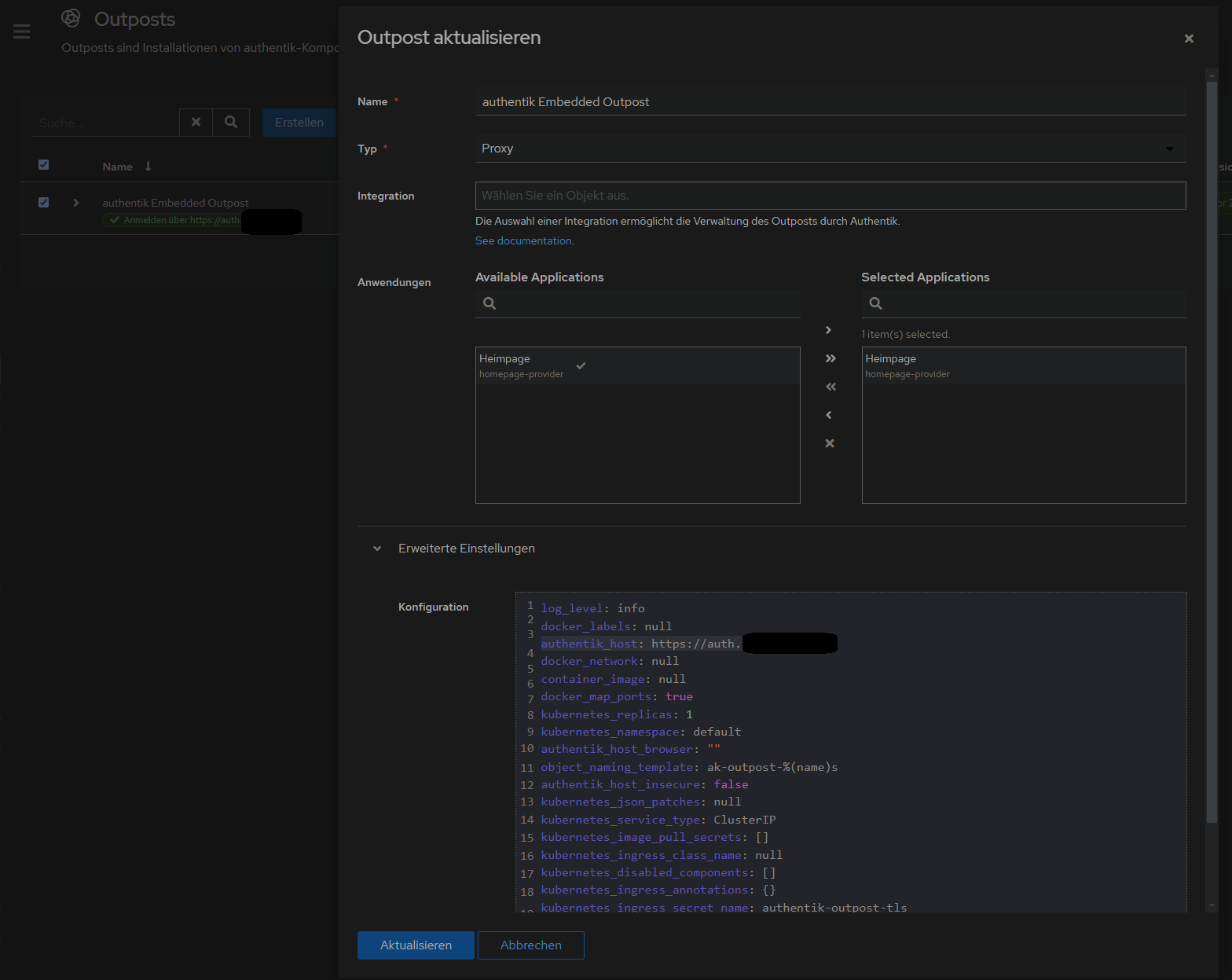](https://wiki.folkerts.it/uploads/images/gallery/2024-10/75Kimage.png)
#### 2. Proxy Provider erstellen
Applications > Provider > new Proxy Provider > Forward Auth (single application) > externer host eingeben
[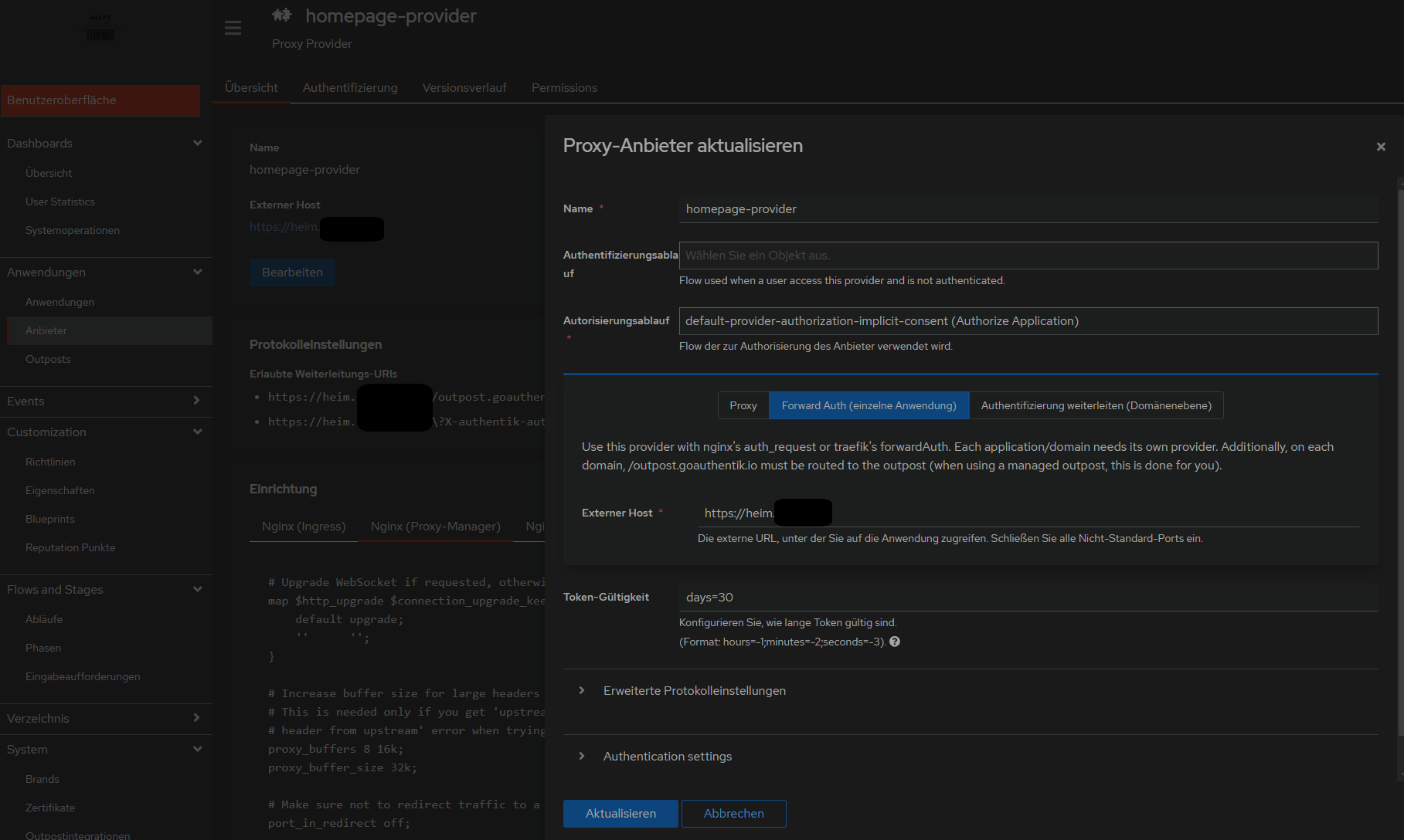](https://wiki.folkerts.it/uploads/images/gallery/2024-10/Tilimage.png)
#### 3. Anwendung mit dem erstellten Provider erstellen
...
danach weiter wie beim 500 Internal Server Error vorgehen, also NPM mit custom configuration und alle Container in gleiches Docker-Network legen:
### 500 Internal Server Error
Lösung auf github gepostet: [https://github.com/vineethmn/geekscomments/issues/1#issuecomment-2436487499](https://github.com/vineethmn/geekscomments/issues/1#issuecomment-2436487499)
I want to share my solution with getting rid the 500 internal server error because i did not find it anywhere online (i found out randomly):
\#### TLDR:
\- add NPM and Authentik to the same docker network
\- use the Authentik server dockercontainer INTERNAL Port in NPM > advanced > custom config and not the one you exposed (when you chose to use for example 9006:9000 in your docker-compose.yml then redirect to 9000 anyway. I dont know why 9006 is not working)
\#### LDR:
First I added the NPM and Authentik containers in the same docker network and added a hostname in my
##### authentik docker-compose.yml
```yaml
...
server:
image: ${AUTHENTIK_IMAGE:-ghcr.io/goauthentik/server}:${AUTHENTIK_TAG:-2024.6.0}
hostname: authentik_server
ports:
- 9006:9000
- 9446:9443
networks:
- reverseproxy_network
volumes:
...
postgresql:
image: docker.io/library/postgres:16-alpine
networks:
- reverseproxy_network
volumes:
...
networks:
reverseproxy_network:
name: reverseproxy_network
driver: bridge
```
and
#####
npm docker-compose.yml
```yaml
services:
app:
image: 'jc21/nginx-proxy-manager:latest'
restart: always
ports:
- '80:80'
- '81:81'
- '443:443'
volumes:
- data:/data
- letsencrypt:/etc/letsencrypt
networks:
- reverseproxy_network
volumes:
data:
letsencrypt:
networks:
reverseproxy_network:
name: reverseproxy_network
driver: bridge
```
after that i used the NPM > Proxy Host > Advanced > Custom Nginx Configuration config by
[https://geekscircuit.com/set-up-authentik-sso-with-nginx-proxy-manager](https://geekscircuit.com/set-up-authentik-sso-with-nginx-proxy-manager)
for my homepage proxy host:
(you only need to change proxy\_pass if your authentik-server hostname does not match with mine 'hostname: authentik\_server')
[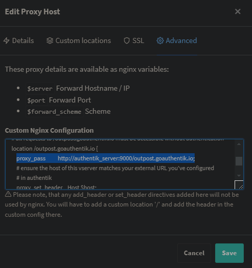](https://wiki.folkerts.it/uploads/images/gallery/2024-10/uJbimage.png)
##### custom nginx configuration
```bash
# Increase buffer size for large headers
# This is needed only if you get 'upstream sent too big header while reading response
# header from upstream' error when trying to access an application protected by goauthentik
proxy_buffers 8 16k;
proxy_buffer_size 32k;
location / {
# Put your proxy_pass to your application here
proxy_pass $forward_scheme://$server:$port;
# authentik-specific config
auth_request /outpost.goauthentik.io/auth/nginx;
error_page 401 = @goauthentik_proxy_signin;
auth_request_set $auth_cookie $upstream_http_set_cookie;
add_header Set-Cookie $auth_cookie;
# translate headers from the outposts back to the actual upstream
auth_request_set $authentik_username $upstream_http_x_authentik_username;
auth_request_set $authentik_groups $upstream_http_x_authentik_groups;
auth_request_set $authentik_email $upstream_http_x_authentik_email;
auth_request_set $authentik_name $upstream_http_x_authentik_name;
auth_request_set $authentik_uid $upstream_http_x_authentik_uid;
proxy_set_header X-authentik-username $authentik_username;
proxy_set_header X-authentik-groups $authentik_groups;
proxy_set_header X-authentik-email $authentik_email;
proxy_set_header X-authentik-name $authentik_name;
proxy_set_header X-authentik-uid $authentik_uid;
}
# all requests to /outpost.goauthentik.io must be accessible without authentication
location /outpost.goauthentik.io {
proxy_pass http://authentik_server:9000/outpost.goauthentik.io; # <<<< CHANGE HERE <<<<
# ensure the host of this vserver matches your external URL you've configured
# in authentik
proxy_set_header Host $host;
proxy_set_header X-Original-URL $scheme://$http_host$request_uri;
add_header Set-Cookie $auth_cookie;
auth_request_set $auth_cookie $upstream_http_set_cookie;
# required for POST requests to work
proxy_pass_request_body off;
proxy_set_header Content-Length "";
}
# Special location for when the /auth endpoint returns a 401,
# redirect to the /start URL which initiates SSO
location @goauthentik_proxy_signin {
internal;
add_header Set-Cookie $auth_cookie;
return 302 /outpost.goauthentik.io/start?rd=$request_uri;
# For domain level, use the below error_page to redirect to your authentik server with the full redirect path
# return 302 https://authentik.company/outpost.goauthentik.io/start?rd=$scheme://$http_host$request_uri;
}
```
i also did not have to change anything on my authentik outpost:
[](https://wiki.folkerts.it/uploads/images/gallery/2024-10/naWimage.png)
Andere mit dem gleichen Problem:
[https://geekscircuit.com/set-up-authentik-sso-with-nginx-proxy-manager/](https://geekscircuit.com/set-up-authentik-sso-with-nginx-proxy-manager/)
[https://github.com/goauthentik/authentik/issues/10010](https://github.com/goauthentik/authentik/issues/10010)
[https://www.reddit.com/r/selfhosted/comments/vs12ug/sso\_with\_authentik\_and\_nginx\_proxy\_manager/?tl=de](https://www.reddit.com/r/selfhosted/comments/vs12ug/sso_with_authentik_and_nginx_proxy_manager/?tl=de)
[https://www.youtube.com/watch?v=Nh1qiqCYDt4&list=PLH73rprBo7vSkDq-hAuXOoXx2es-1ExOP](https://www.youtube.com/watch?v=Nh1qiqCYDt4&list=PLH73rprBo7vSkDq-hAuXOoXx2es-1ExOP)
#### Einladungen per Mail
User-Enrollment kann mit mit Flows aus dem Anhang dieses Artikels realisiert werden.
Quelle: [https://www.youtube.com/watch?v=mGOTpRfulfQ](https://www.youtube.com/watch?v=mGOTpRfulfQ)
[https://docs.goauthentik.io/docs/add-secure-apps/flows-stages/flow/examples/flows](https://docs.goauthentik.io/docs/add-secure-apps/flows-stages/flow/examples/flows) (Enrollment-2-Stage.yaml in Abläufe importieren)
##### Flows
[](https://wiki.folkerts.it/uploads/images/gallery/2025-01/Vnpimage.png)
[](https://wiki.folkerts.it/uploads/images/gallery/2025-01/rbjimage.png)
^ auf Reiehnfolge der Fields achten, damit username, Name, Email, Pw, pw nochmal richtig sortiert sind
[](https://wiki.folkerts.it/uploads/images/gallery/2025-01/4zkimage.png)
##### Phasen
[](https://wiki.folkerts.it/uploads/images/gallery/2025-01/7VTimage.png)
[](https://wiki.folkerts.it/uploads/images/gallery/2025-01/z3Aimage.png)
Danach auf Verzeichnis > Einladungen > Erstellen klicken und mit dem Flow einen Einladungslink erzeugen:
[](https://wiki.folkerts.it/uploads/images/gallery/2025-04/image.png)
den Eintrag ausklappen, um den Link zu kopieren:
[](https://wiki.folkerts.it/uploads/images/gallery/2025-04/Df6image.png)